[project]
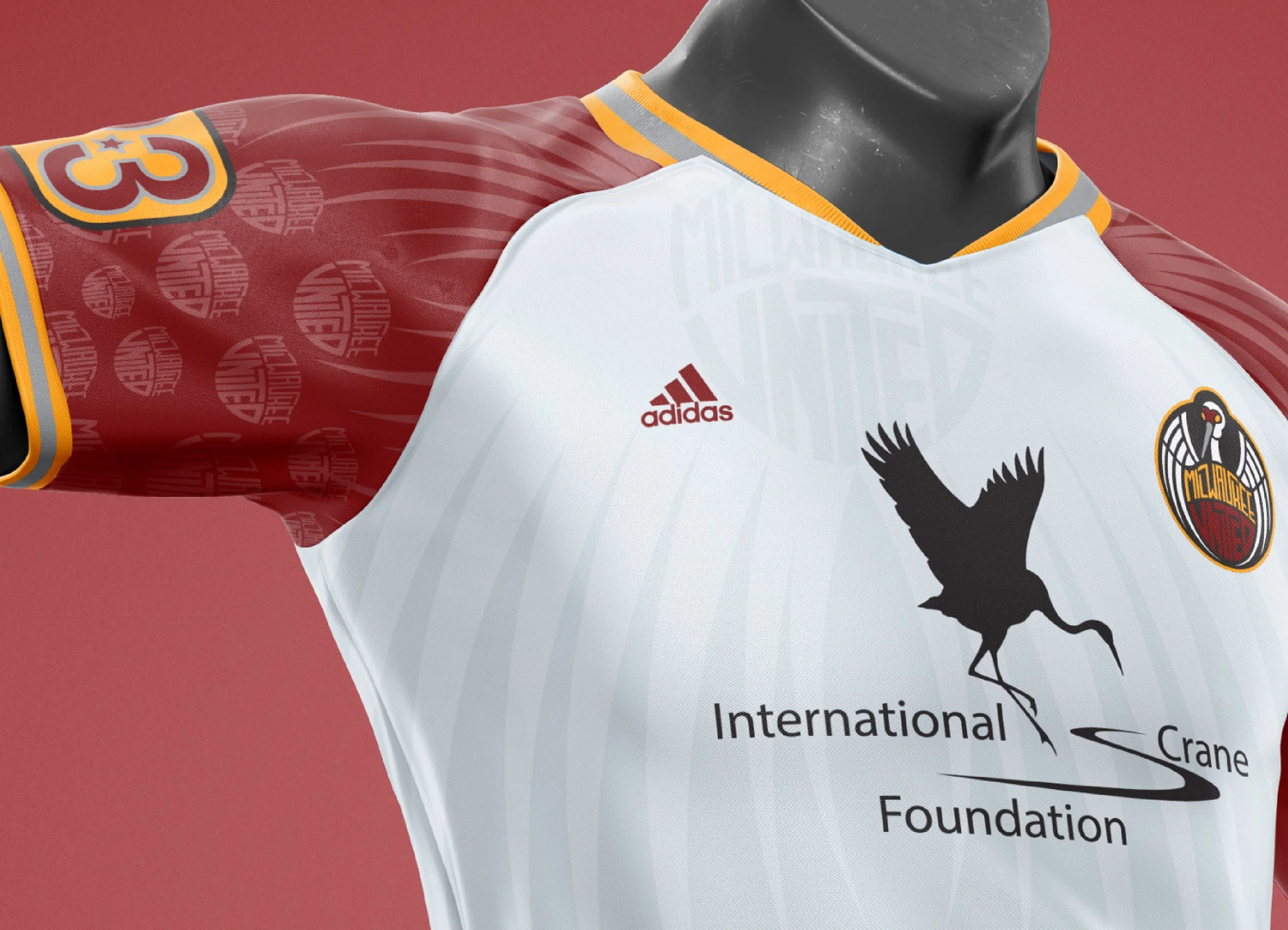
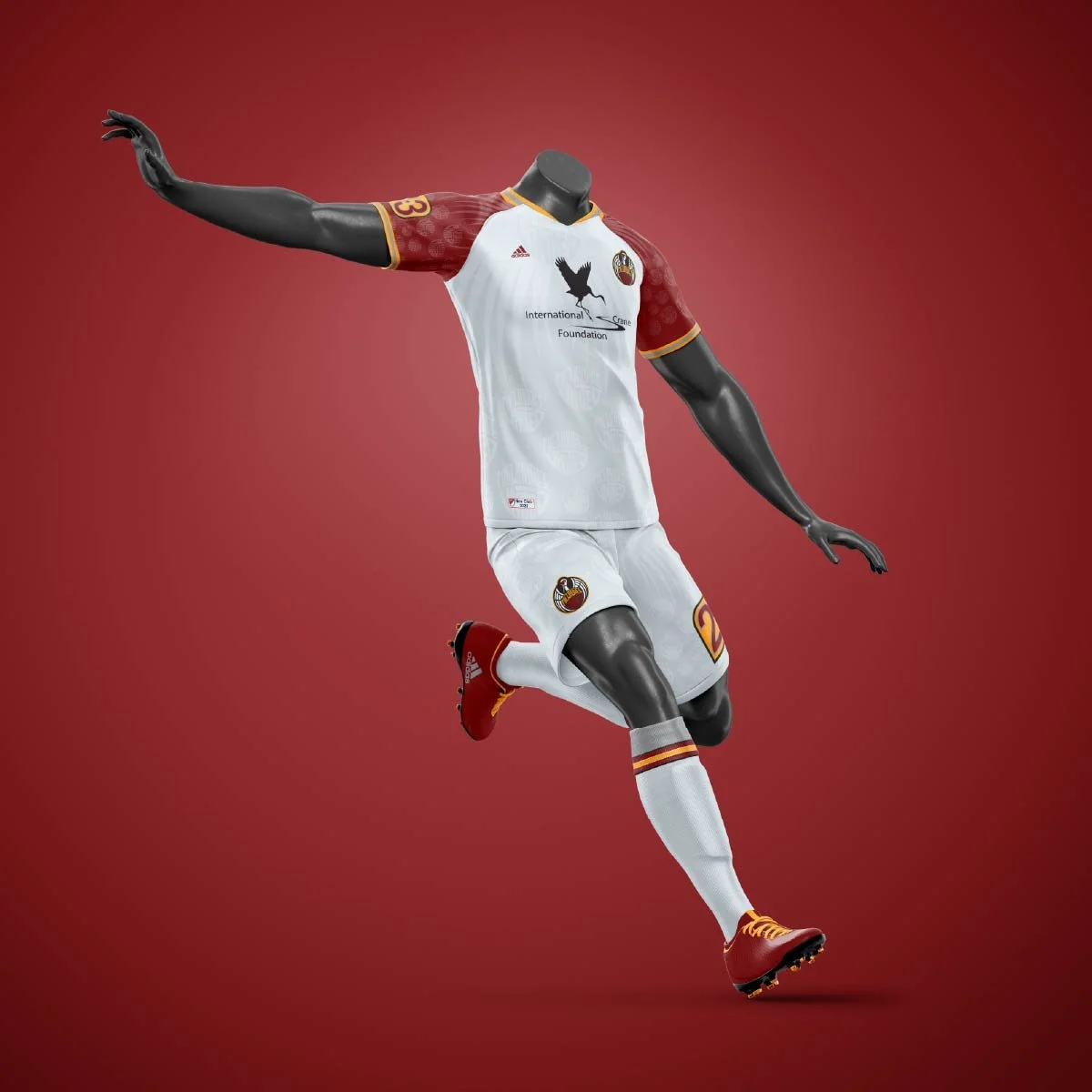
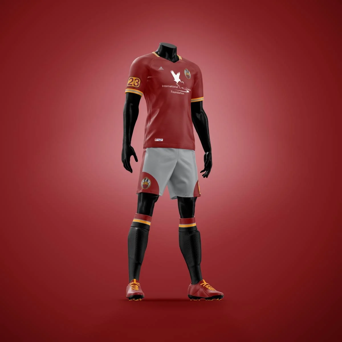
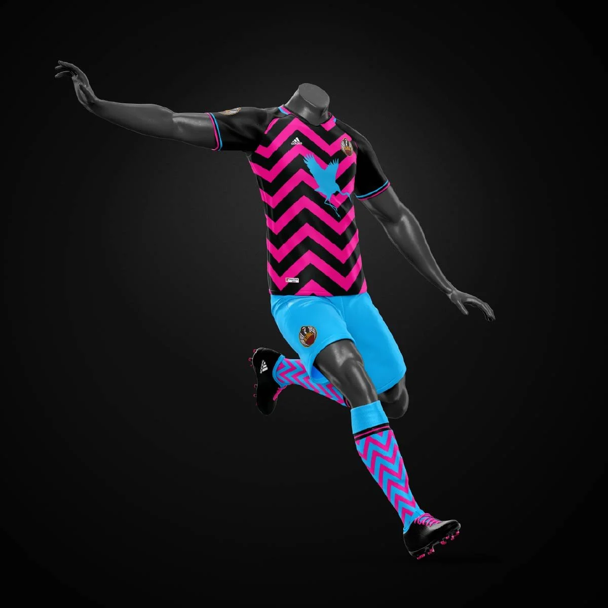
milwaukee united football club, a speculative minor league soccer club for the city of milwaukee.
[deliverables]
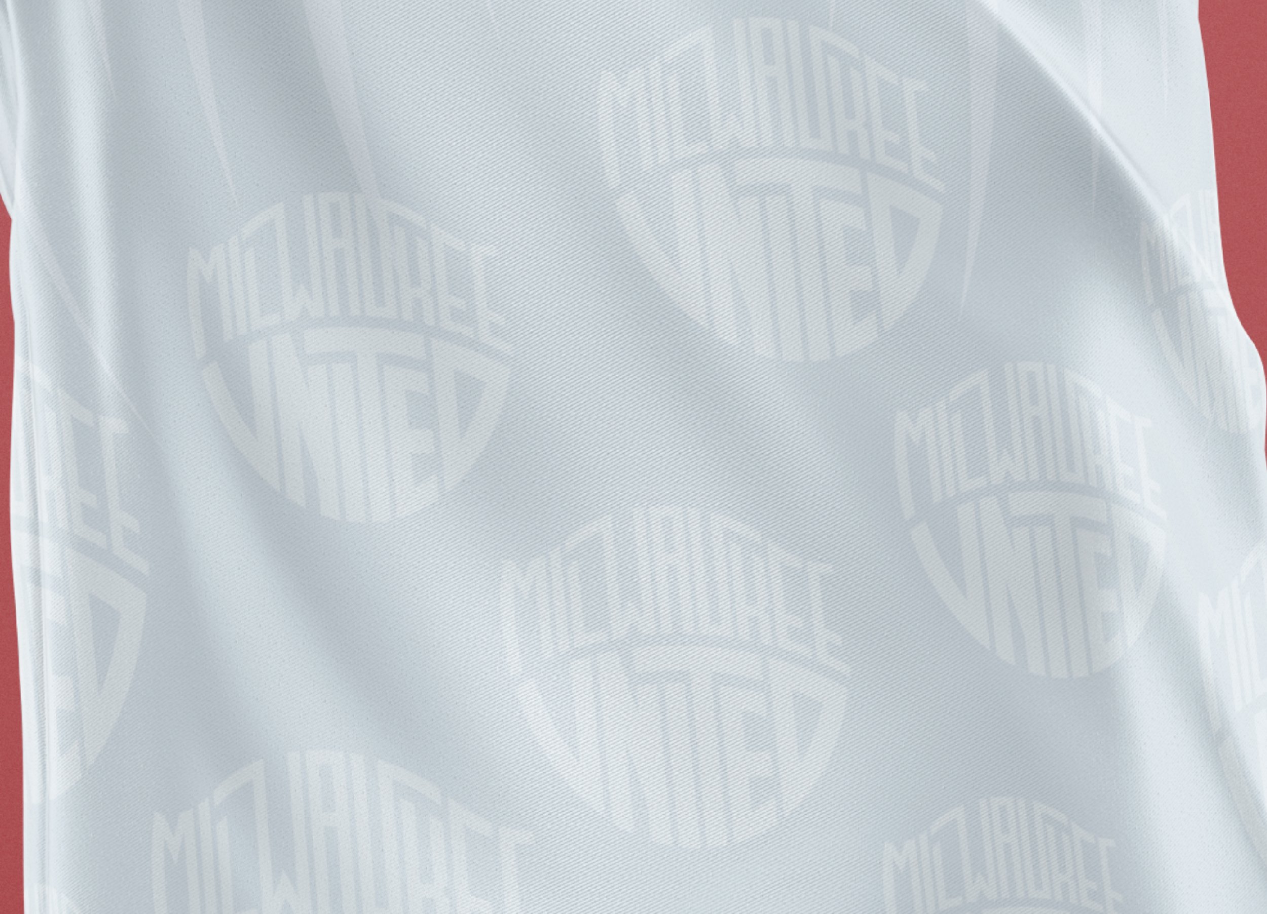
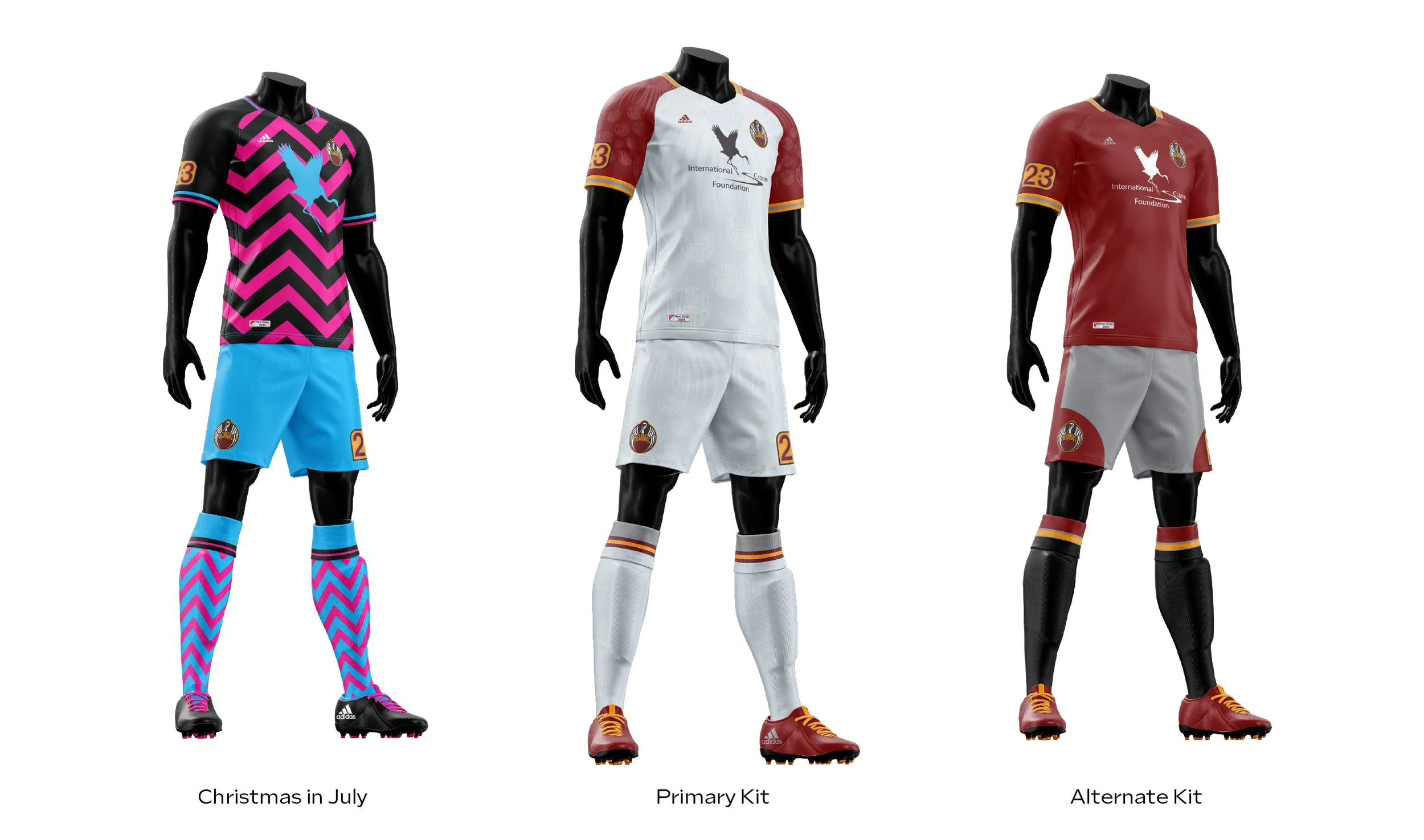
brand identity, visual mark, color palette, typography system, kit designs, apparel mockups, hype video.
[date]
spring 2023.
[about]
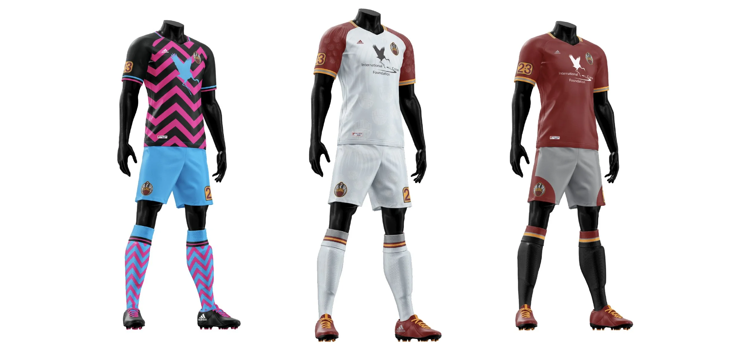
milwaukee united football club is a speculative minor league soccer club, designed in a semester-long sports branding course at the milwaukee institute of art and design. the brief was simple, milwaukee doesn't have a team yet, but it was chosen to be a franchise starting the 2026 season. build the brand and make it special.
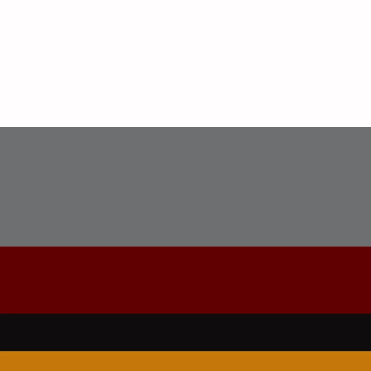
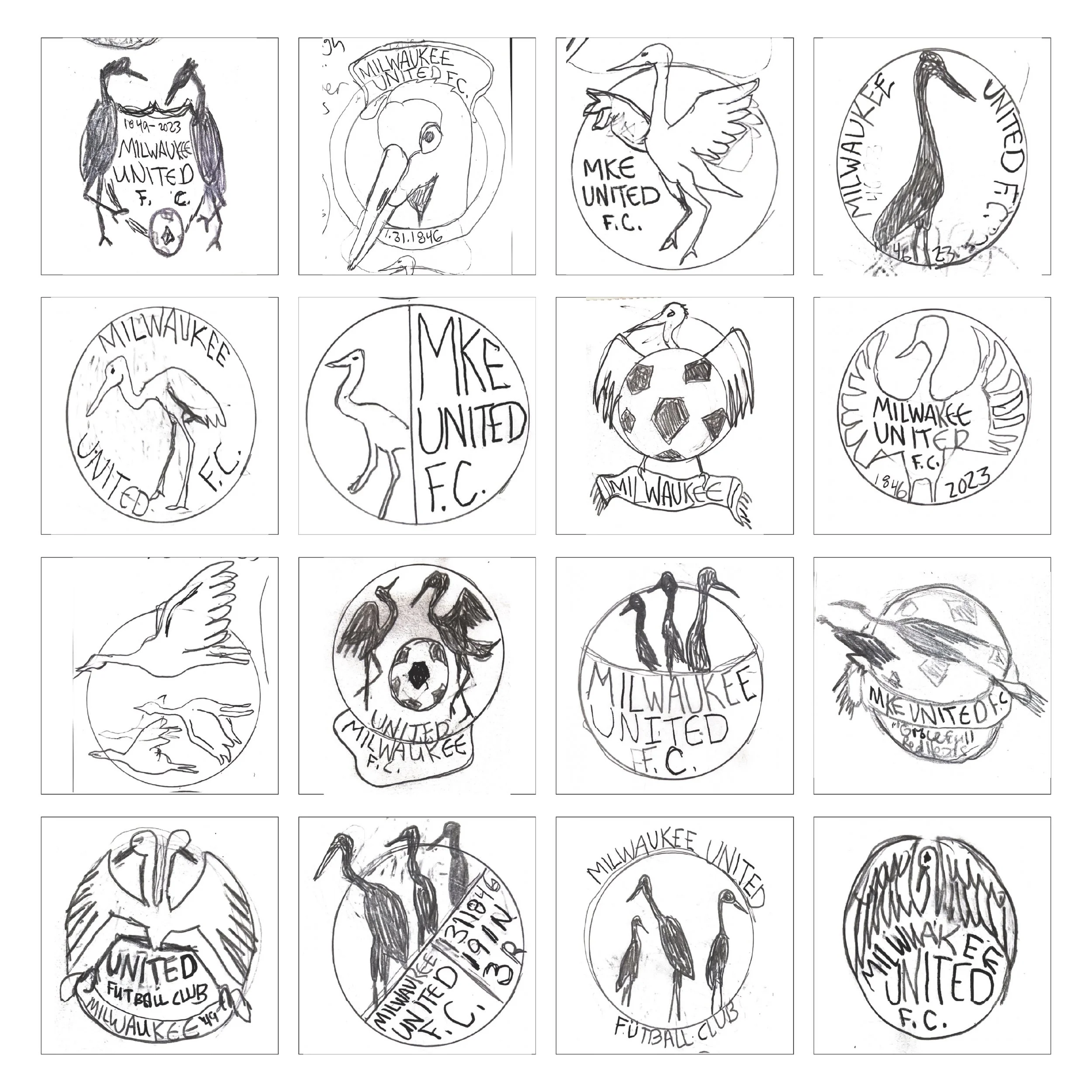
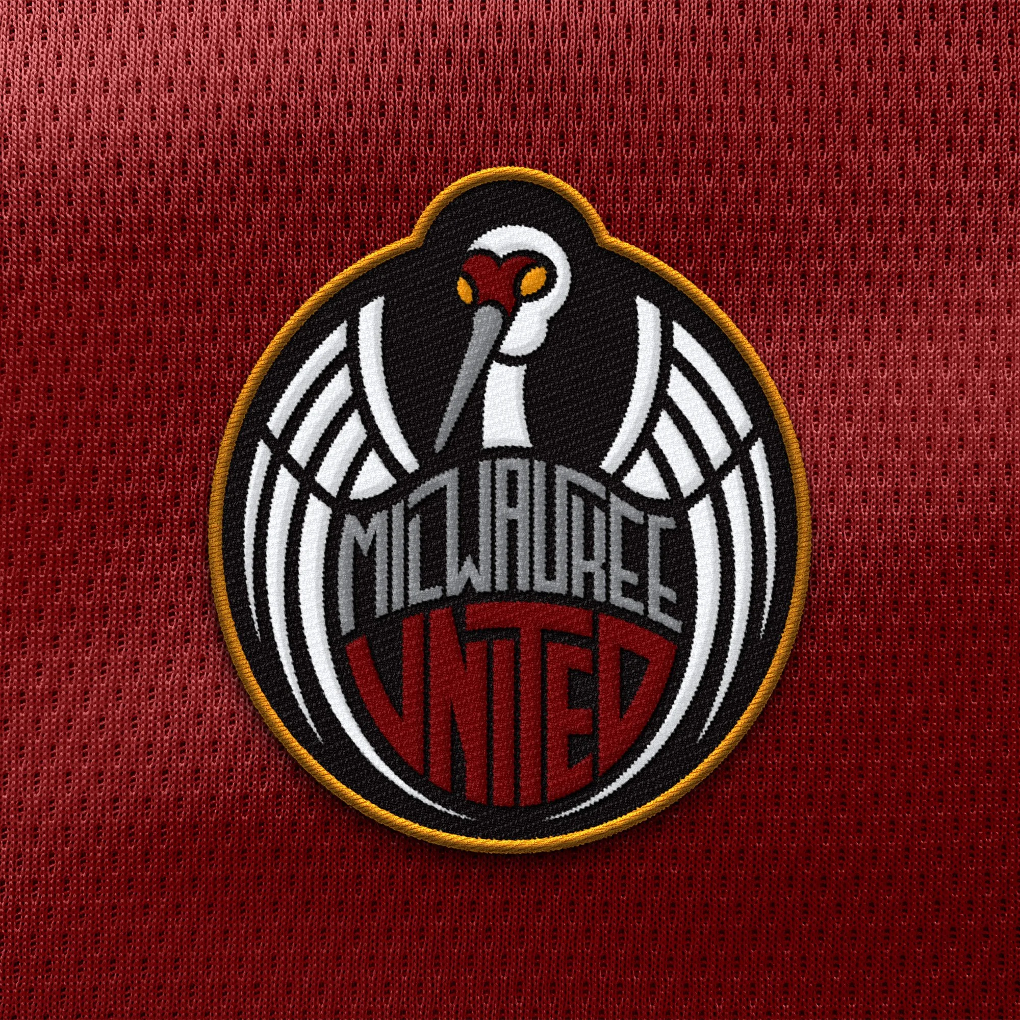
the name was the starting point. united suggested community, loyalty, a sense of place. that pointed toward a symbol rooted in the region, not a generic mascot pulled from a stock library. the answer showed up in the wild — sandhill cranes. they're graceful but fierce and they are loyal to their flock and nests. that felt right for a club built around a city. the color palette came directly from the crane — the muted grays, the red crown, the warm undertones.
the identity ran across the full system: visual mark, type, three kit designs, apparel mockups, and a hype video to bring it all to motion. two of the kits played it relatively straight. the third went somewhere else entirely — louder, weirder, the kind of design decision you make when the brief lets you. it's the one i'd want to wear.
[next]
[project]
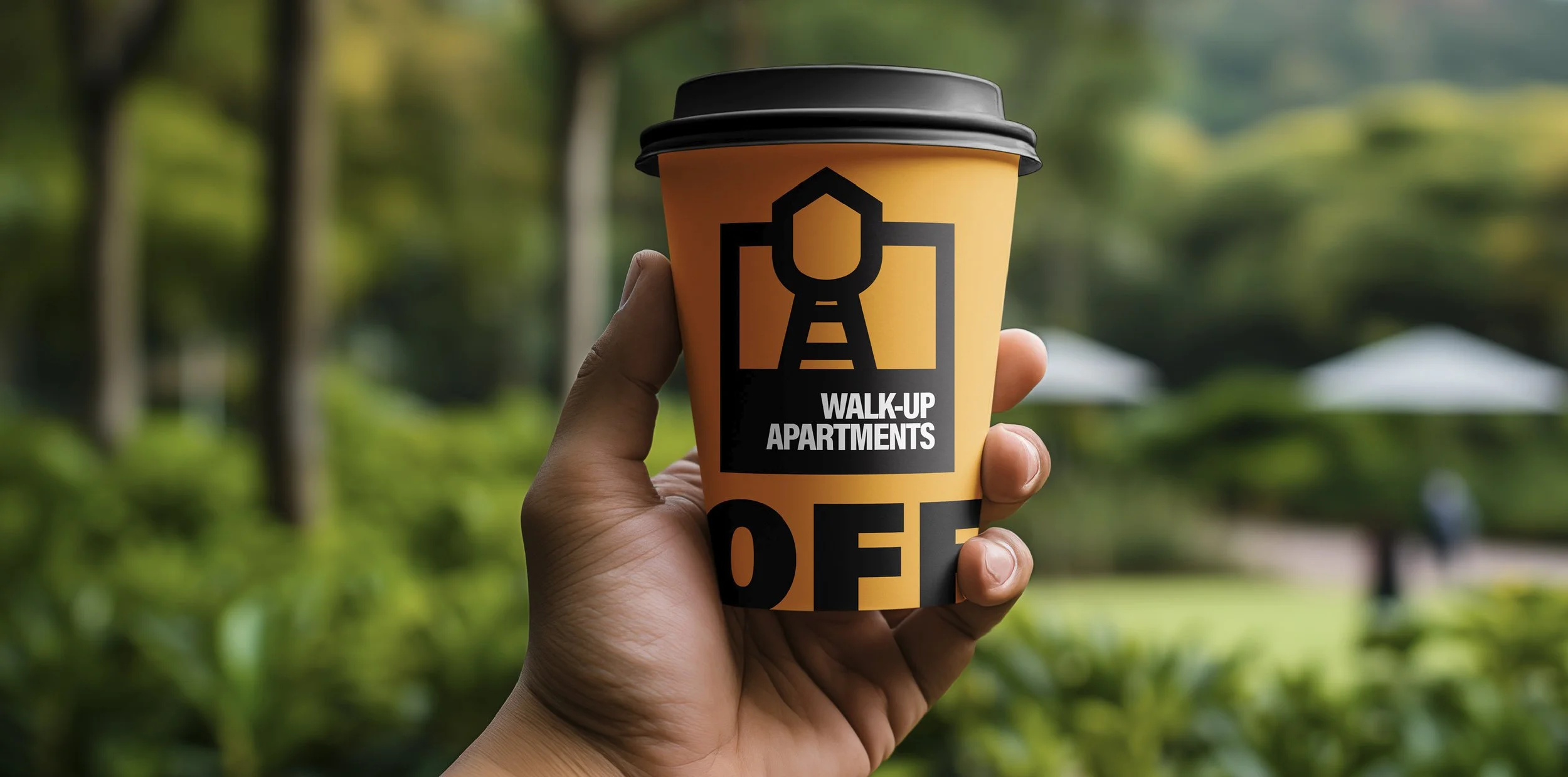
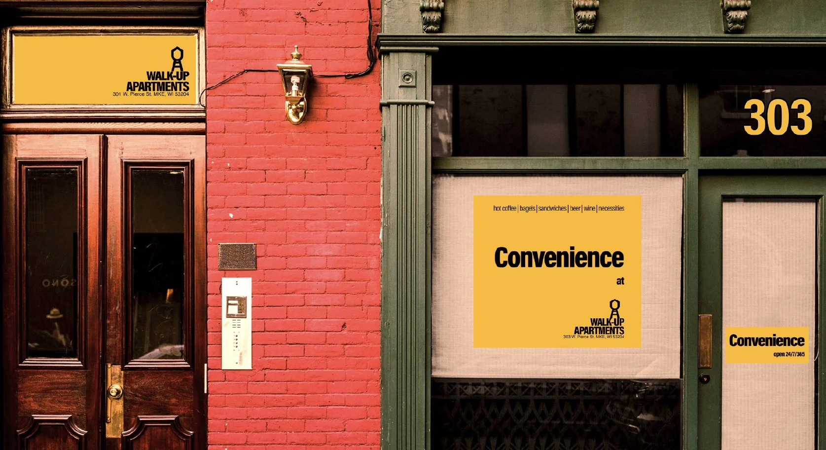
walk-up apartments, a speculative apartment brand rooted in milwaukee's third ward.
[deliverables]
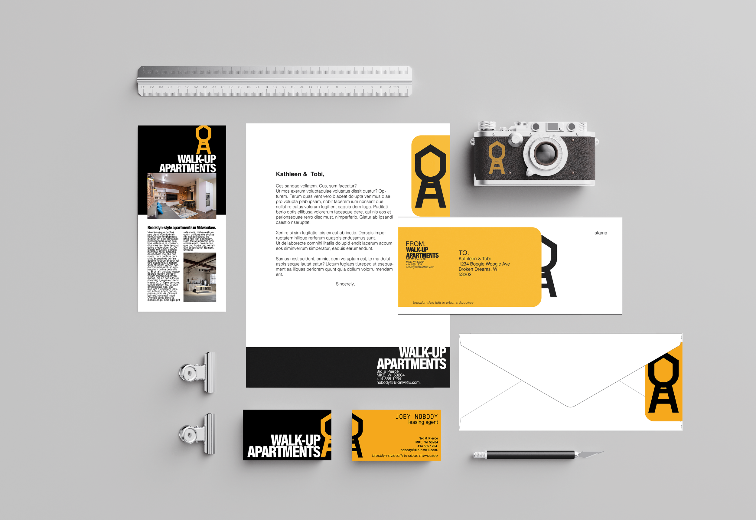
logo, color palette, brand identity system, ancillary branded materials.
[date]
spring 2022.
[about]
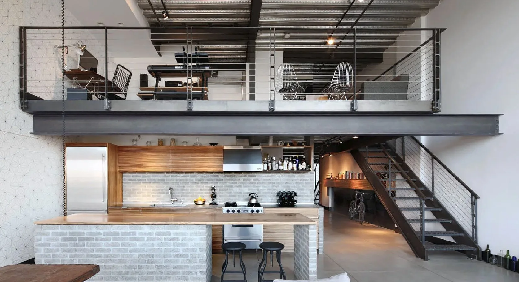
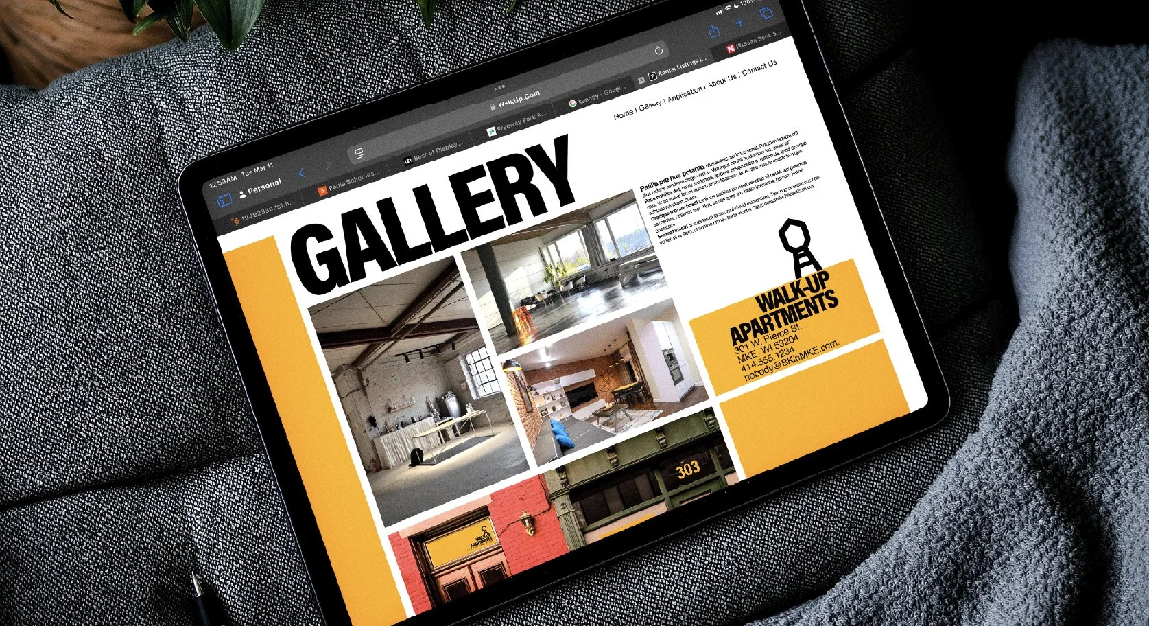
walk-up apartments is a complete brand identity system developed as part of a brand systems course at the milwaukee institute of art and design. the concept drew on the character of brooklyn-style walk-ups — the kind of buildings that carry history in their bones, where the architecture tells you something about the people who live there.
transplanting that sensibility into milwaukee's third ward — a neighborhood with its own creative energy and urban texture — became the foundation for every design decision. the identity needed to feel like it belonged to a specific place and a specific kind of living, not a generic apartment complex pulled from a developer's template.
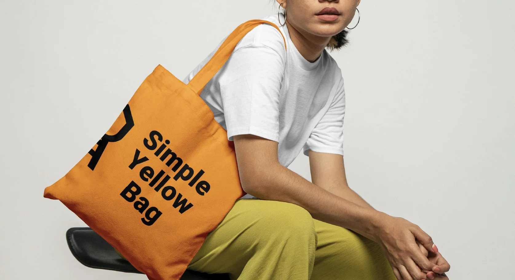
the system included a visual mark, a color palette, and a set of ancillary branded materials. every piece was built to feel considered and authentic — handmade in spirit, even when it wasn't. a brand for buildings that have stories, designed for the people who'd want to live in them.
[next]
[project]
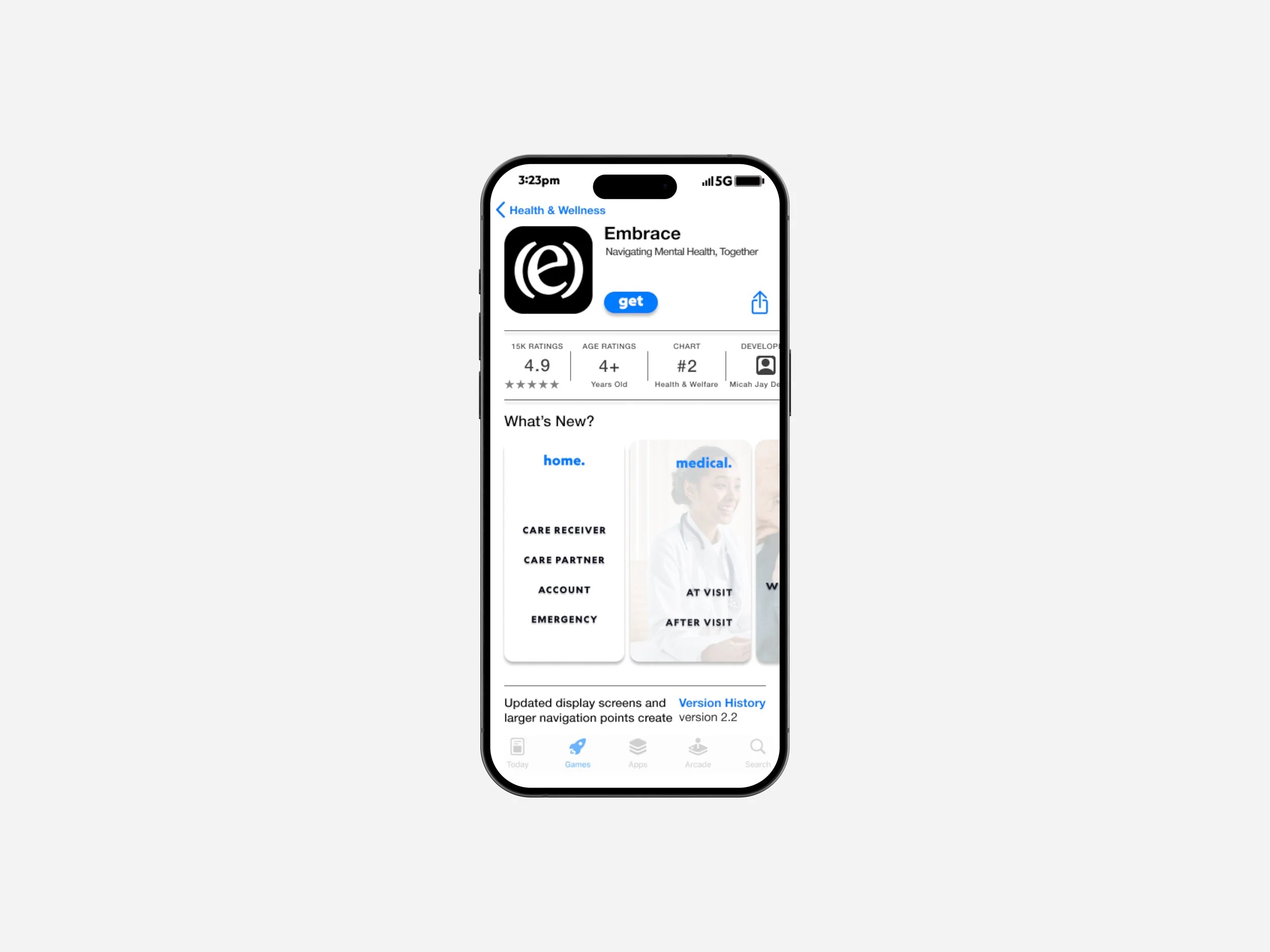
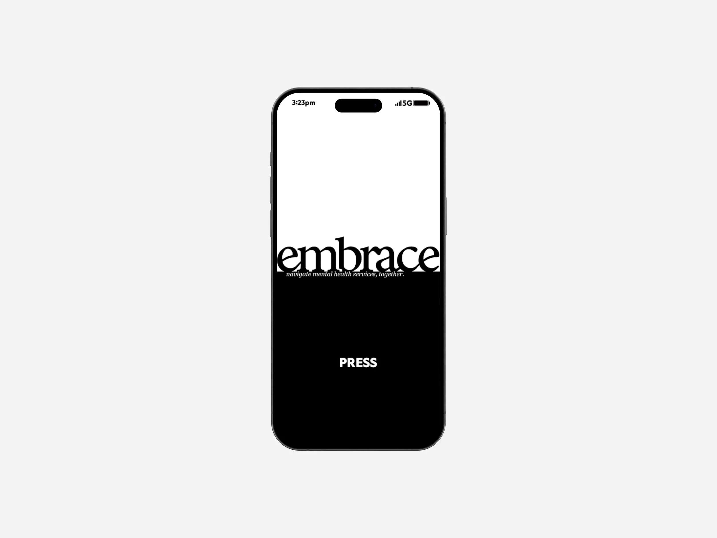
embrace, a mobile healthcare application designed for adults 65 and older.
[deliverables]
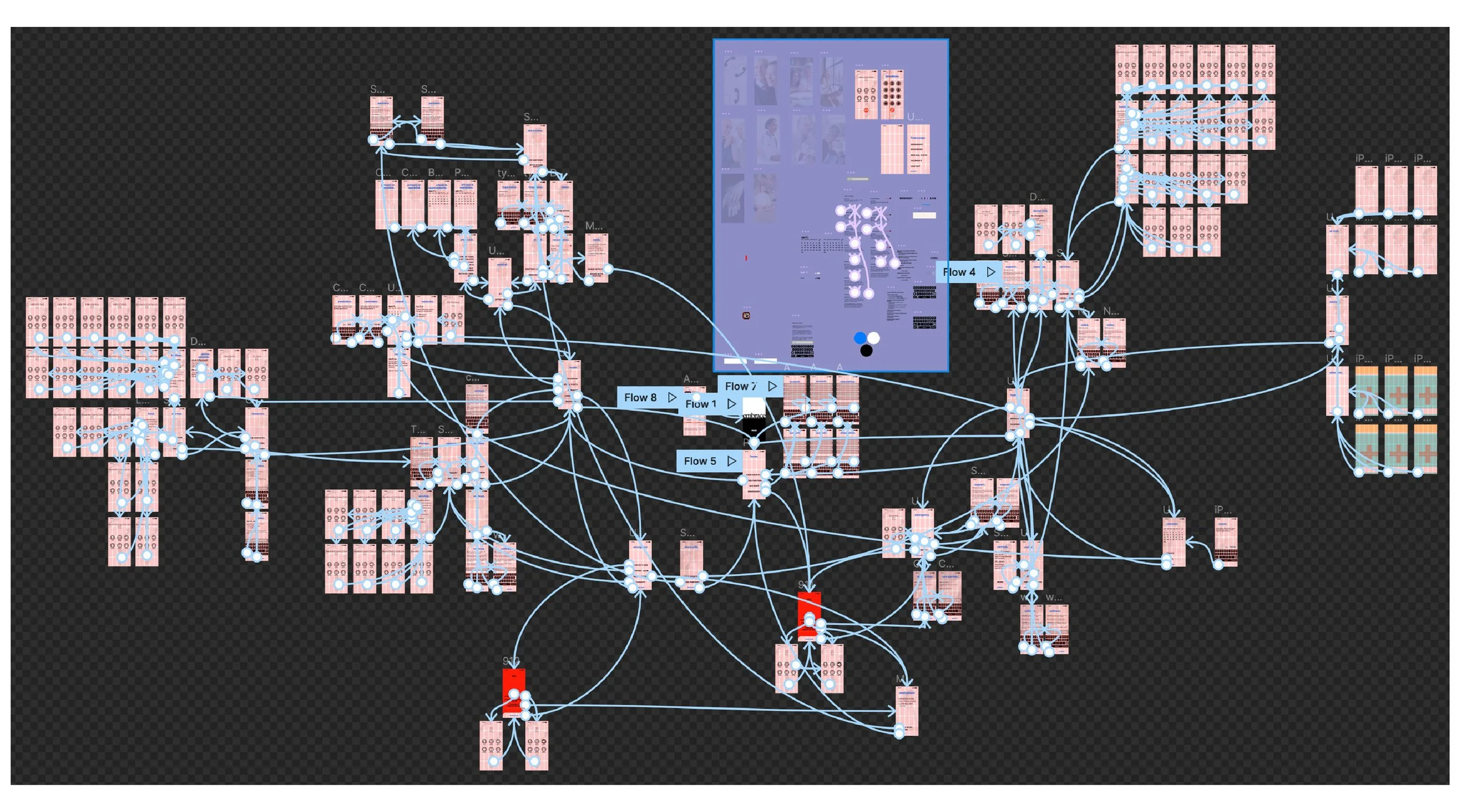
user research, competitive analysis, brand identity, wireframes, interactive prototype, thesis book, interaction video, final presentation video, thesis exhibition.
[date]
fall 2022 – spring 2023.
[about]
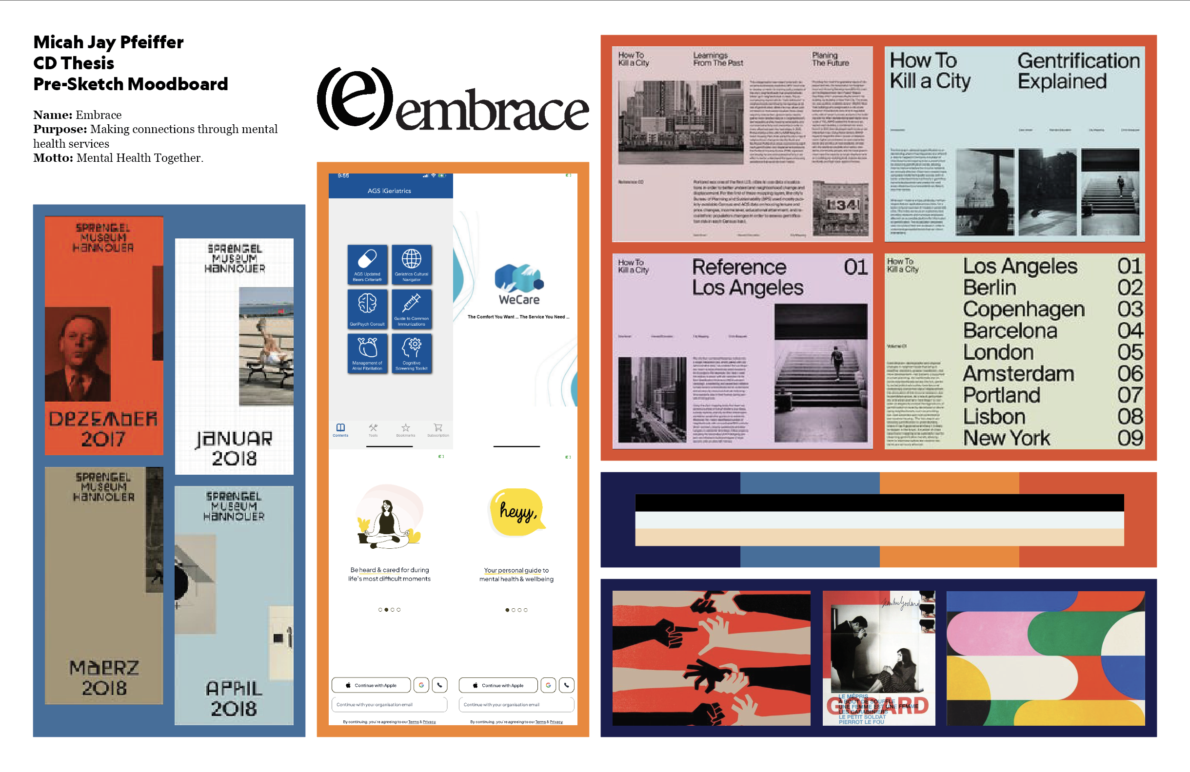
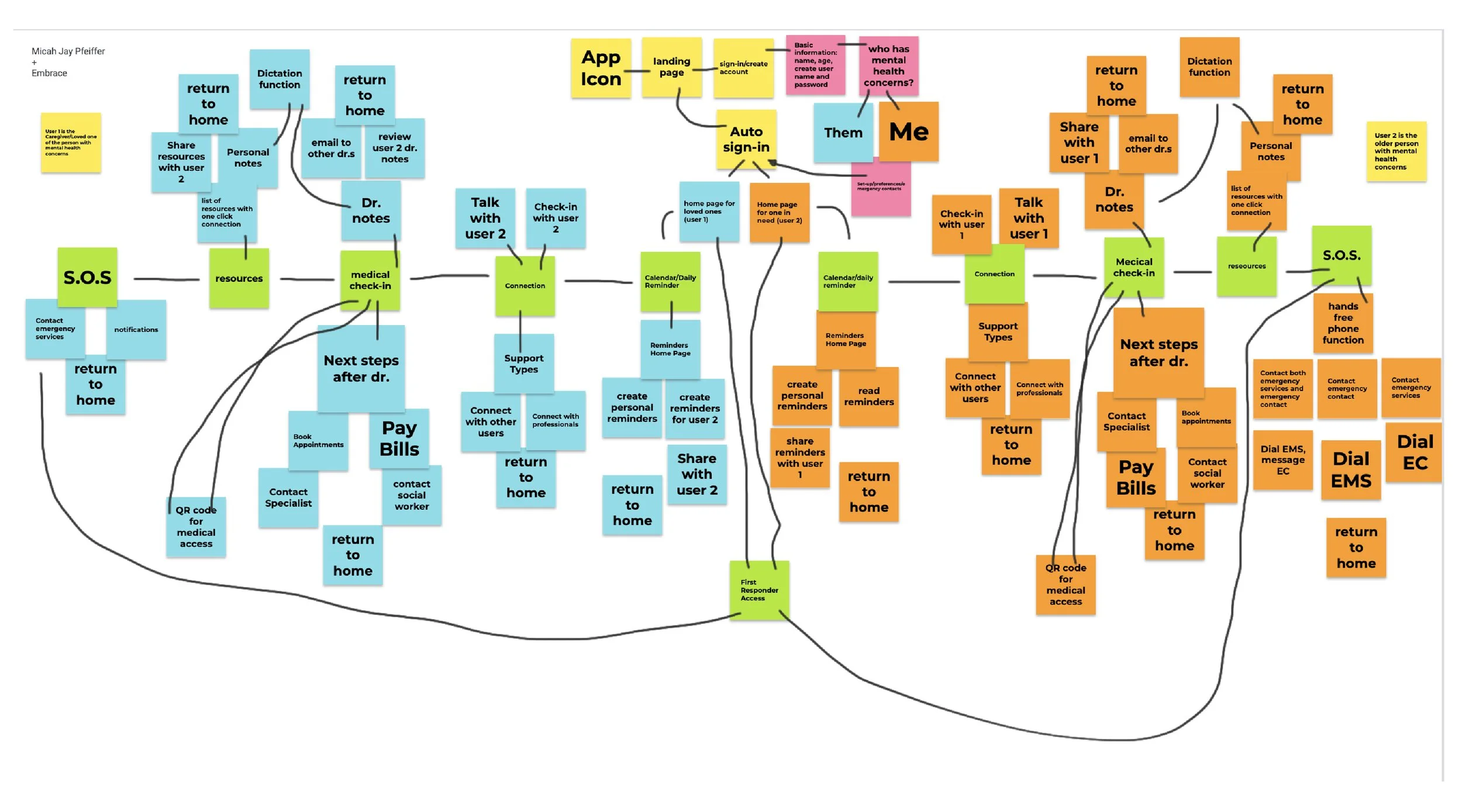
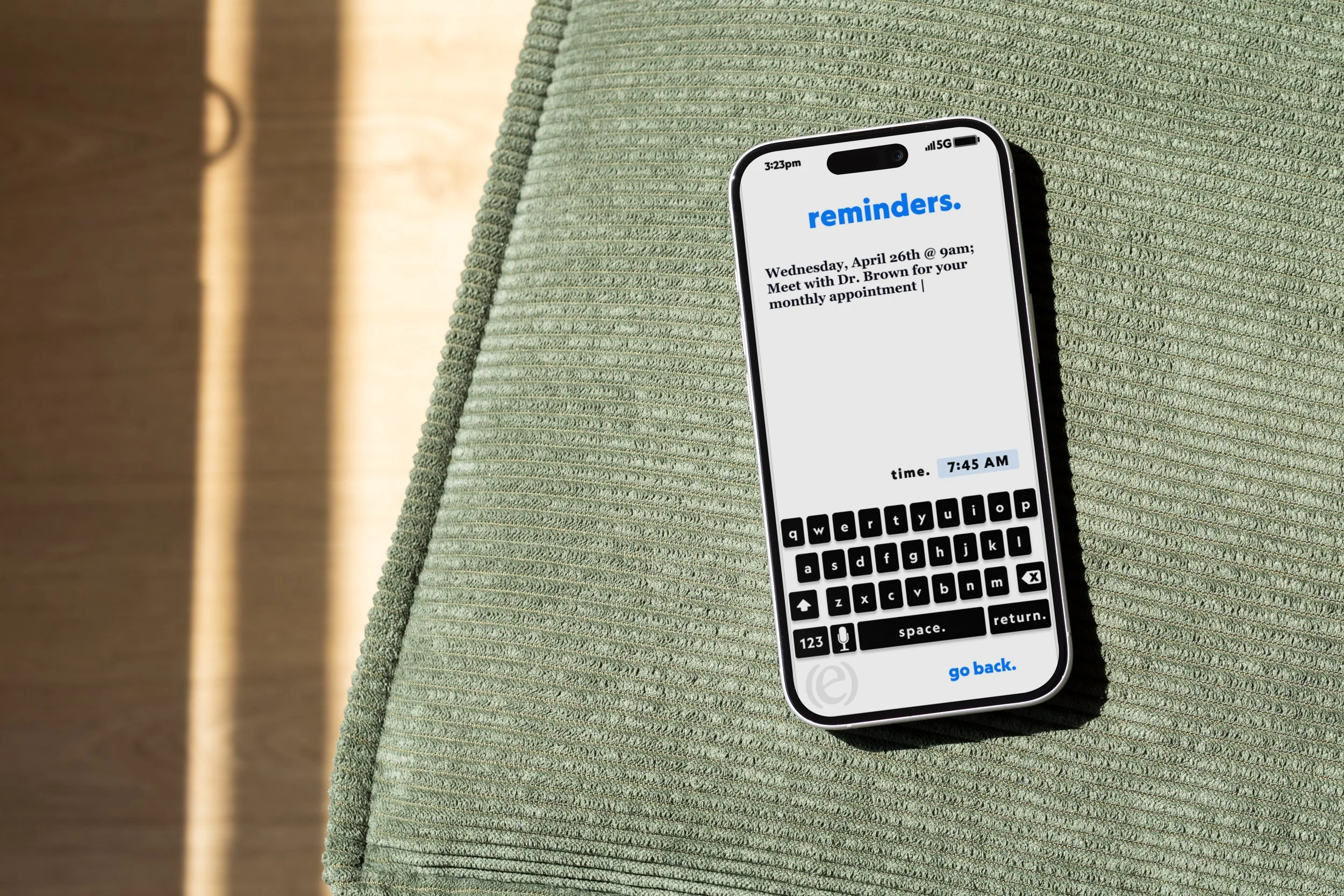
embrace is a mobile healthcare application designed for adults 65 and older, developed as a senior thesis project at the milwaukee institute of art and design over two semesters. the concept started with a gap. mental healthcare tools were built for younger, digitally confident users — leaving behind the people who arguably needed them most.
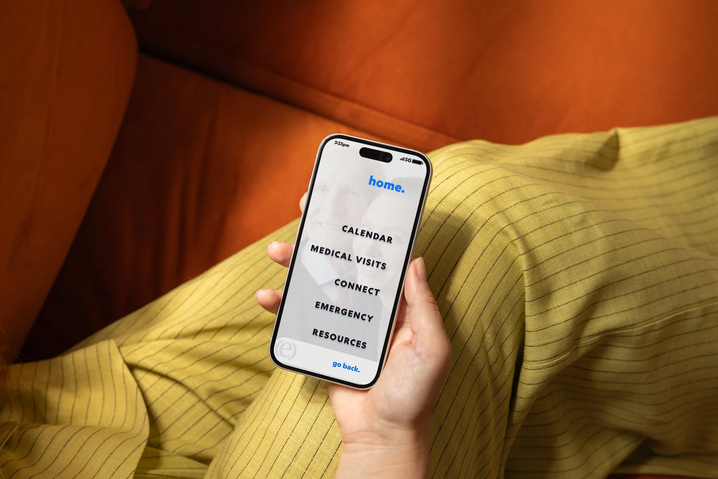
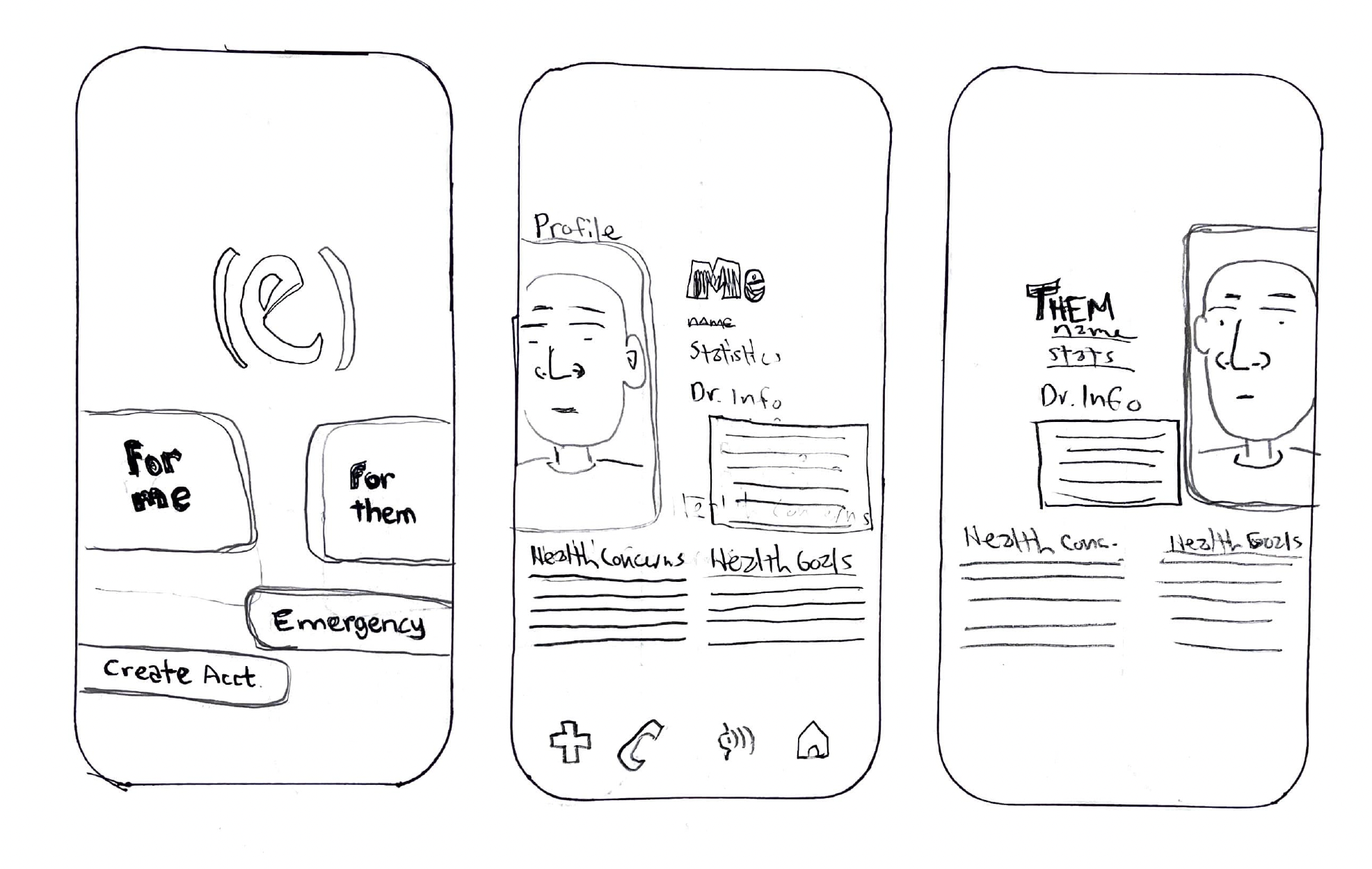
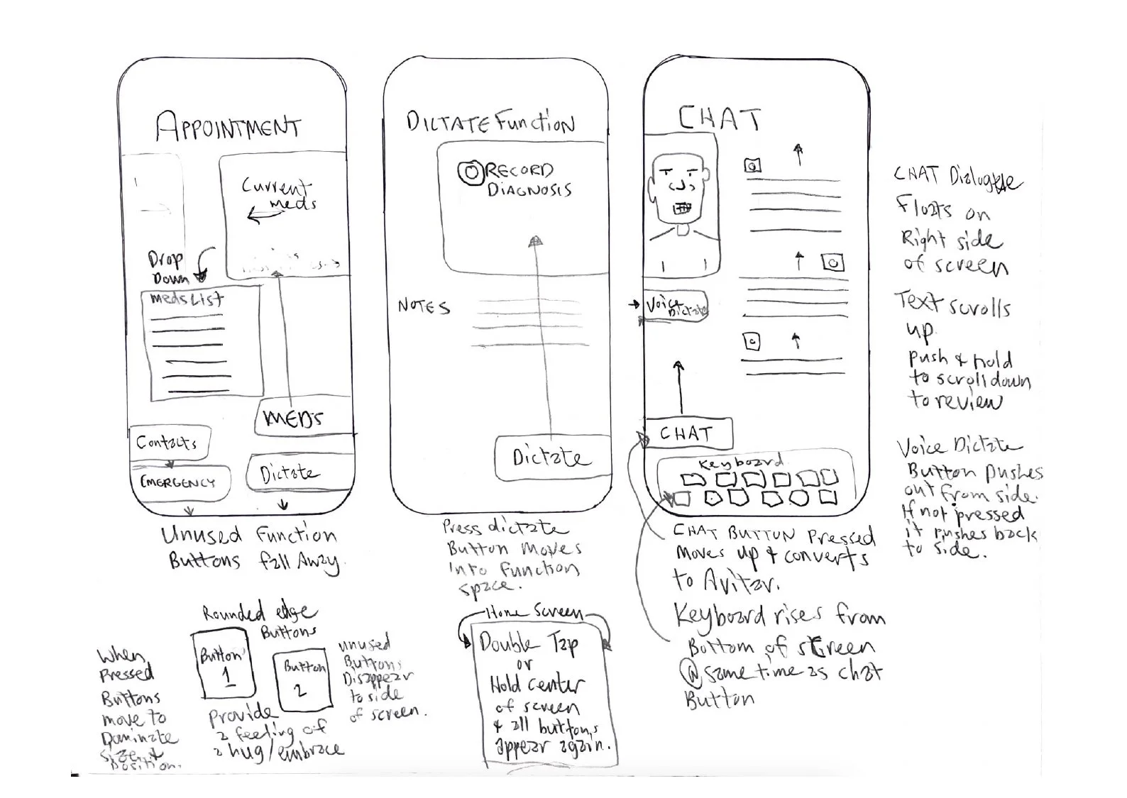
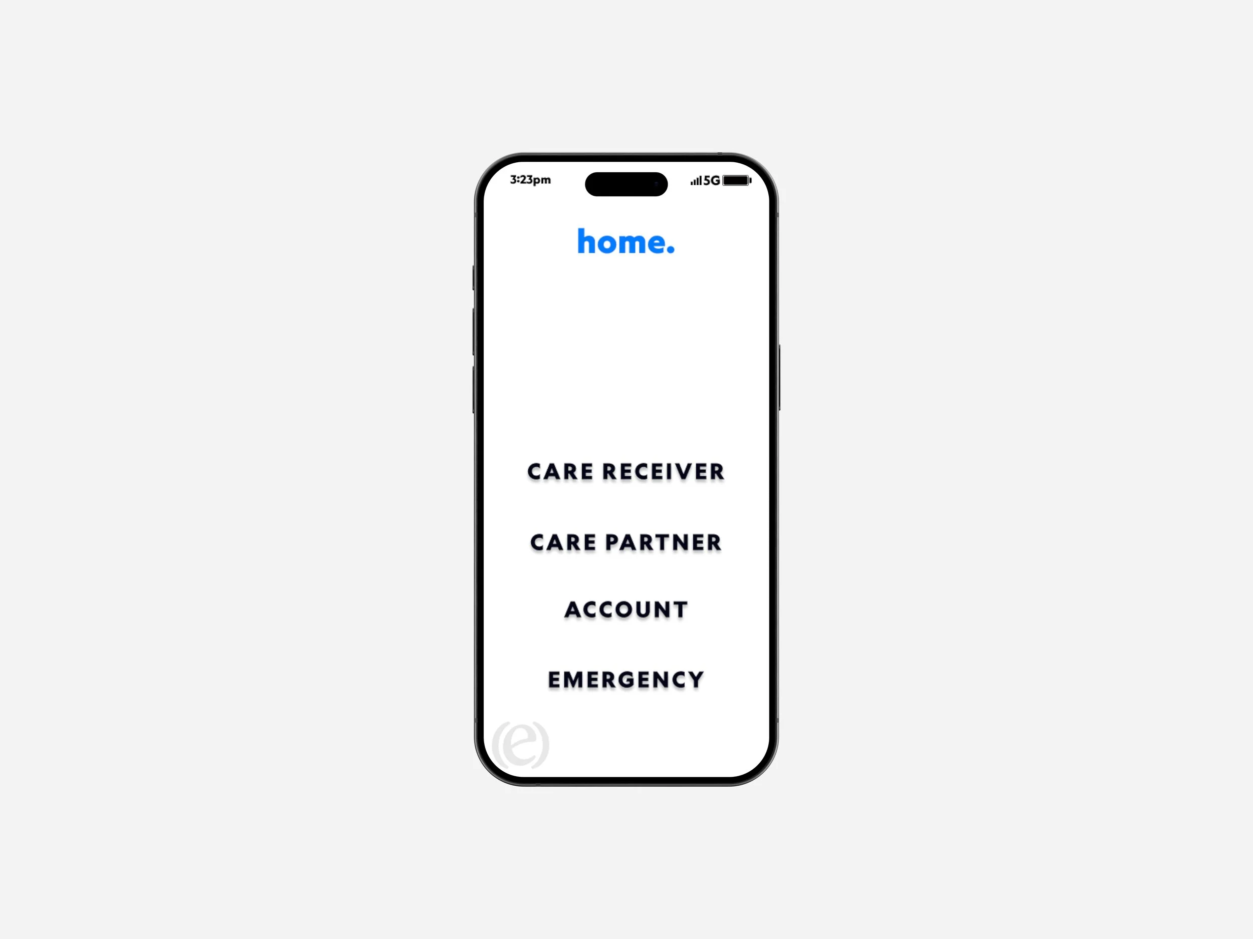
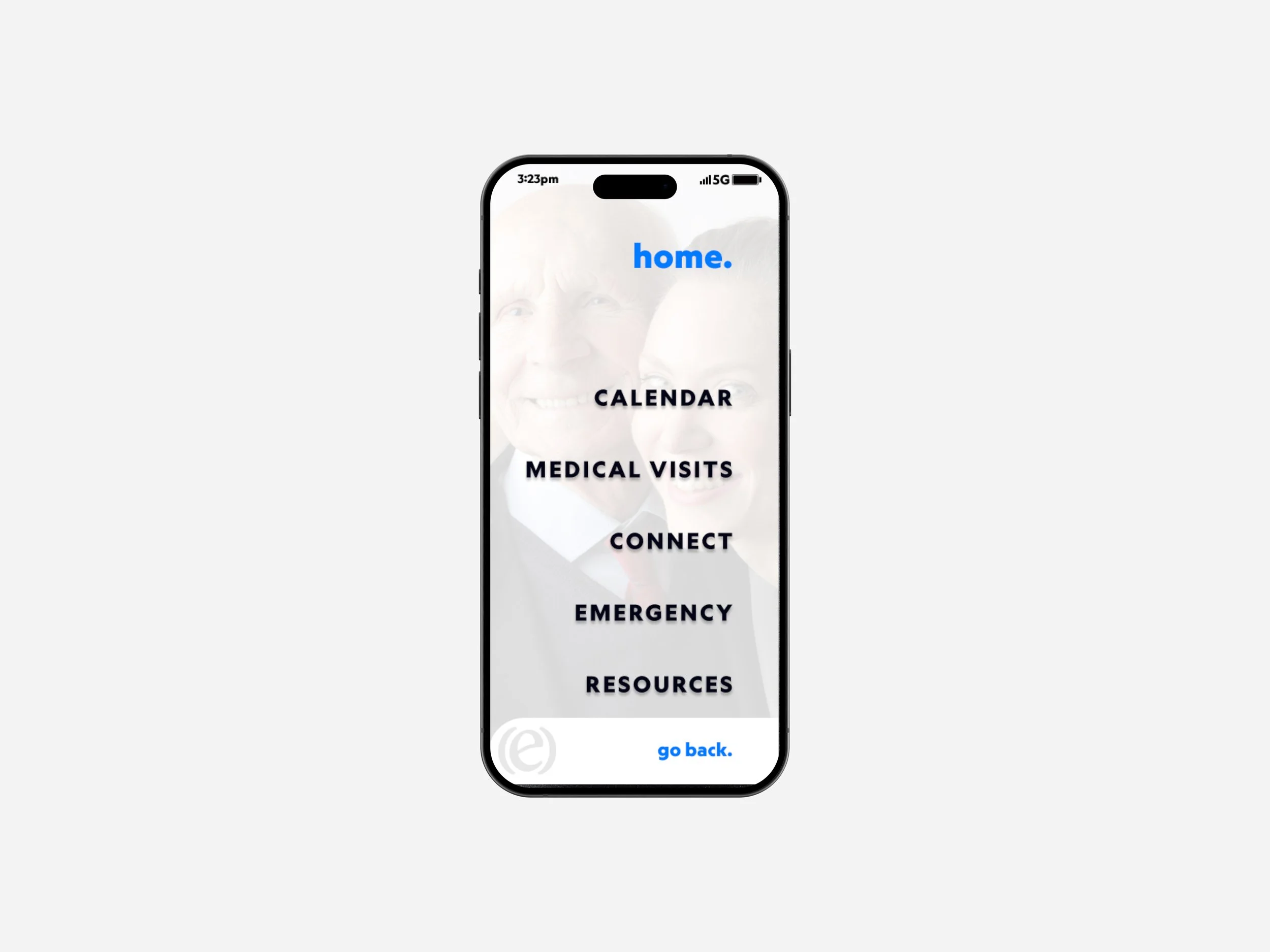
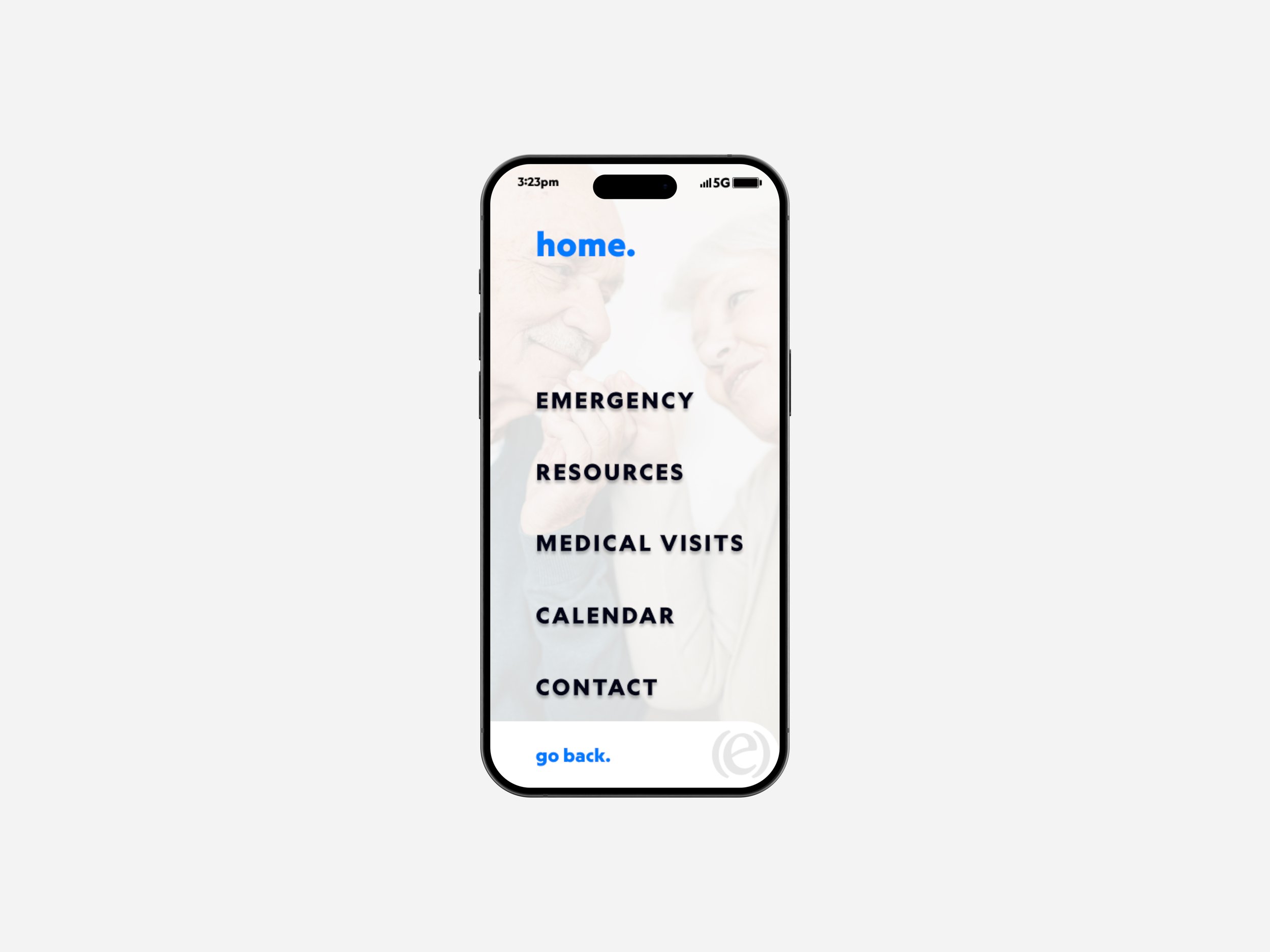
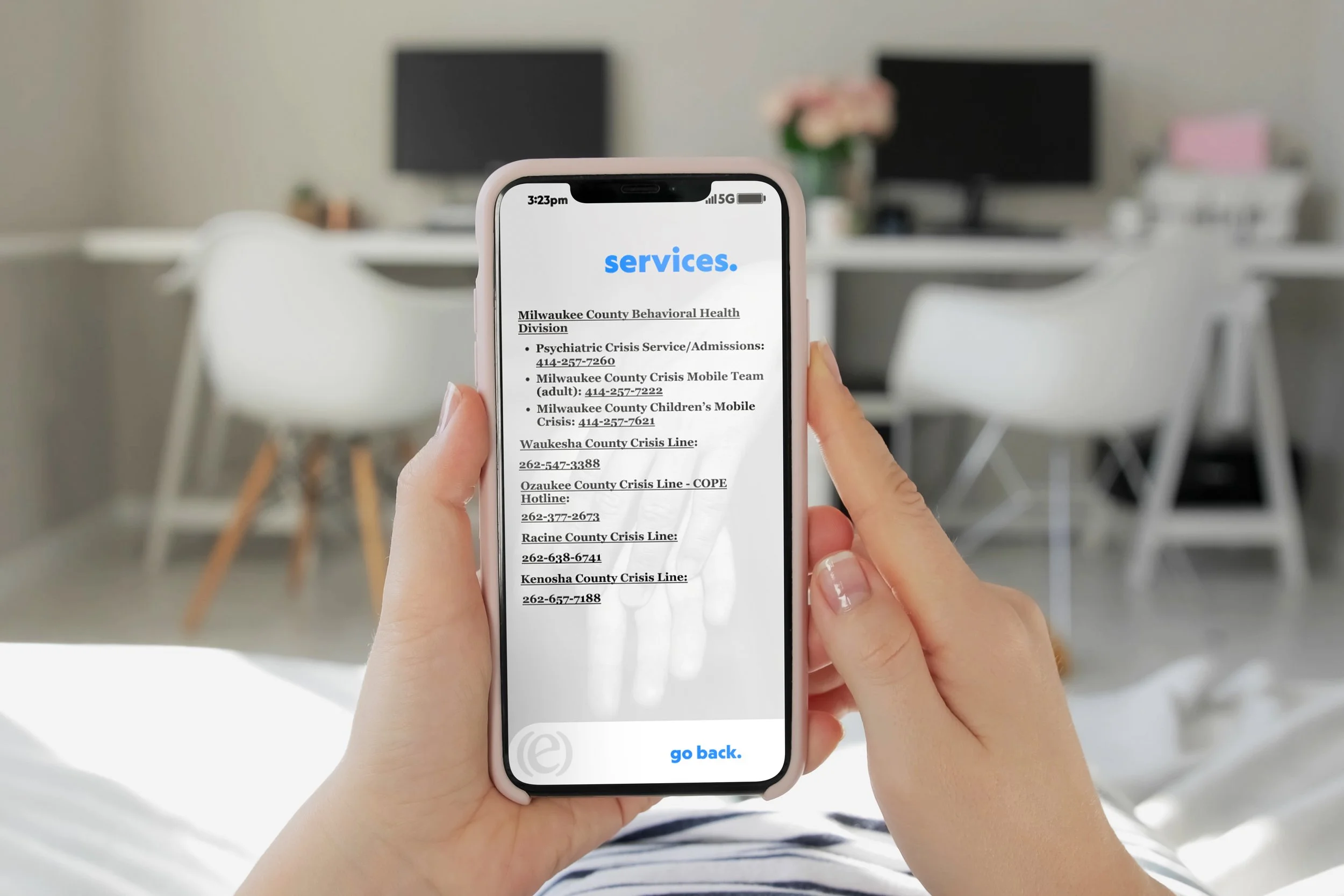
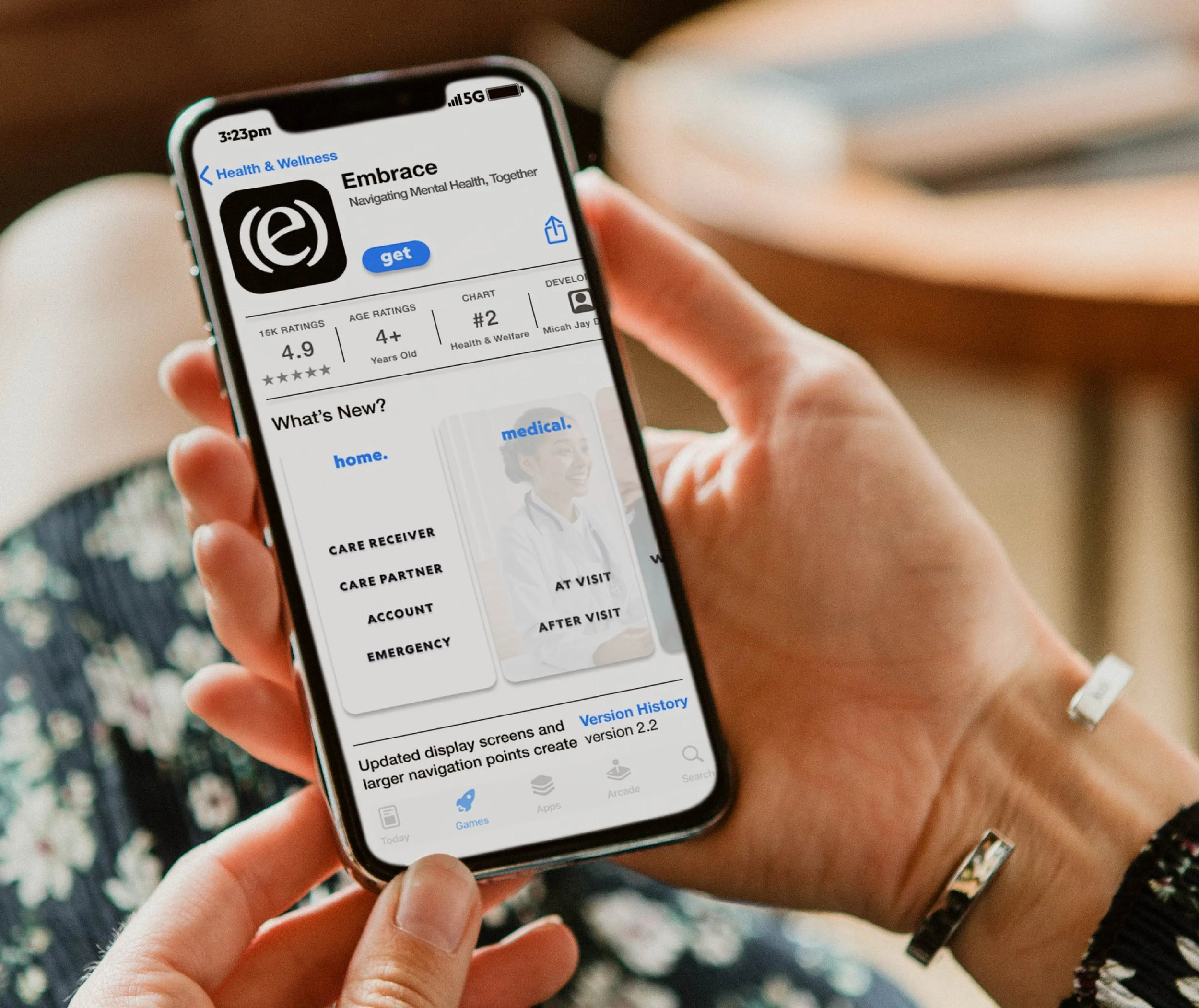
embrace was designed around two roles: the care recipient and the care partner. getting help and giving support are equally important parts of the experience, and the app had to hold both. word-based navigation replaced icons and abstract symbols, meeting users where they were rather than asking them to adapt to a visual language they didn't grow up with.
every design decision — from the steel blue color palette to the typographic scale to the interaction flow — was made with one question in mind: will this work for someone who doesn't feel at home on a screen? the result was a complete brand identity and application design built around the people it was meant to serve, not the people who usually get designed for.
[next]



[project]
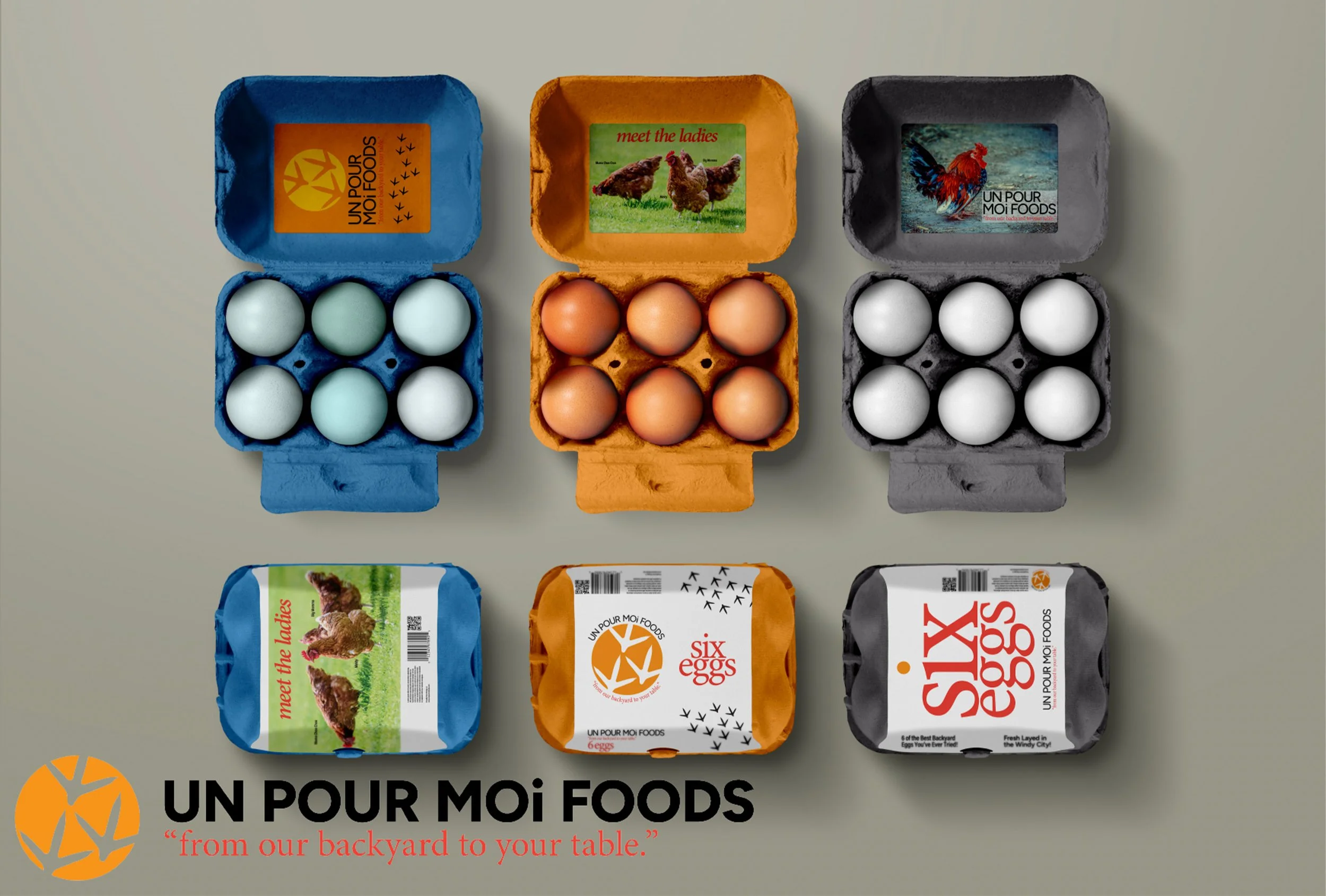
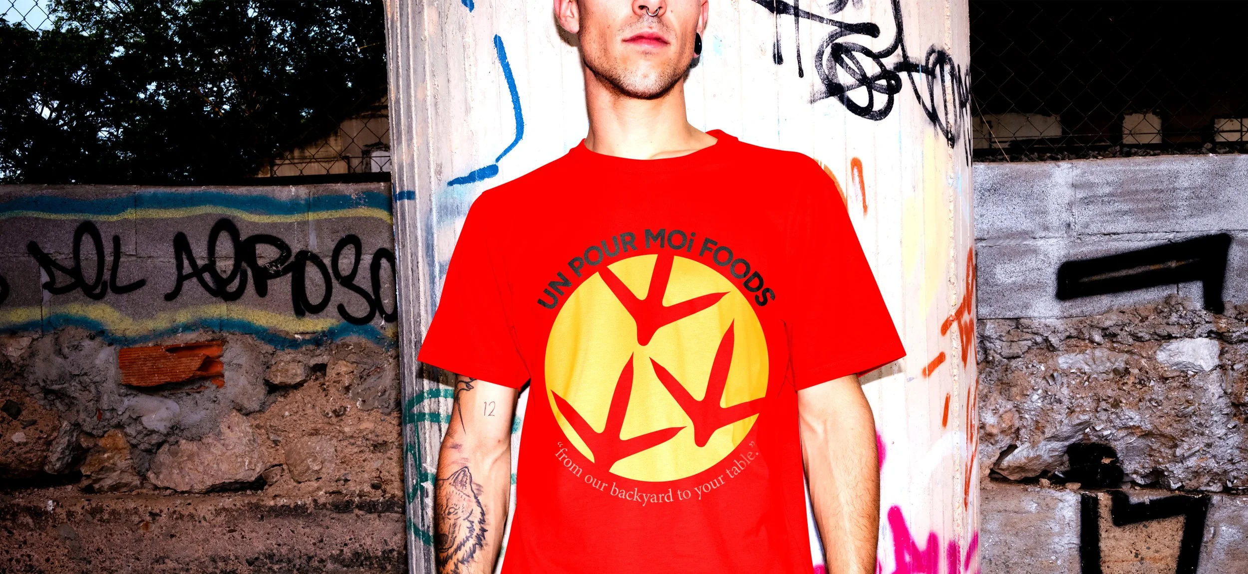
un pour moi foods, a backyard egg business based on the south side of chicago.
[deliverables]
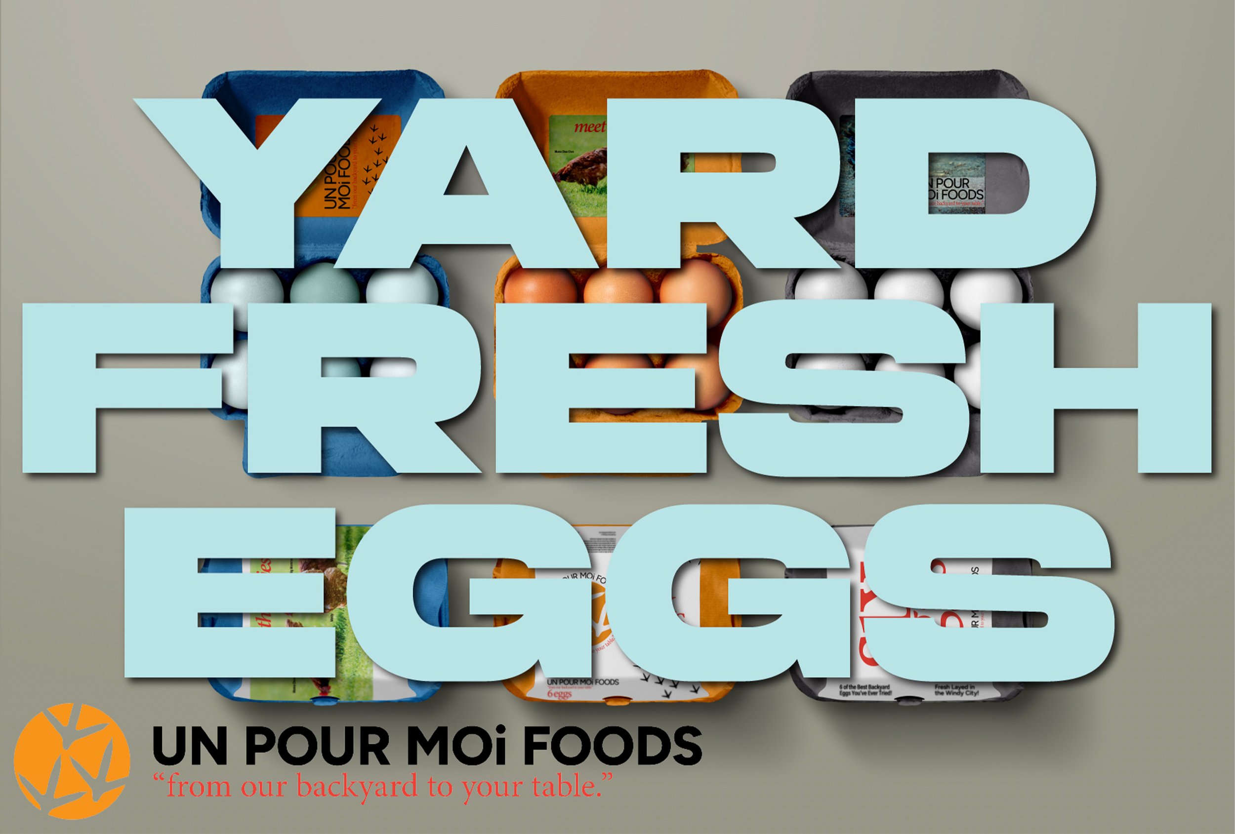
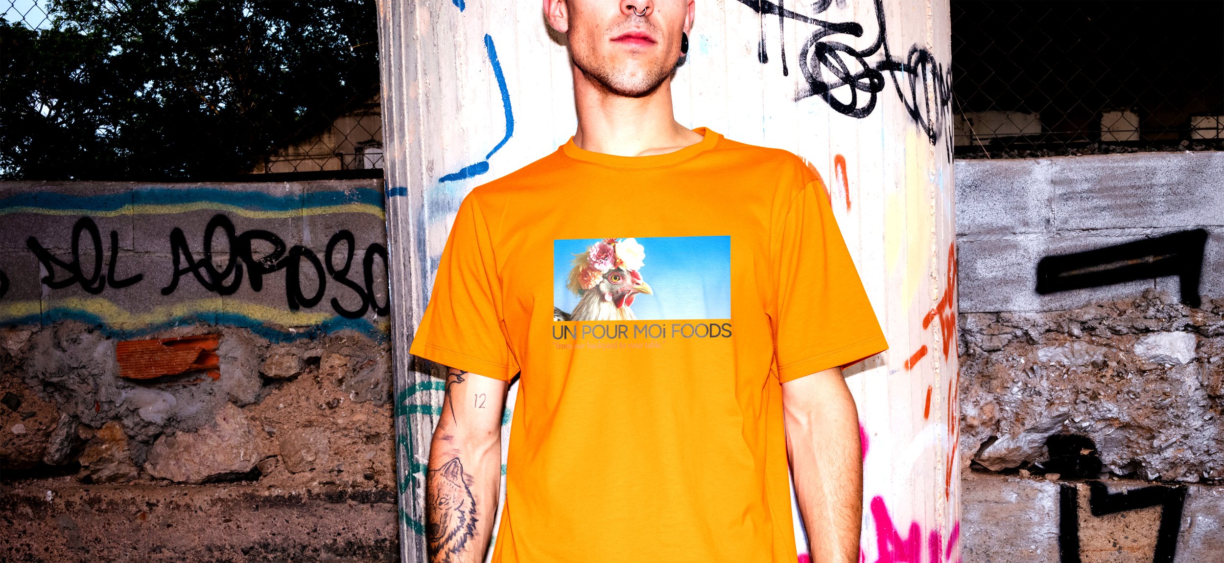
logo, packaging mockups, soft goods mockups, branded collateral.
[date]
fall, 2023.
[about]
un pour moi foods is a small backyard egg business owned by a couple on the south side of chicago. rooted in their neighborhood and committed to their community, they raise chickens in their backyard and sell locally sourced eggs at their farmers market. the longer-term vision is bigger — teach others how to raise chickens in an urban environment, bringing fresh food production back into the city block by block.
the project started with a logo. something that could carry the warmth, intention, and community spirit behind what they were building. from there the identity extended outward — across packaging, soft goods, and branded materials that could grow alongside the business as it scaled.
a brand for two people doing something small and important, designed to look the part.
[brand identity]
a brand identity works when you can spot it at fifty feet. an egg carton at a farmers market. a sign on a brick building on the corner. a jersey somebody's wearing at the bar. a phone screen someone's grandmother can actually use. every one of these projects started with the same question. what does this thing look like when it's not trying to look like anything else?
[projects]