

[project]
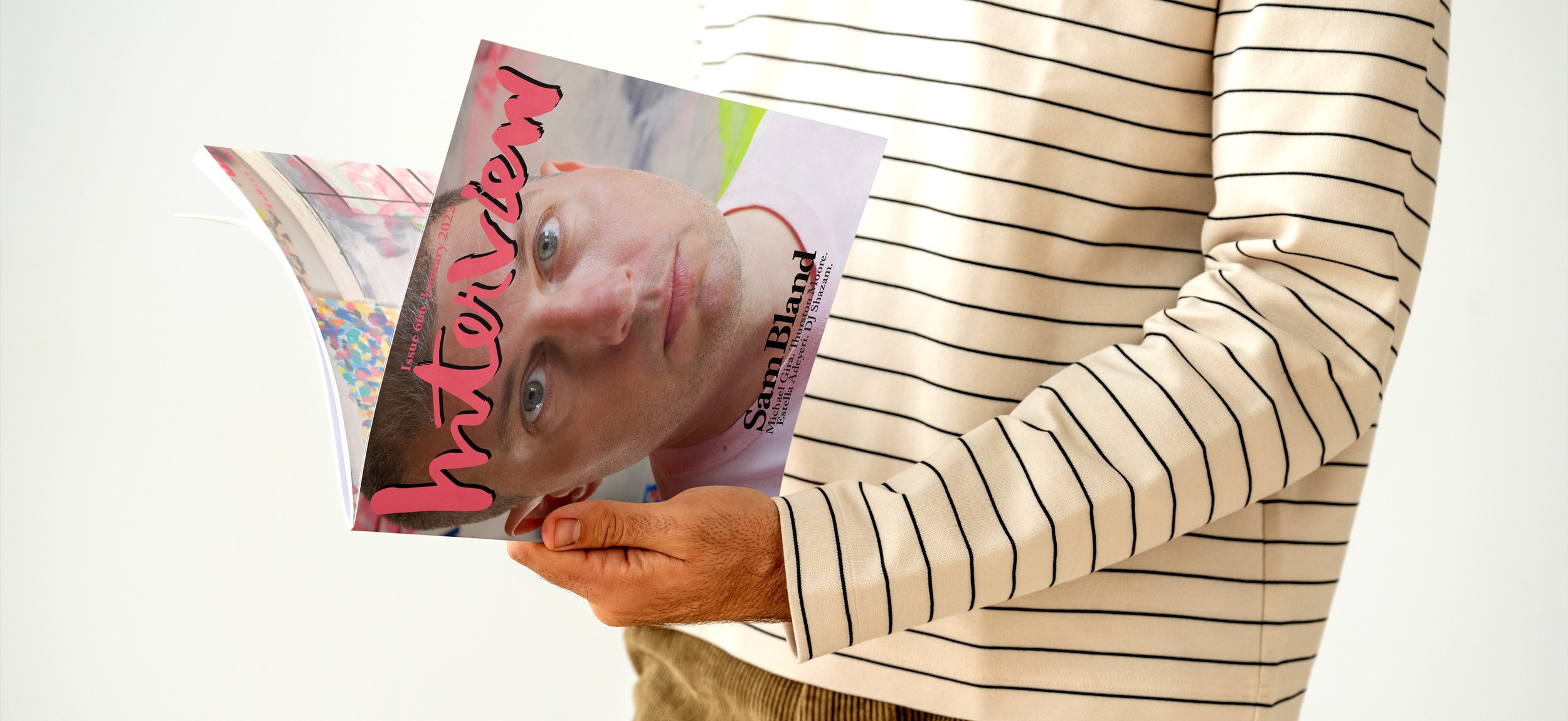
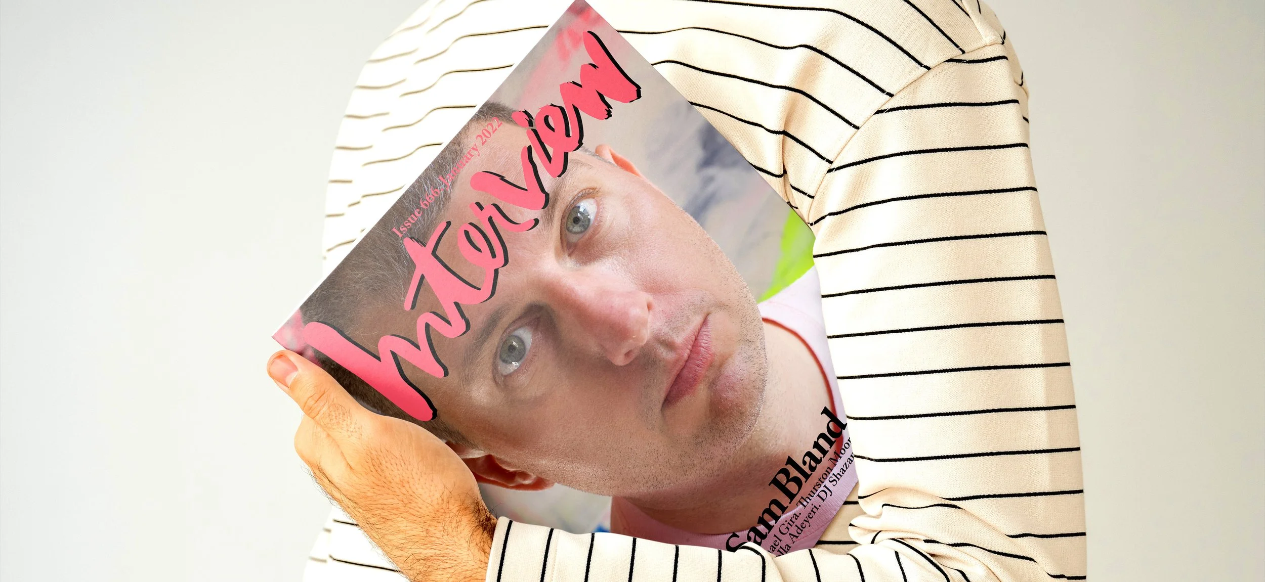
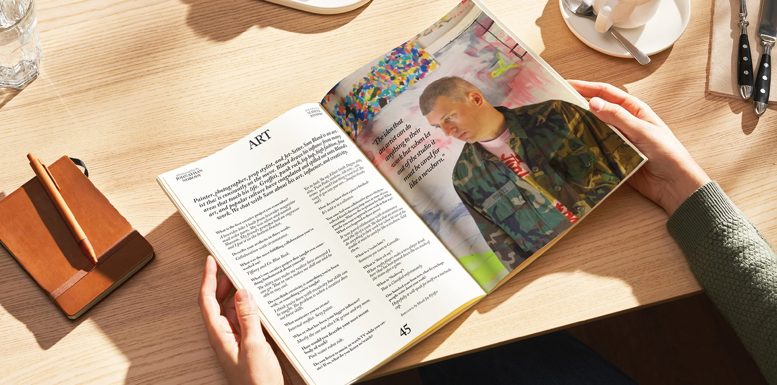
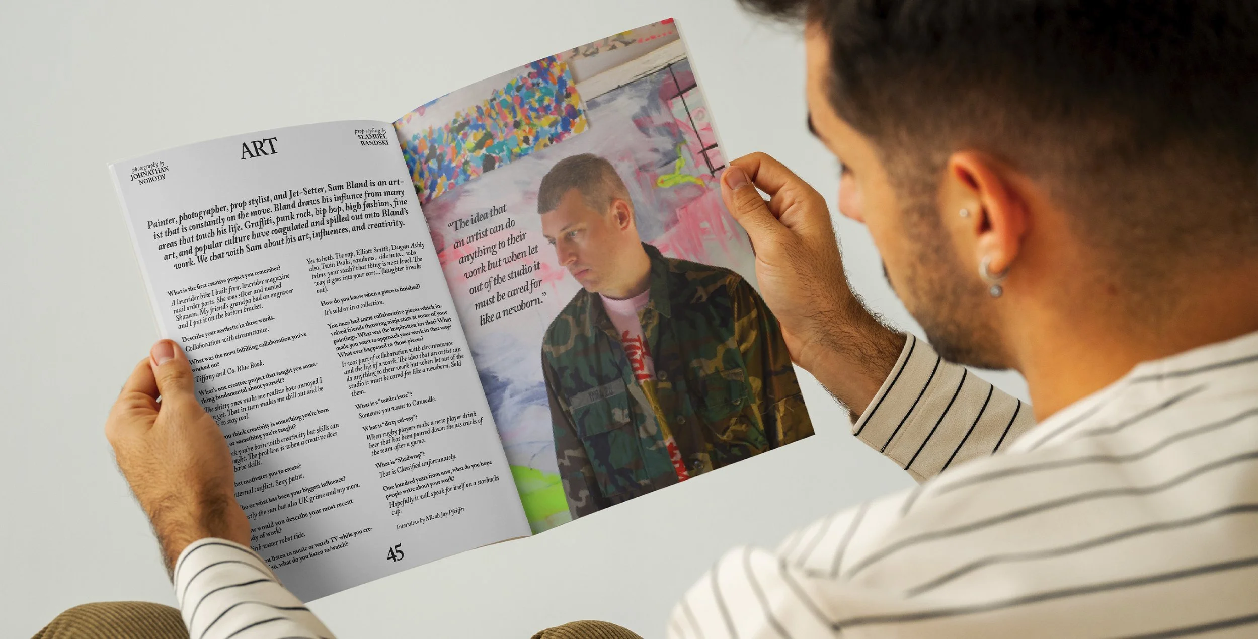
interview magazine, an art direction project featuring visual artist sam bland.
[deliverables]
cover and two two-page spreads.
[date]
winter 2021.
[about]
the plan was to fly to philadelphia, be in the studio for the shoot, meet sam in person, run the day. the budget said no. so the shoot happened without me. sam, the photographer, and the set designer were all together in his philadelphia studio. i was in milwaukee, six hundred miles away, watching through a video call and trusting the shot list to hold up in a room i couldn't walk into.
this was an art direction class at miad. the assignment forced the shift from designer to director — pick a licensed magazine, pick a living artist, build a team, hold the vision. i chose interview because the format gives the artist real space. i chose sam because he was a friend who said yes, and because his work — graffiti, pop culture, punk, destruction — earned the kind of space interview gives you. the shoot outlines and the direction had to do the work i couldn't. faith in the team did the rest.
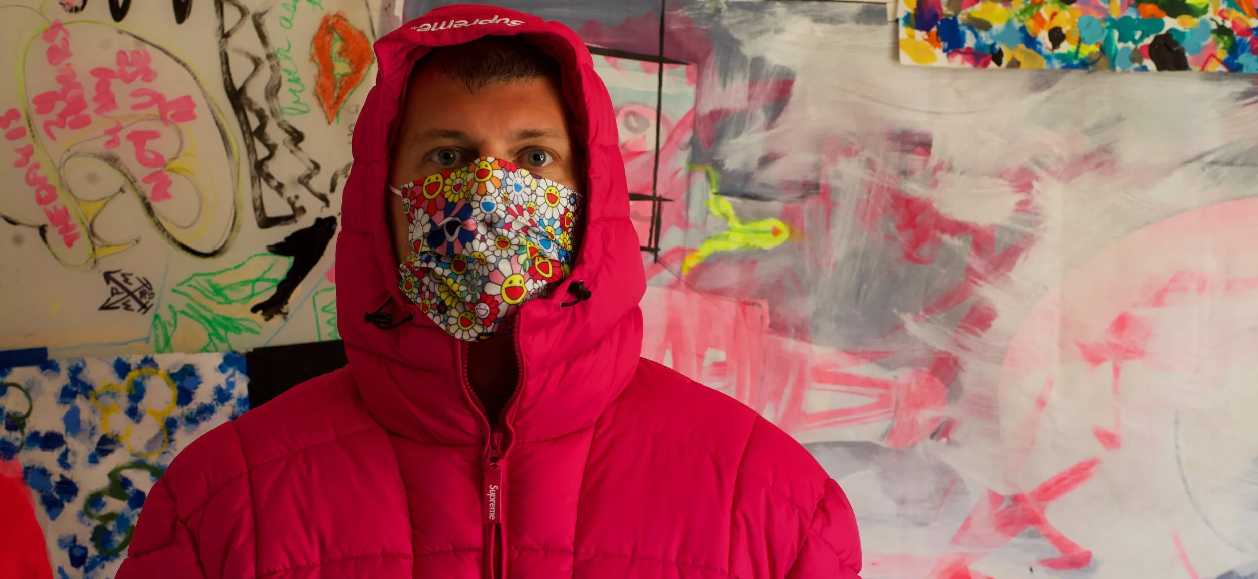
five pages came back: a cover and two two-page spreads, built to interview's style guidelines. the photos of sam were loud — saturated color, sharp contrast, the studio pressing in from every edge of the frame. the design layered around the images instead of fighting them. that was the point. an art director's job isn't to make the work look like the director. it's to make sure the work looks like the artist.
[next]
[start]

[end]
[project]
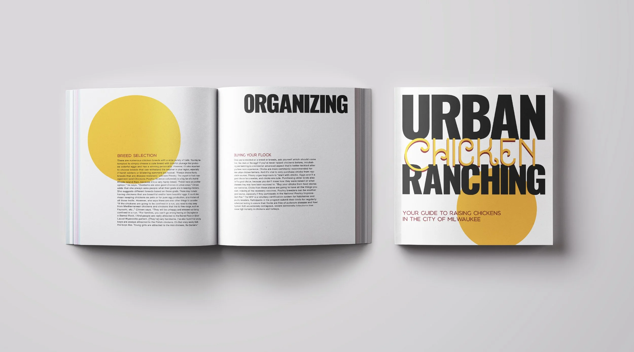
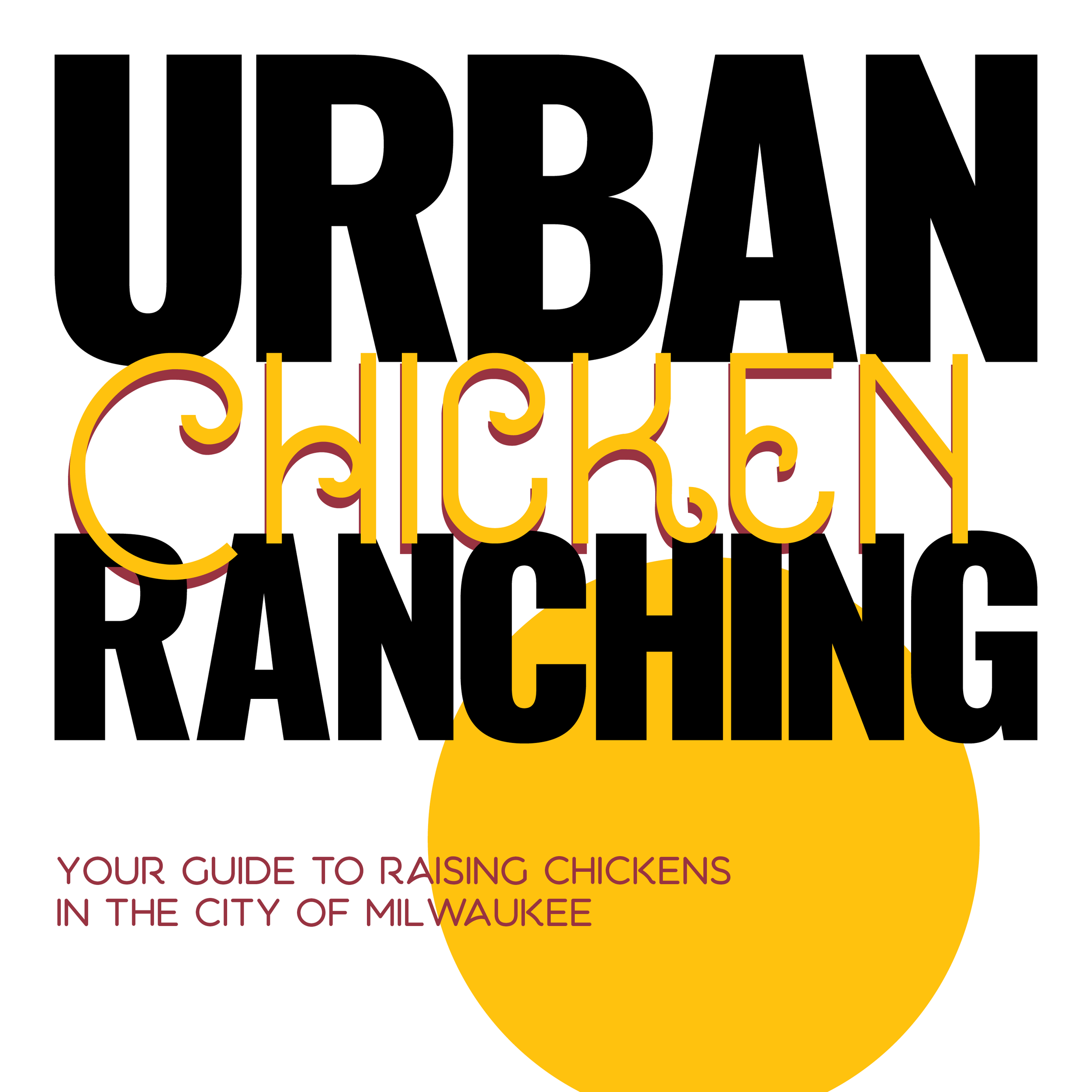
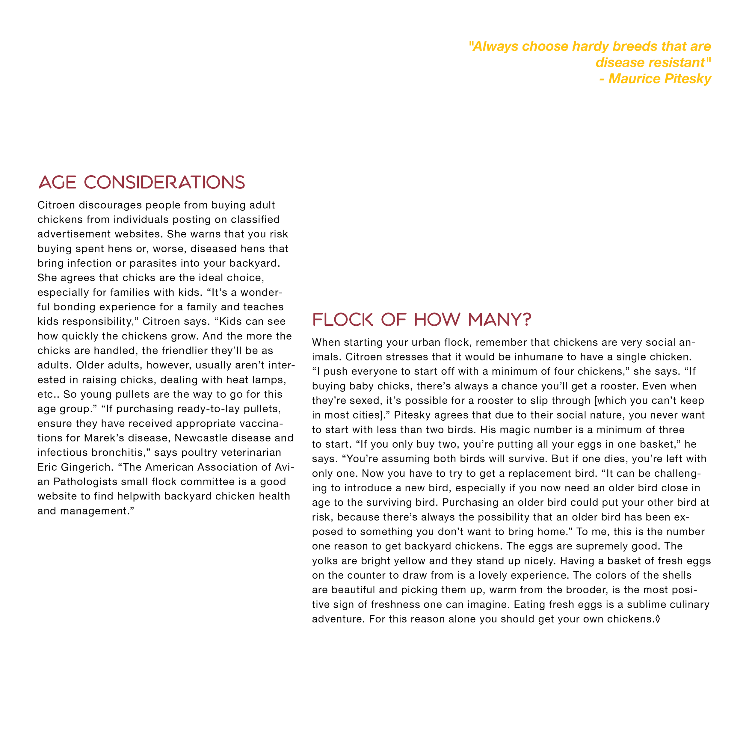
an informational pamphlet on urban chicken ranching.
[deliverables]
multi-page pamphlet, digital.
[date]
2021.
[about]
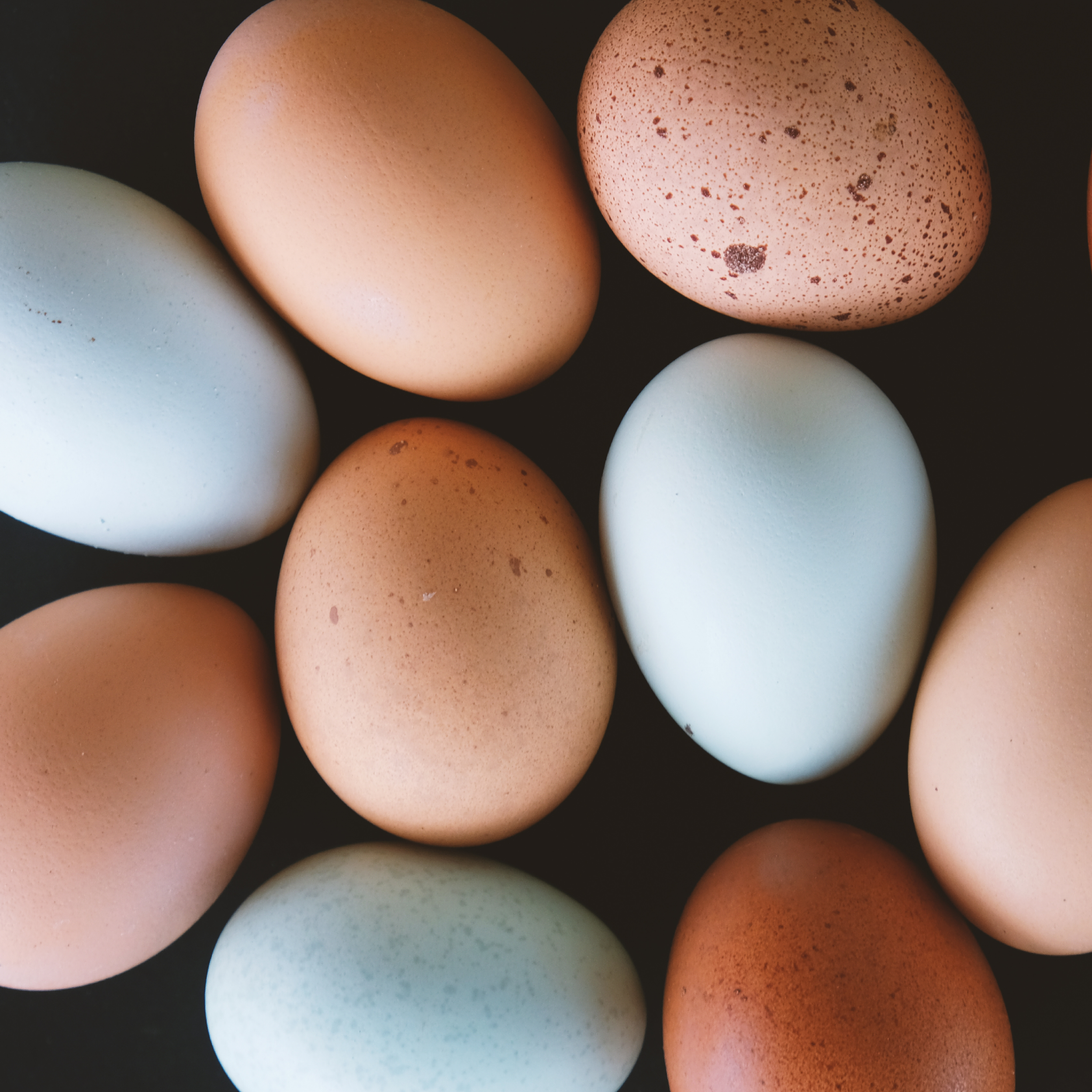
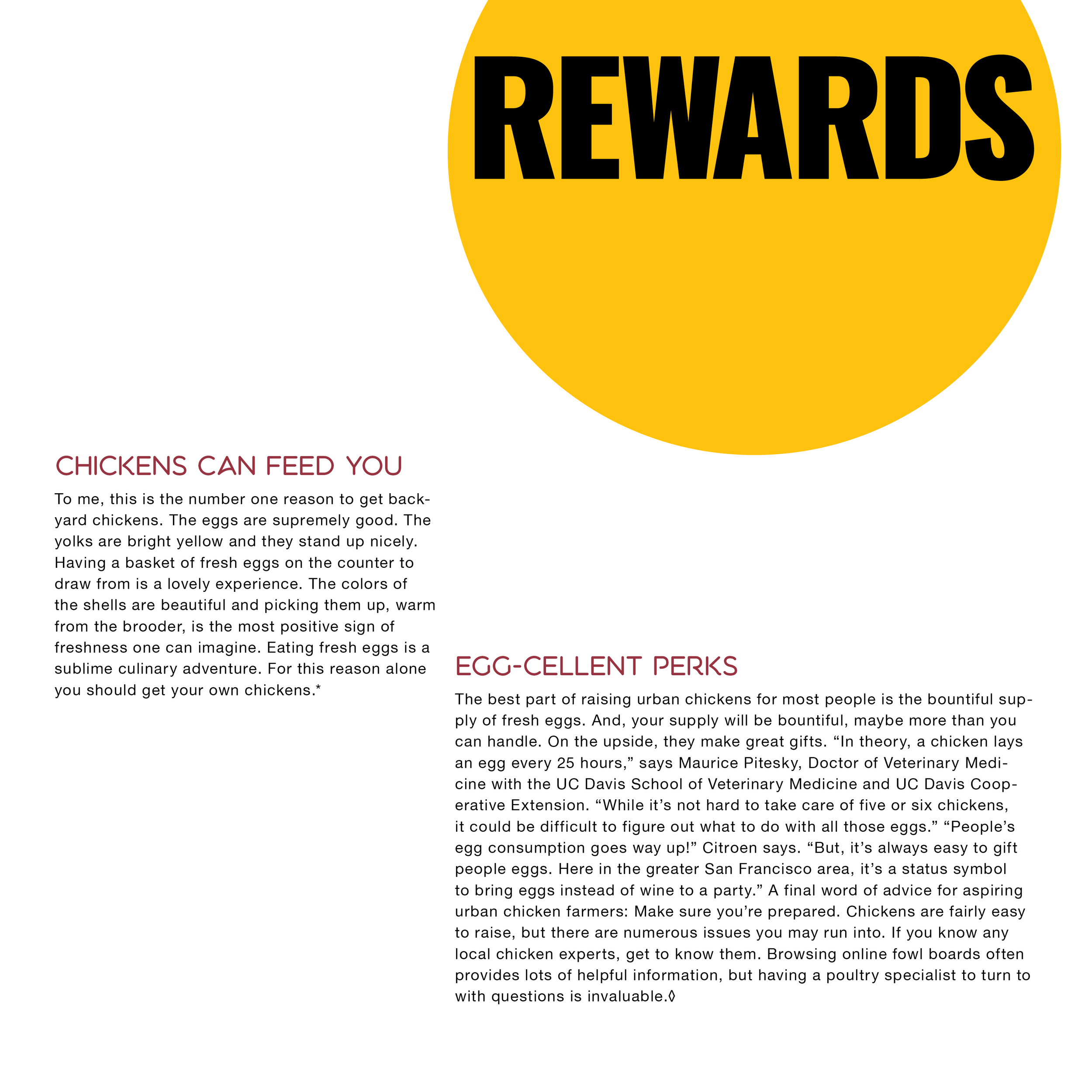
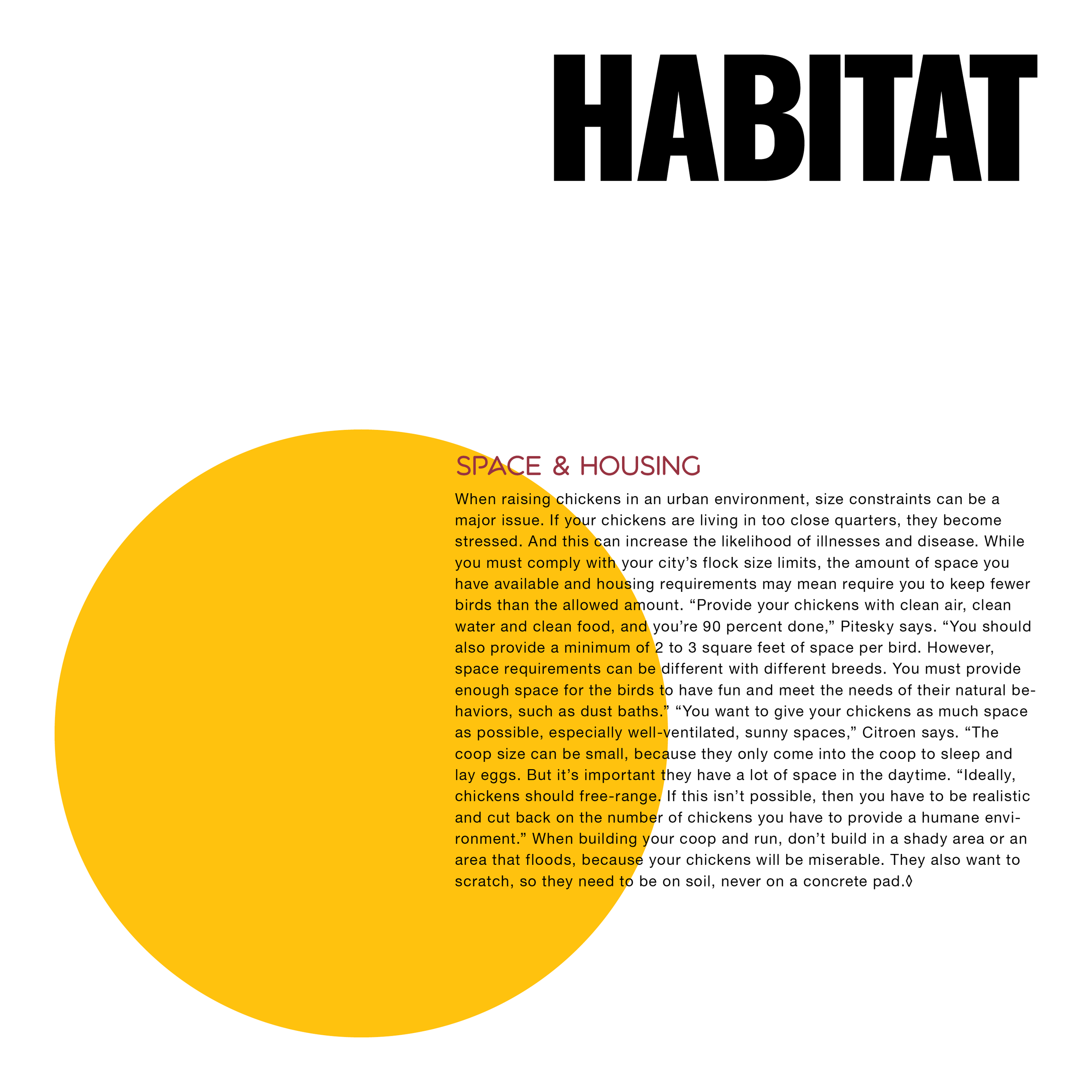
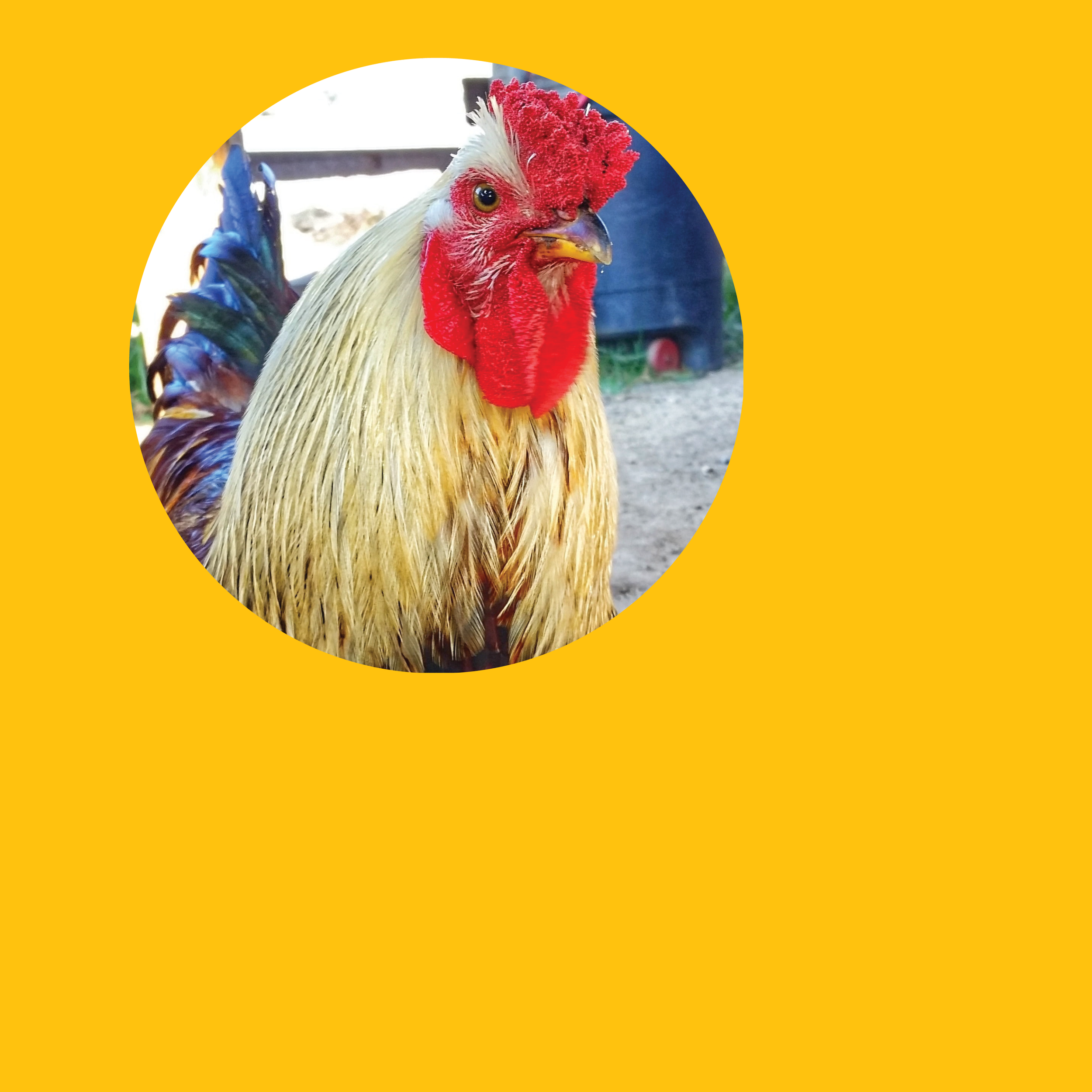
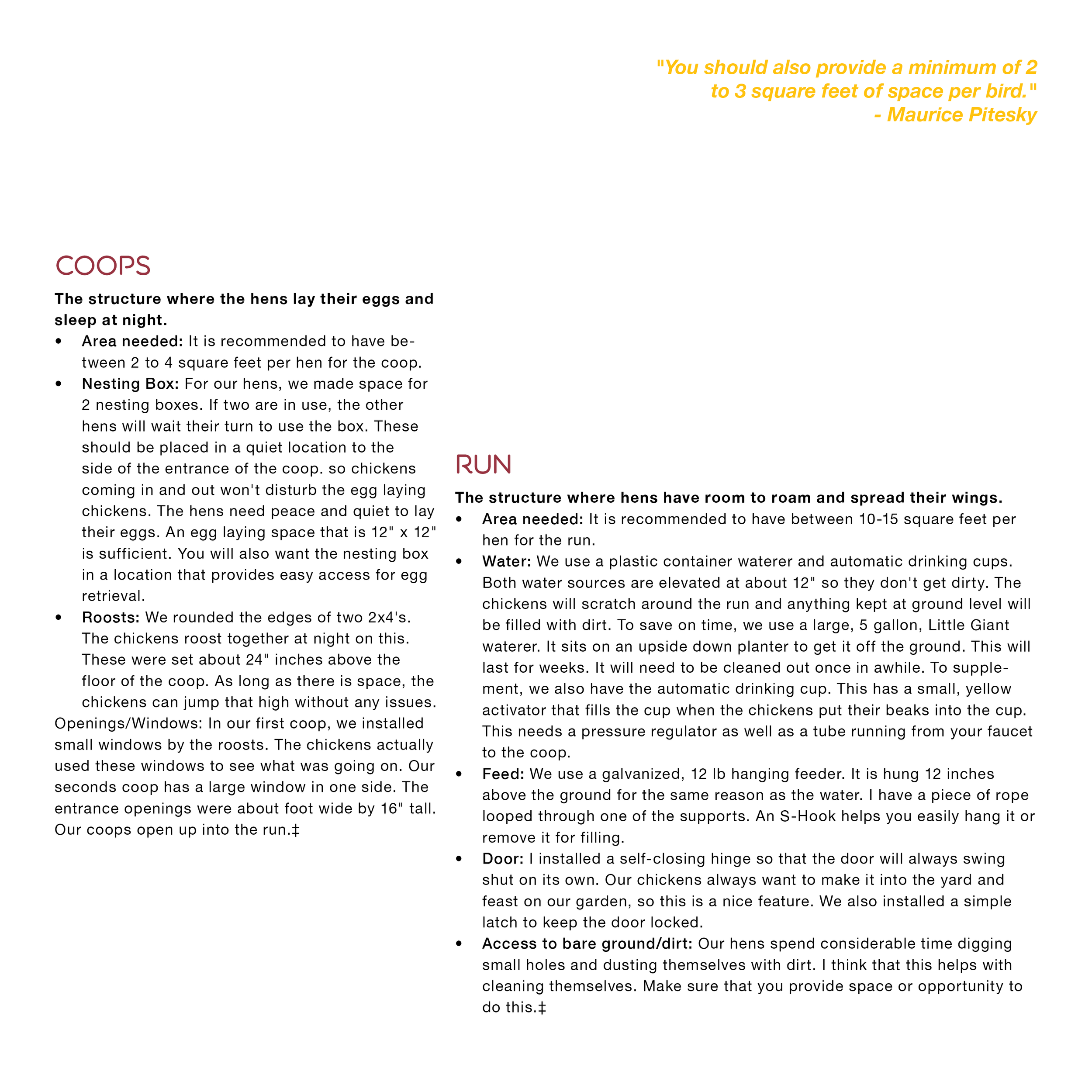
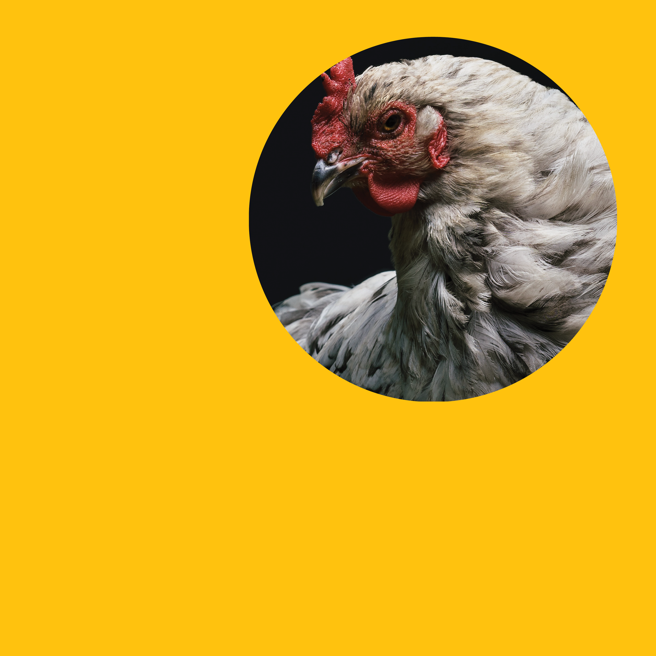
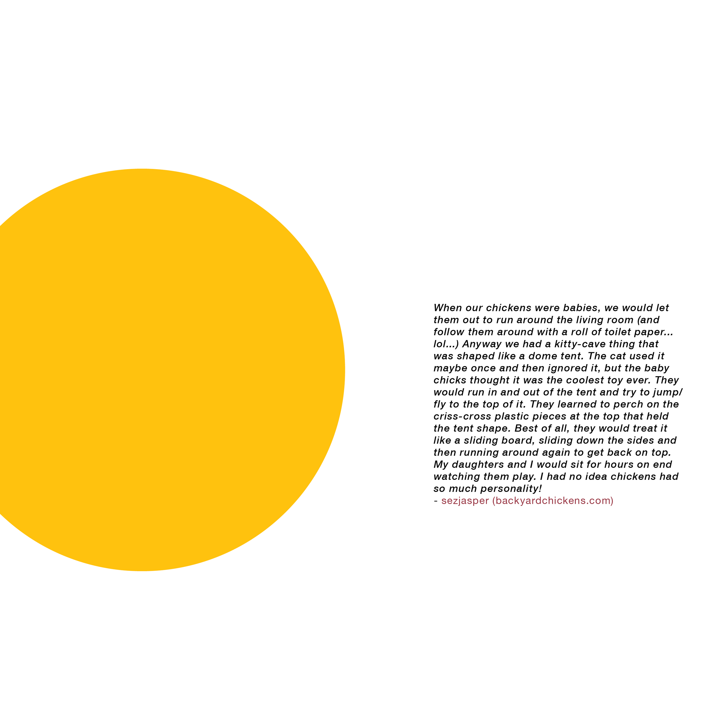
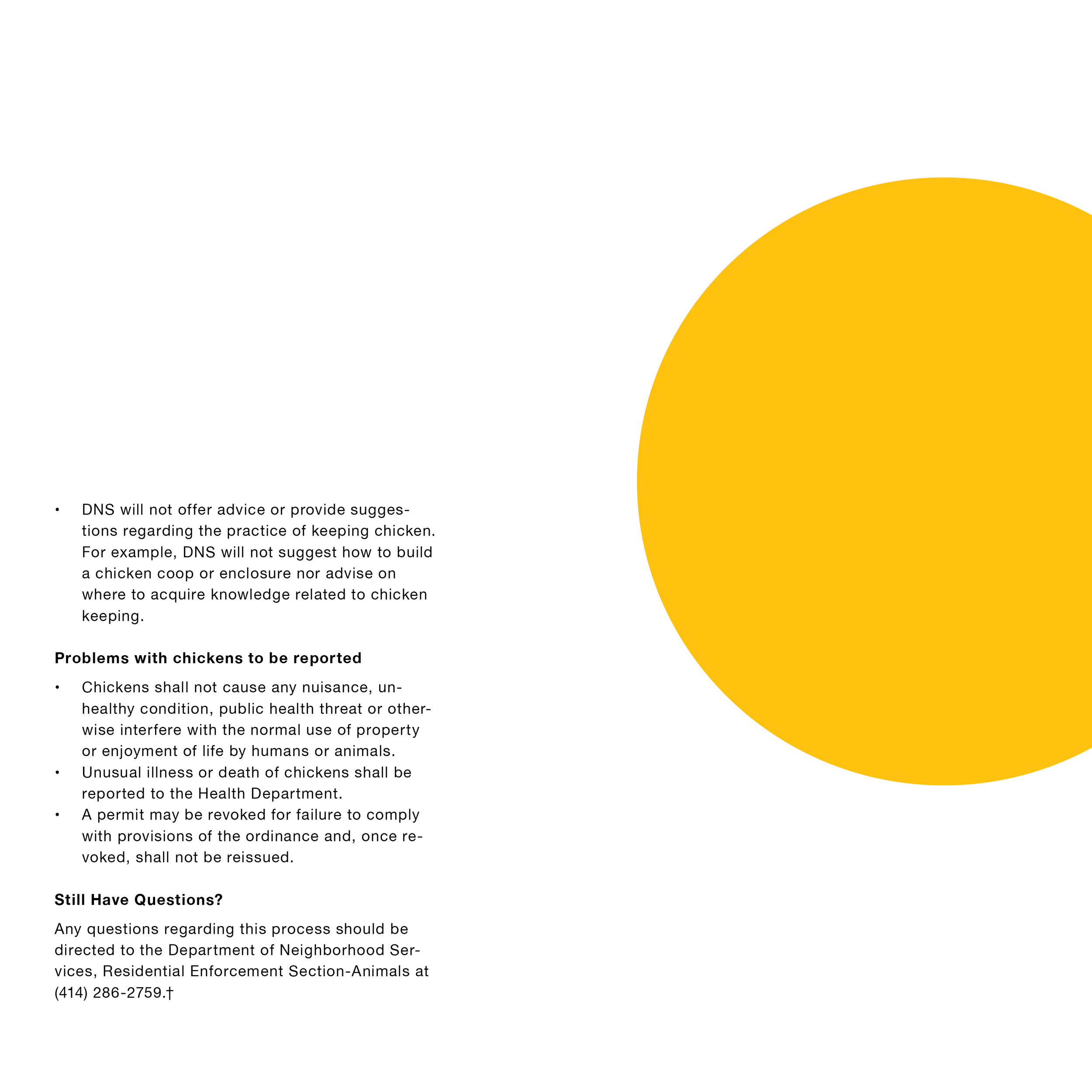
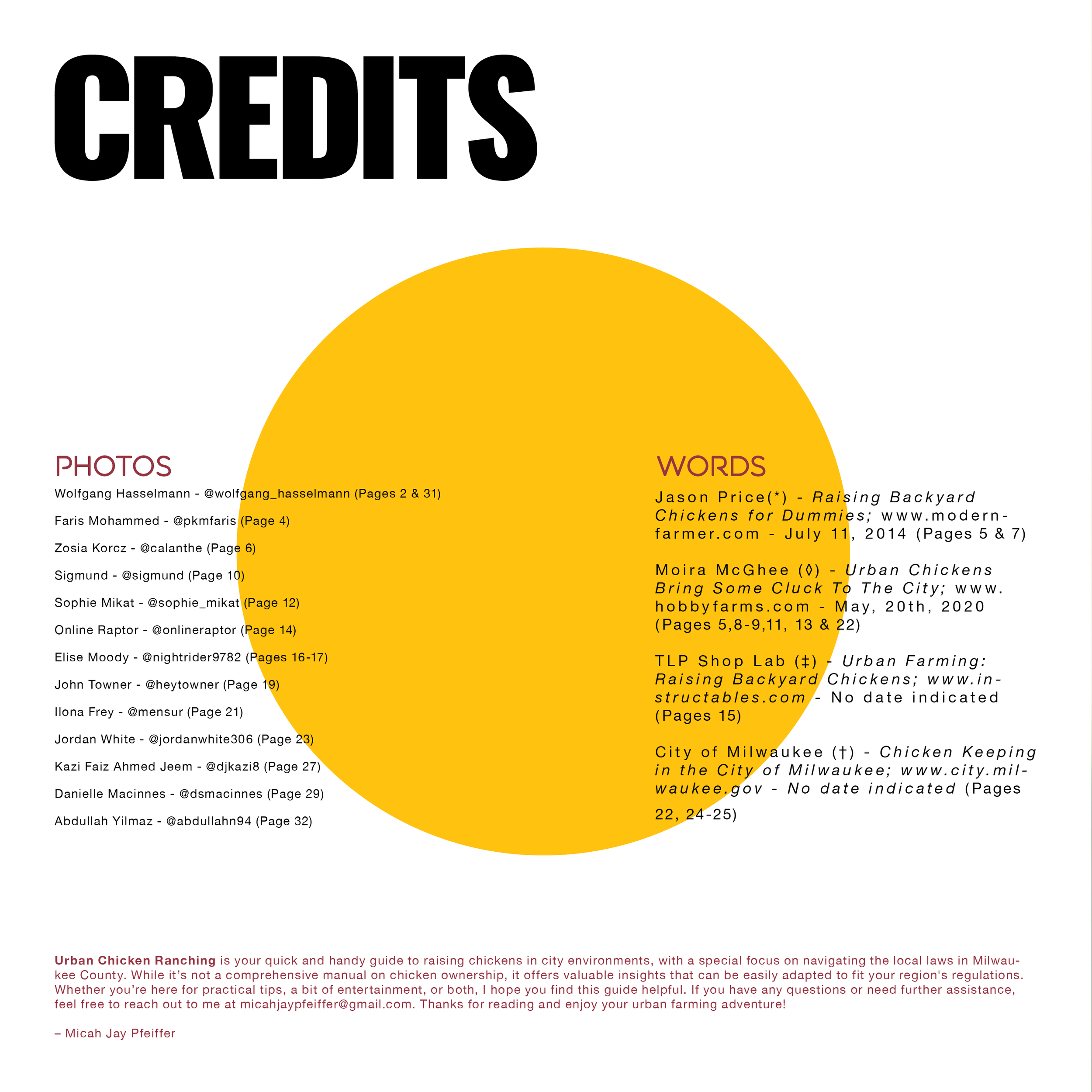
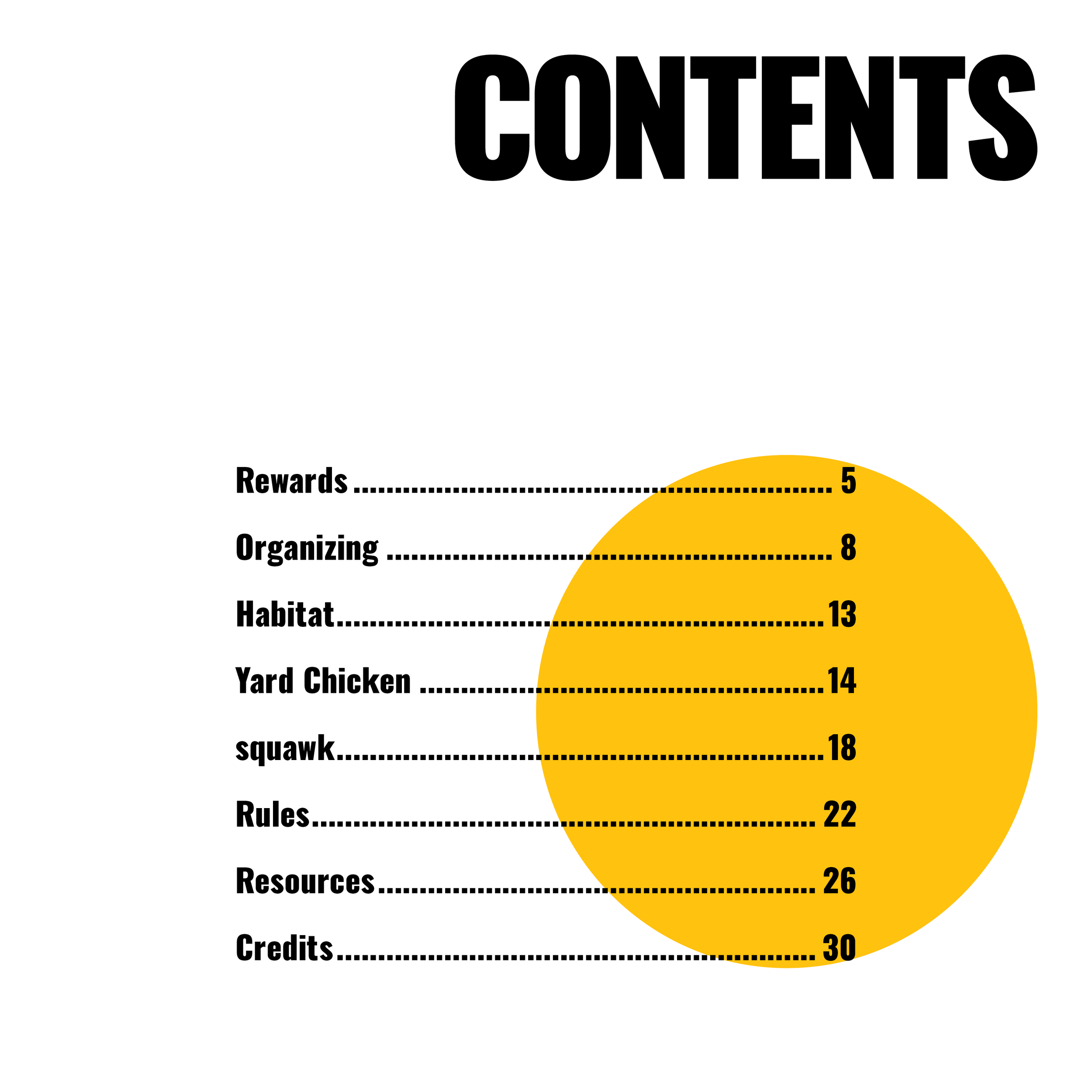
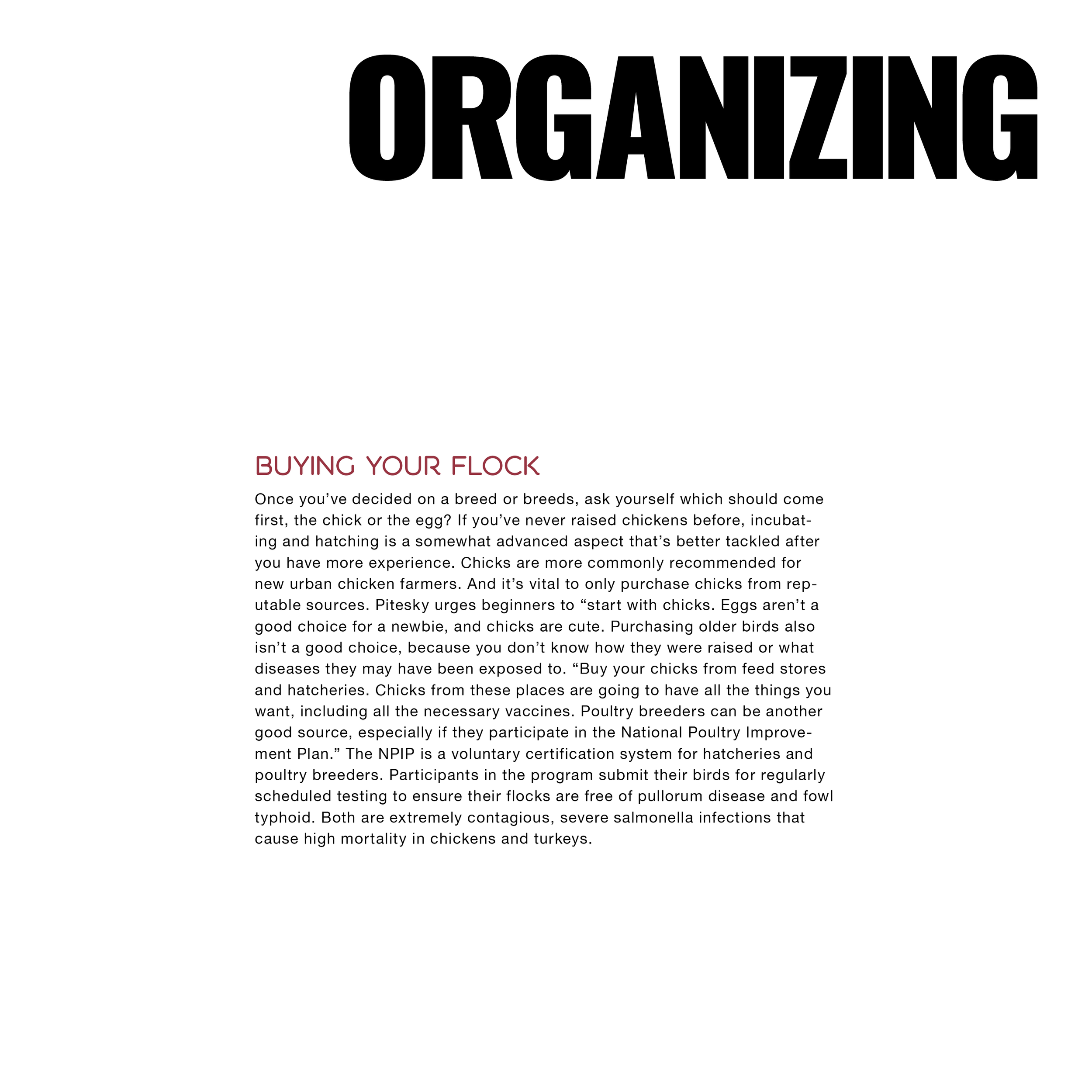
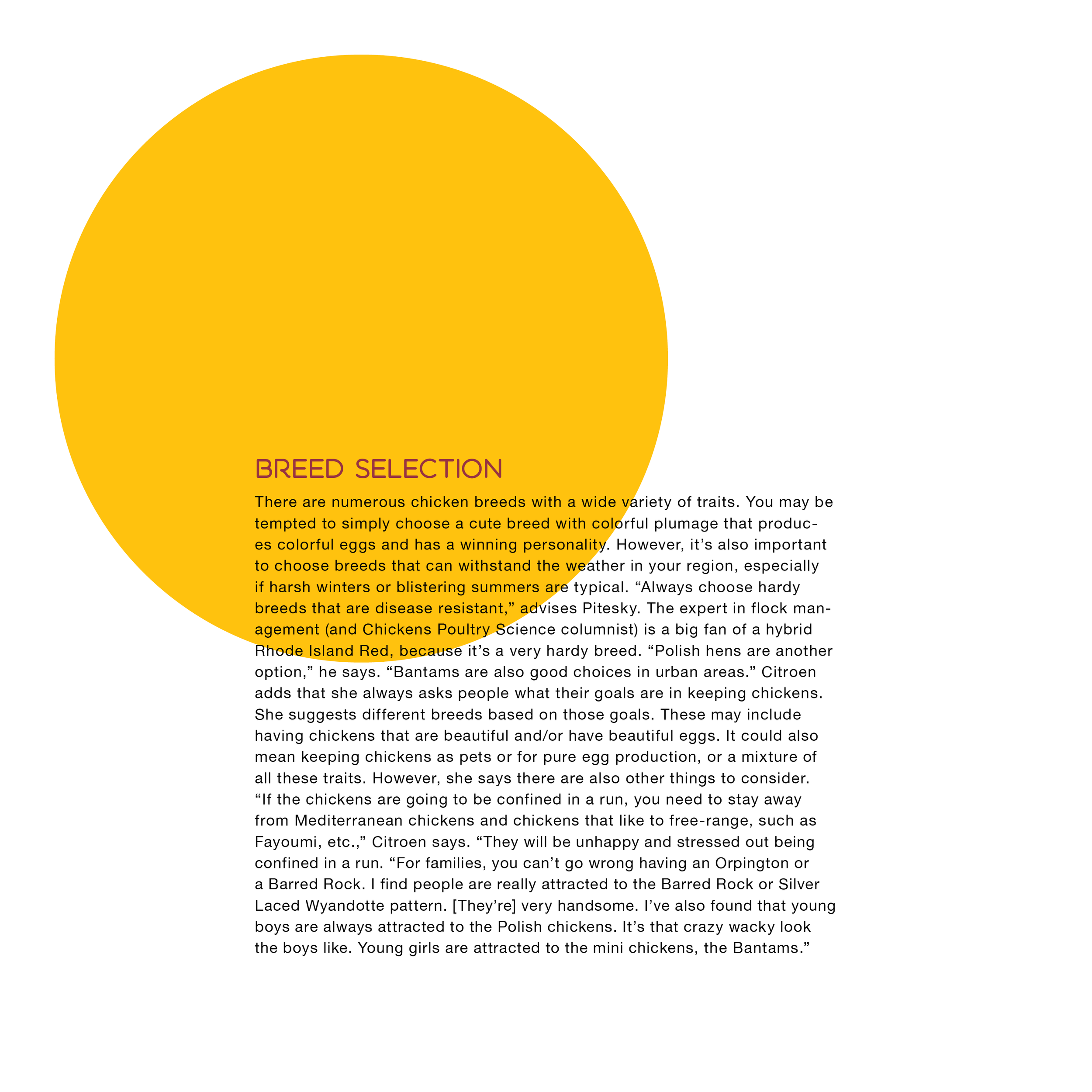
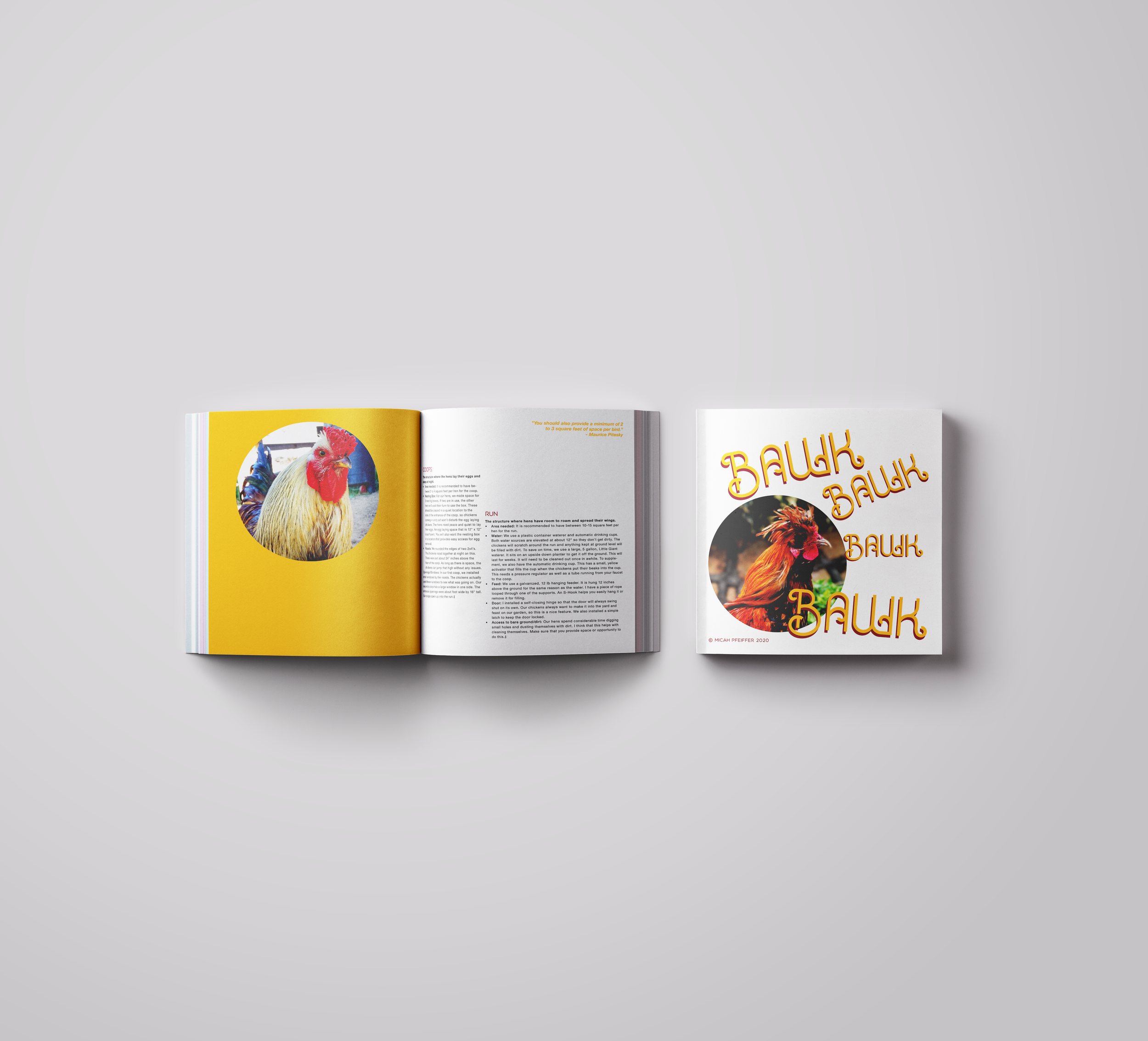
a yellow circle sits on a white spread. sometimes it holds a callout. sometimes it's just there. it moves around the pages as you go — different position, different job, same yellow. it's an egg. that was the visual thread holding the whole pamphlet together.
this was a class project. the assignment was a multi-page pamphlet, part information piece and part content organization exercise. i was, at the time, actively interested in raising chickens myself, so the topic picked itself.
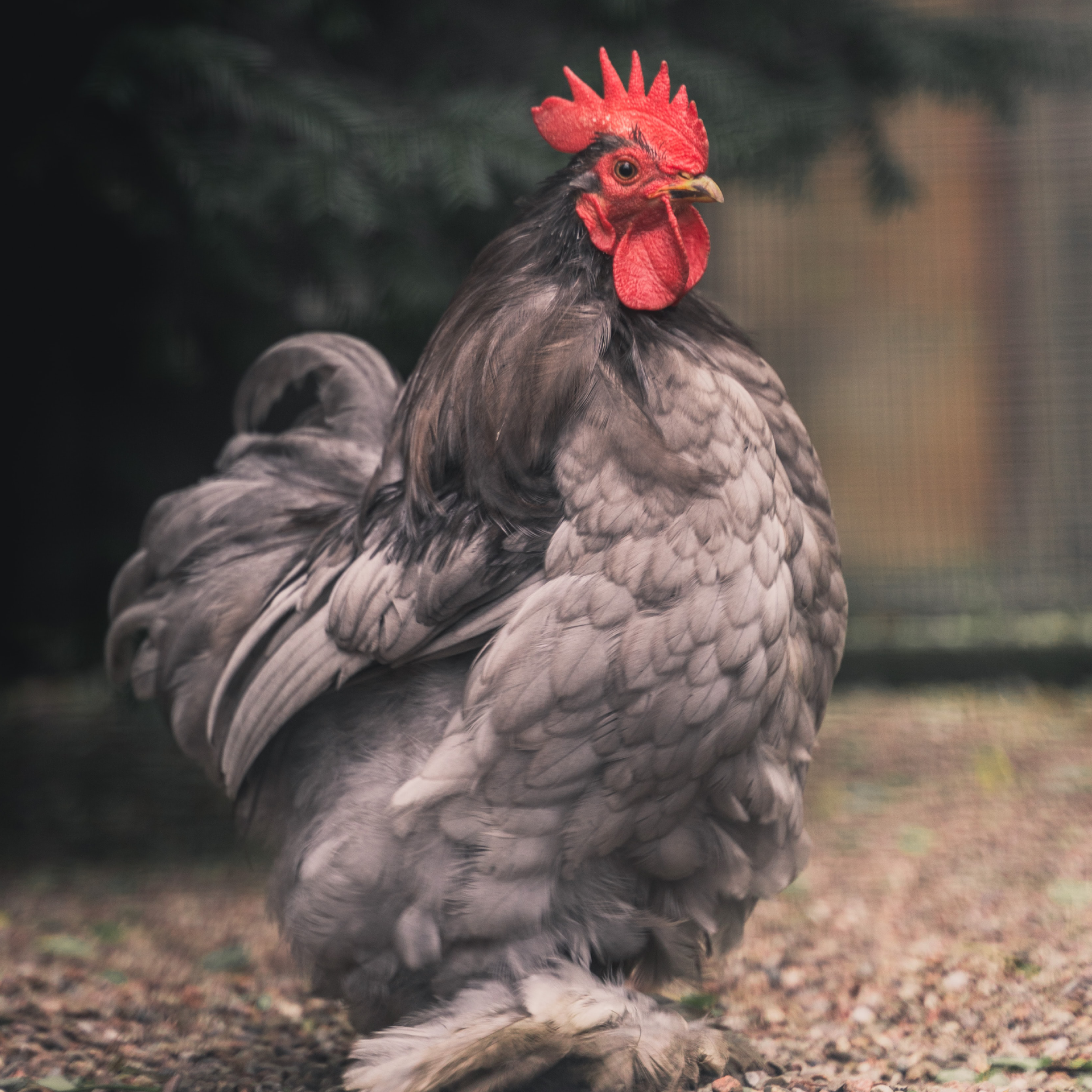
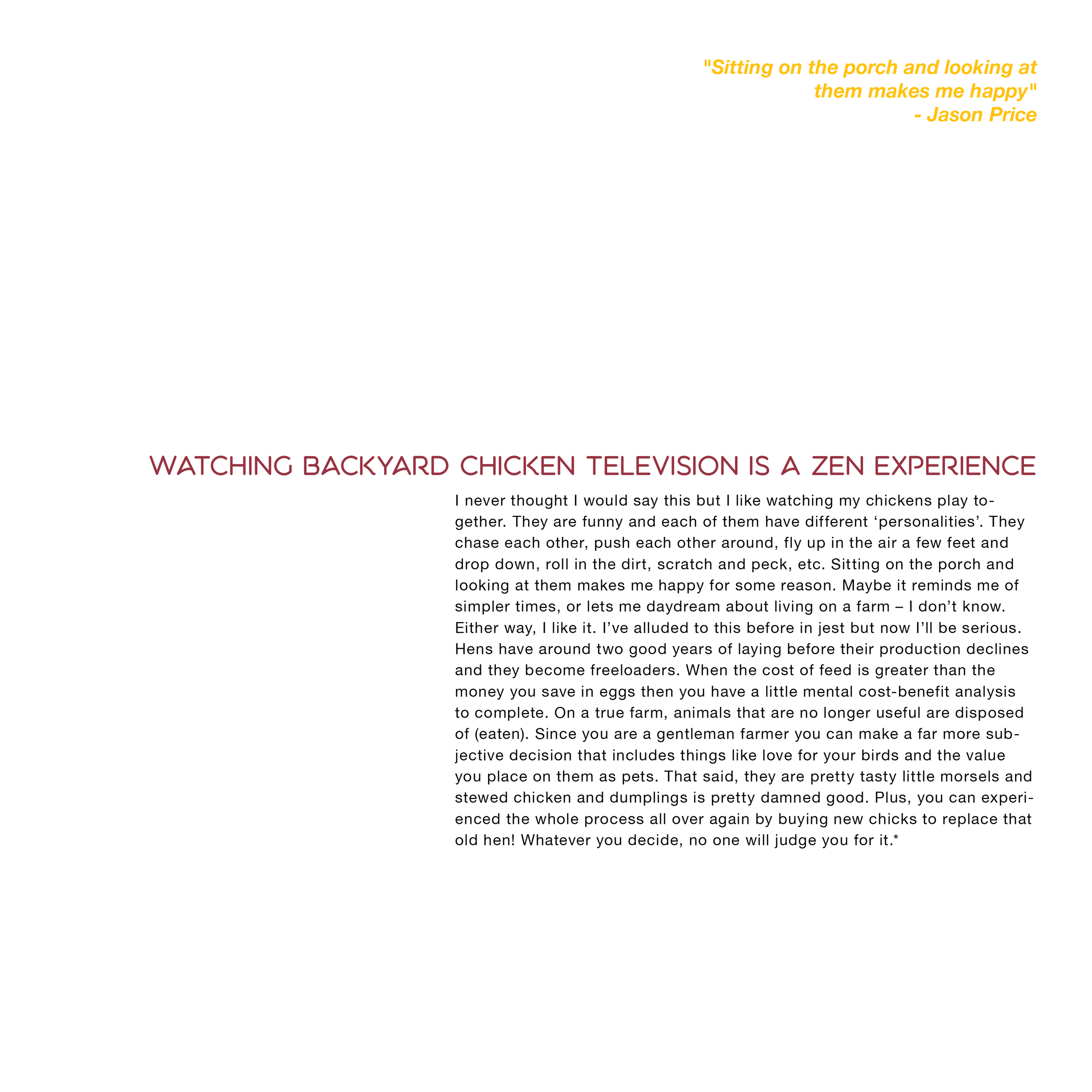
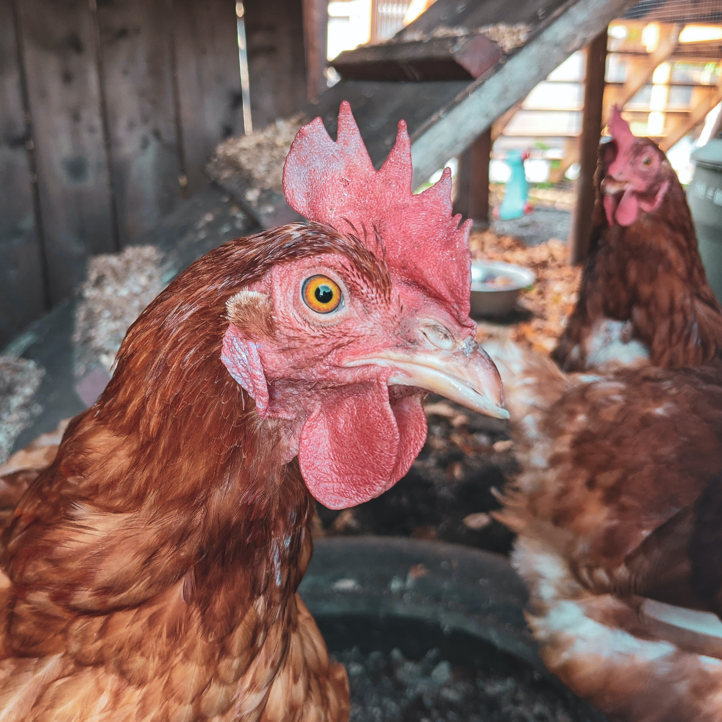
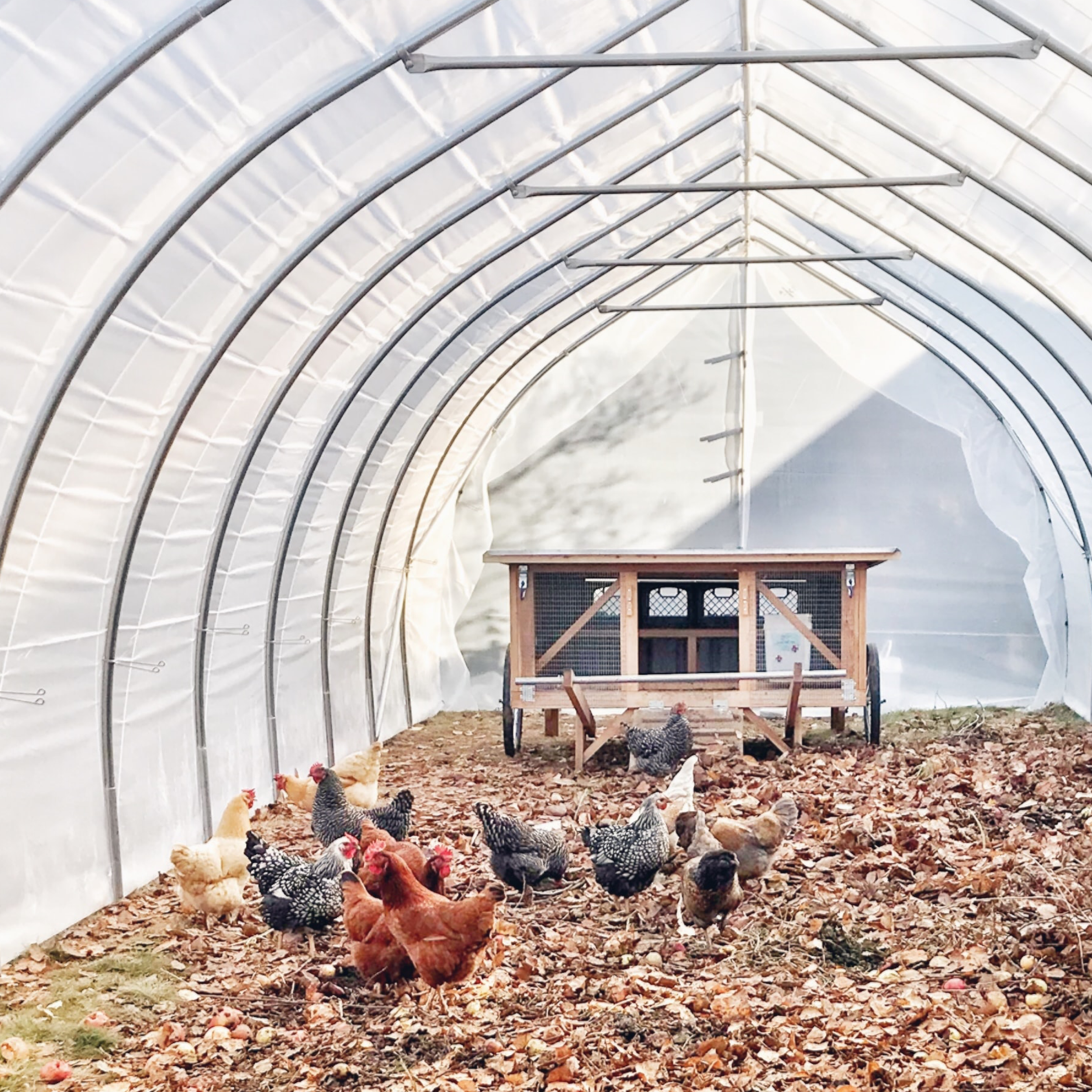
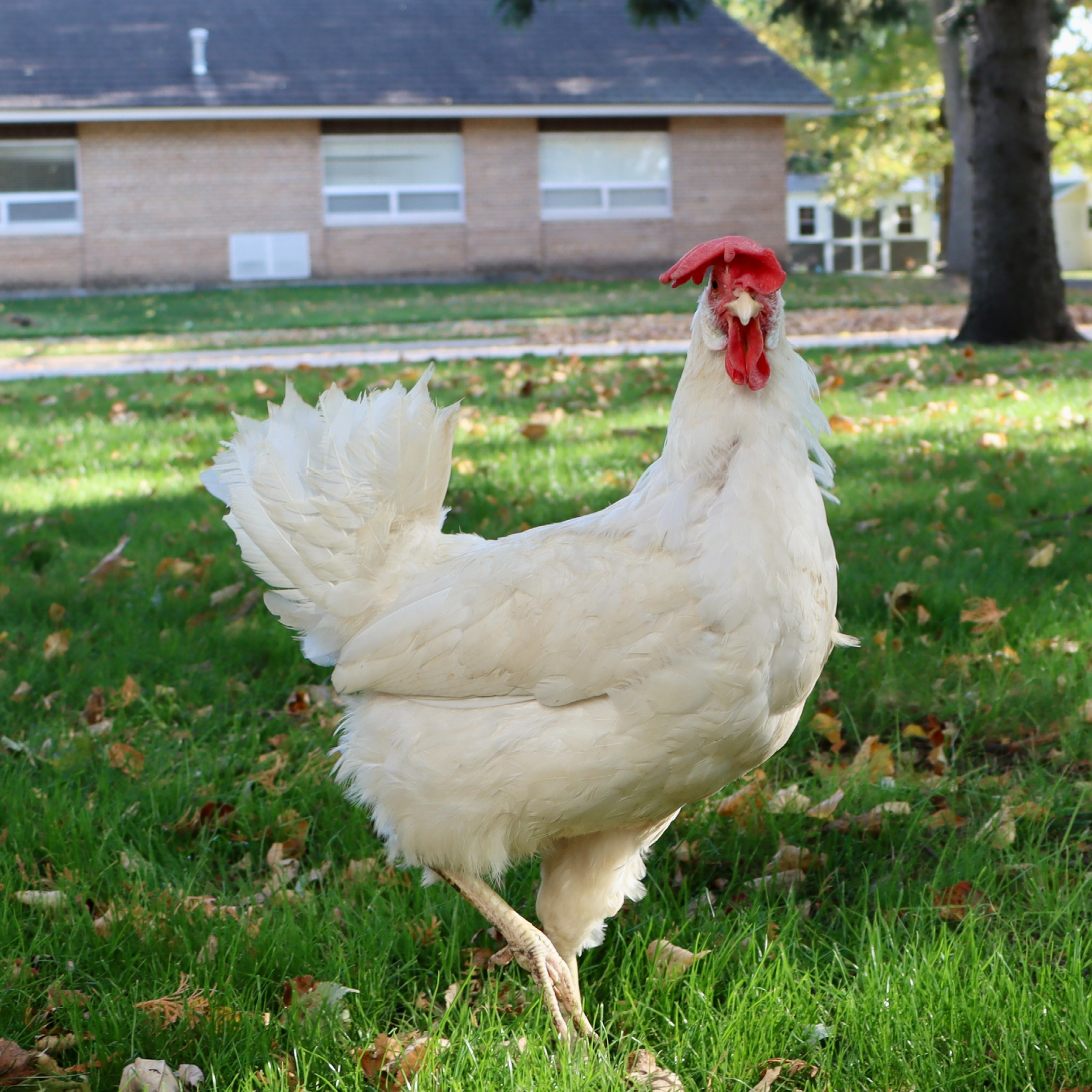
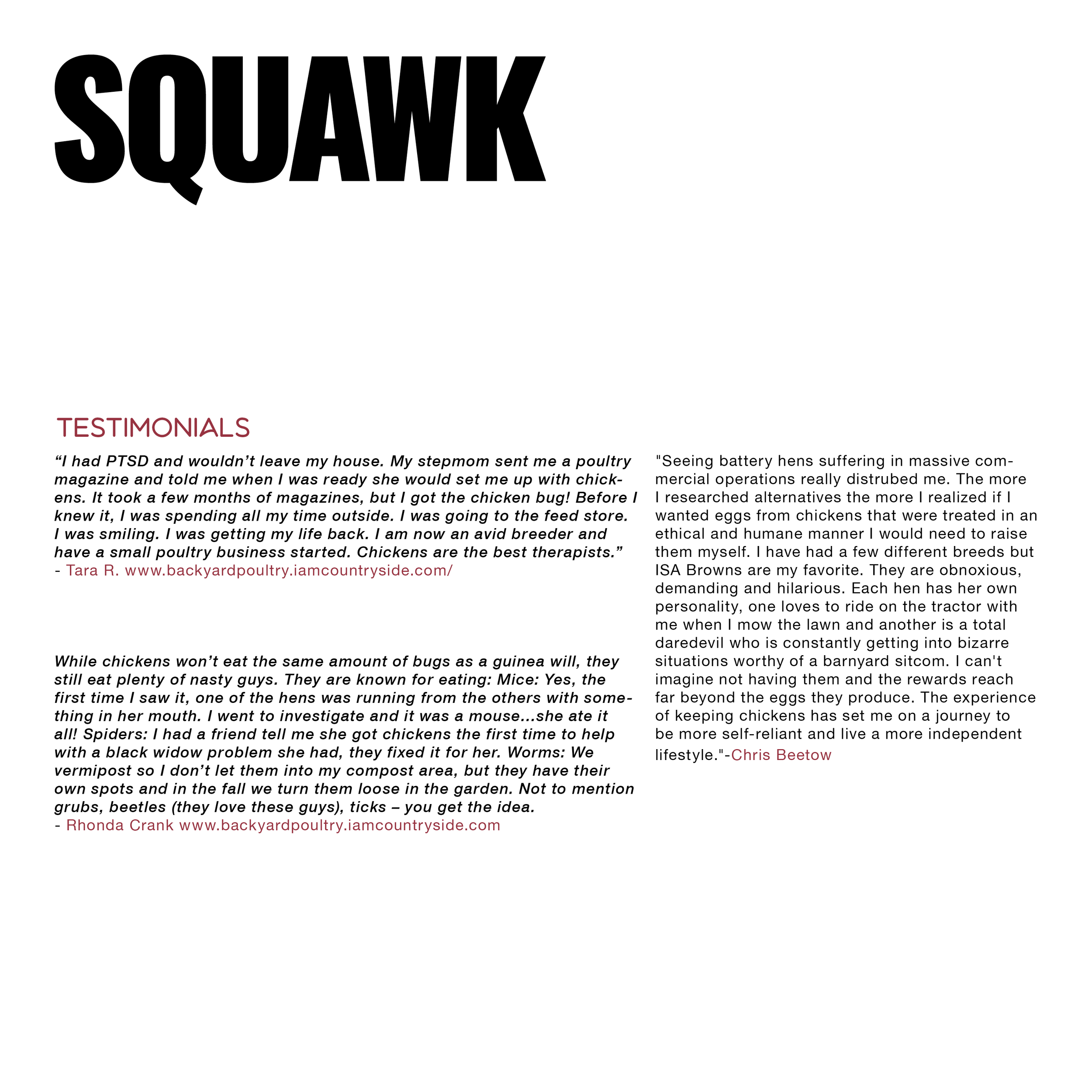
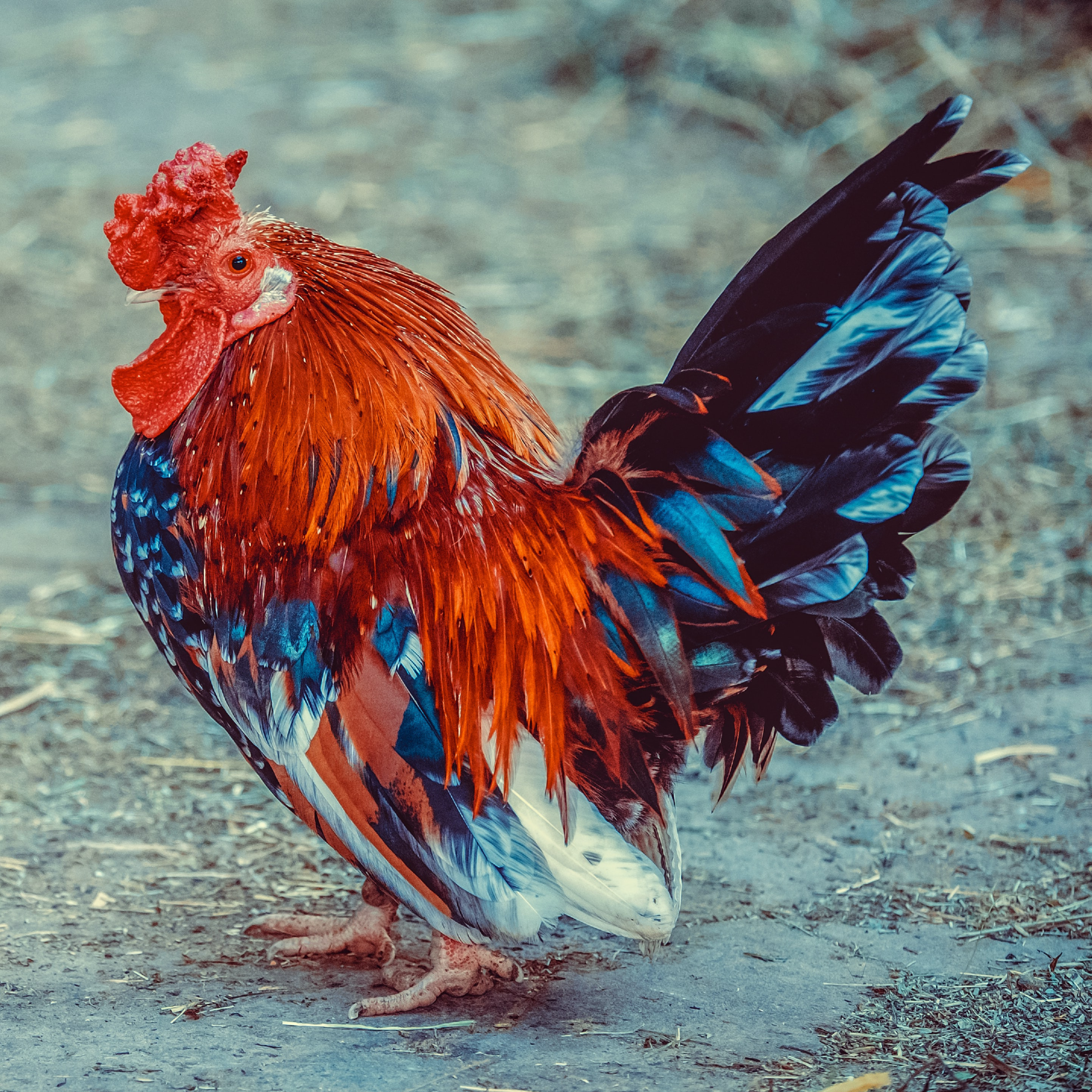
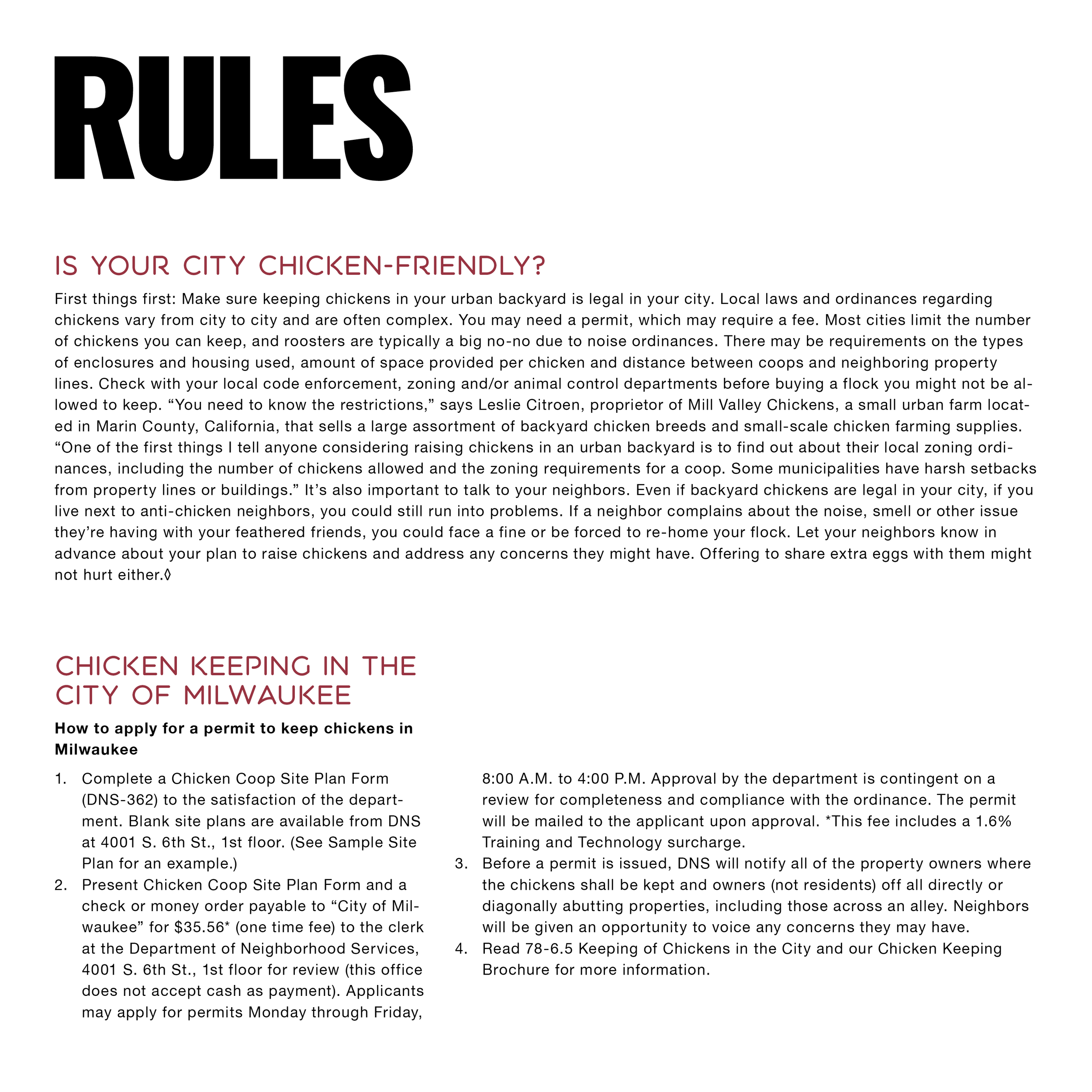
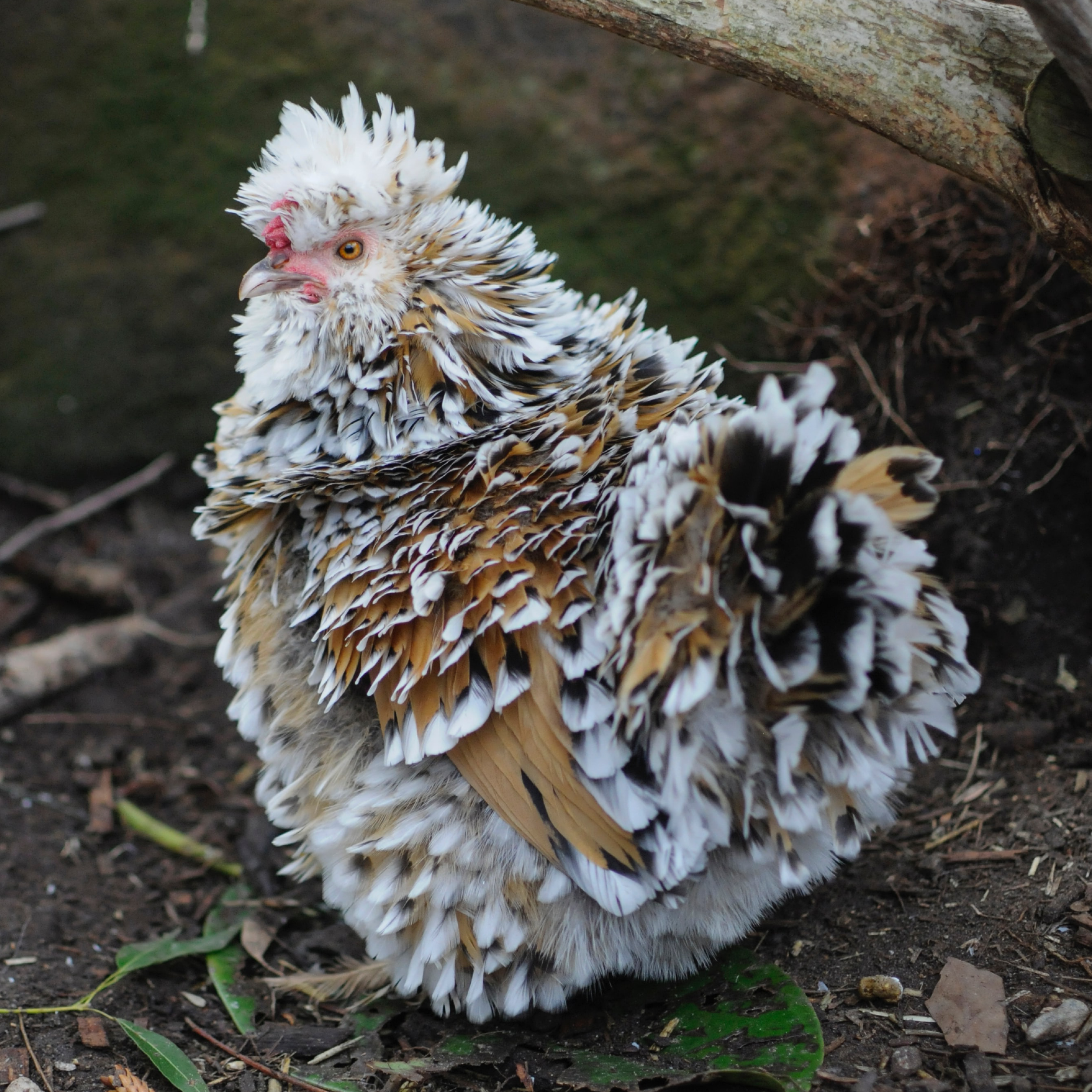
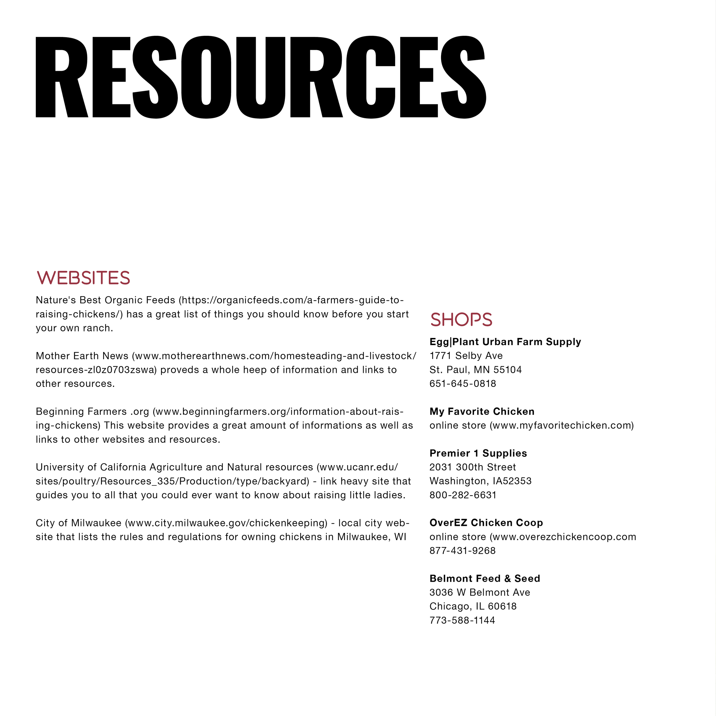
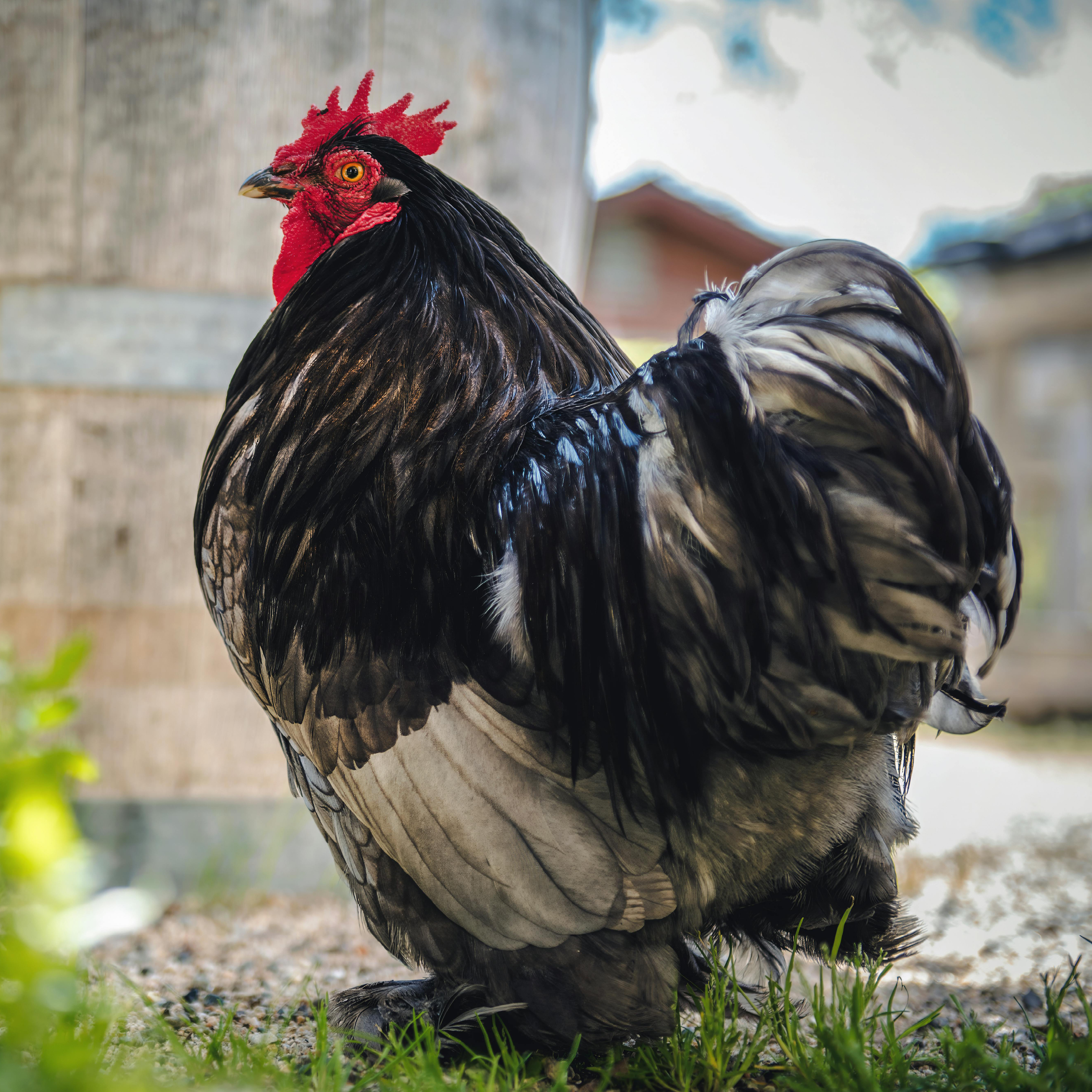
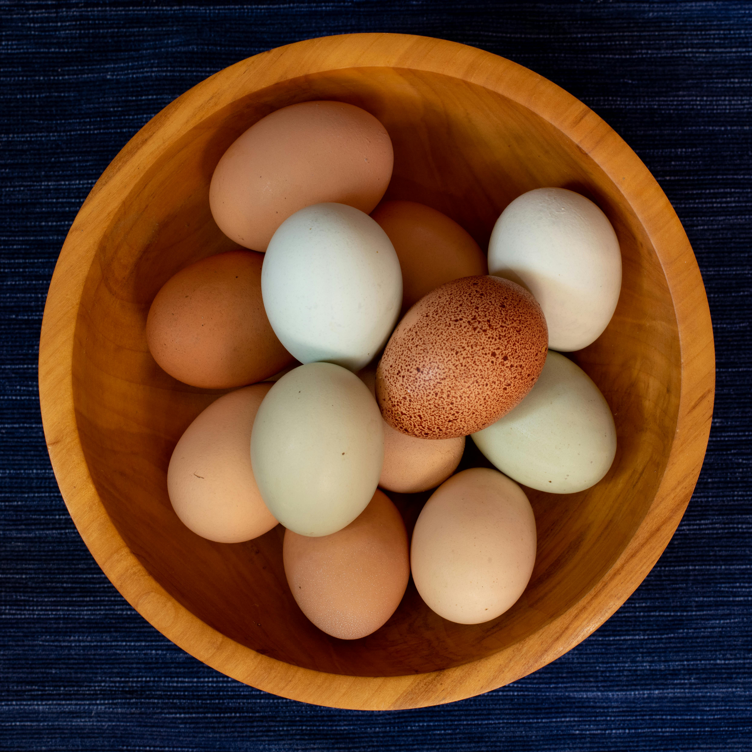
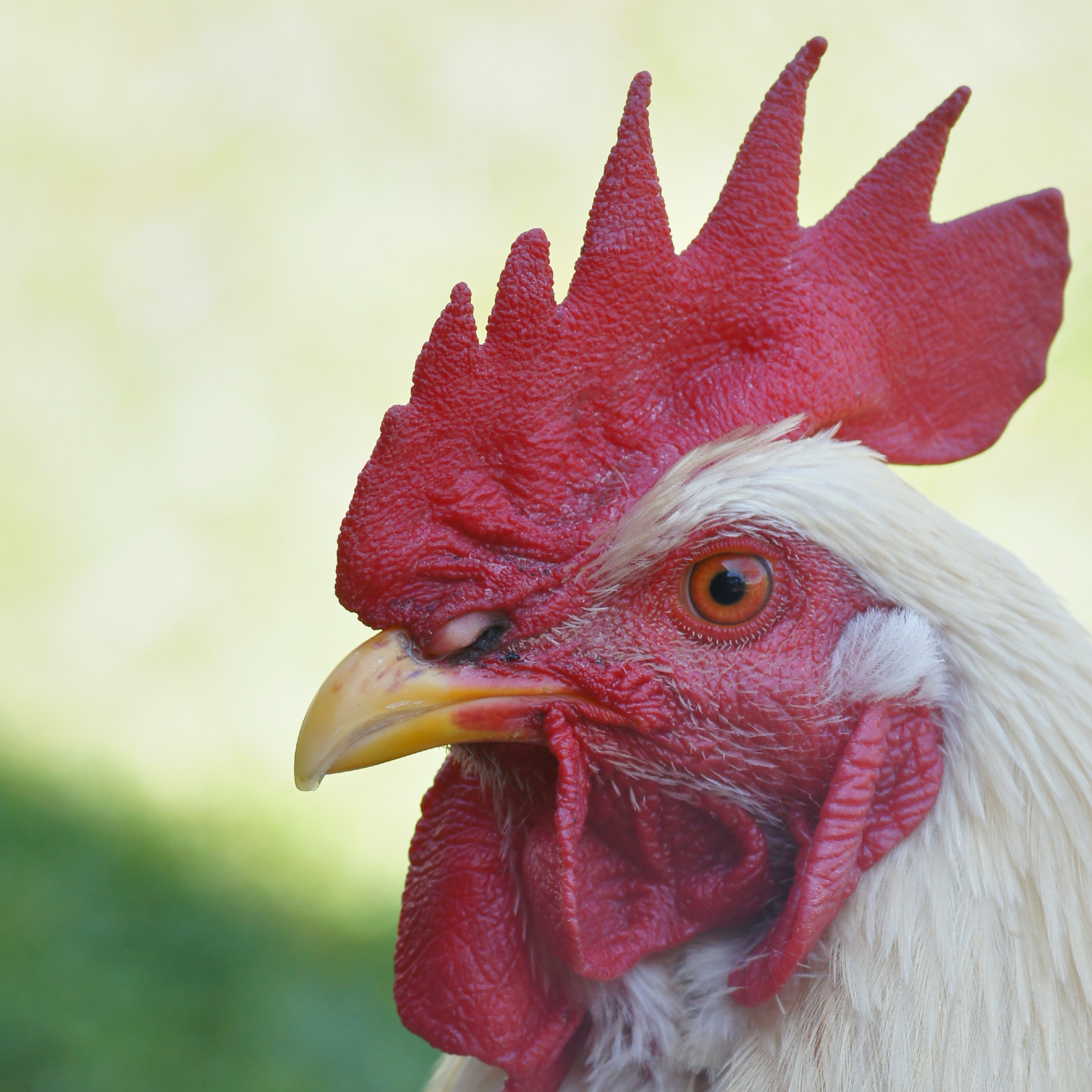
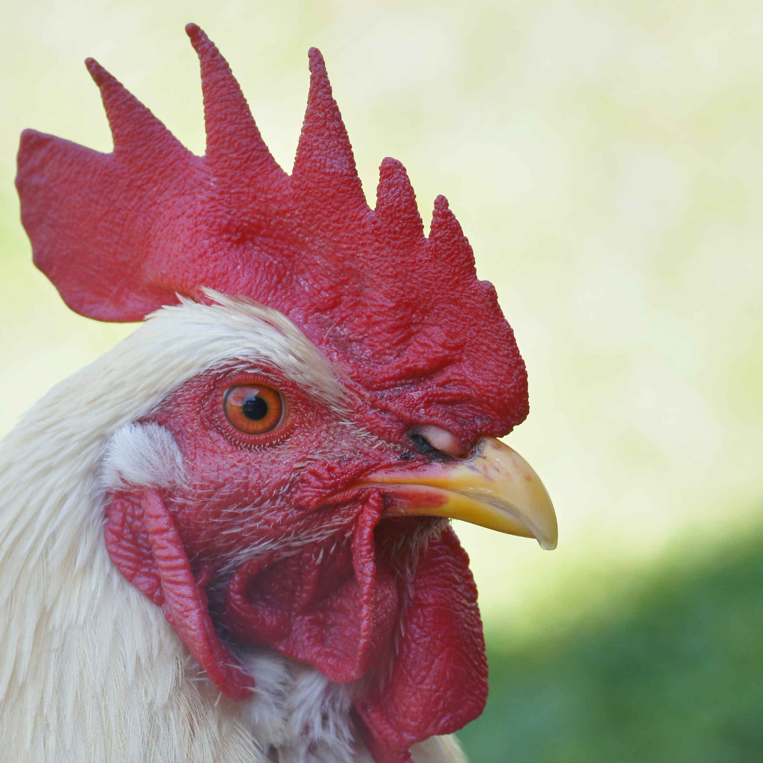
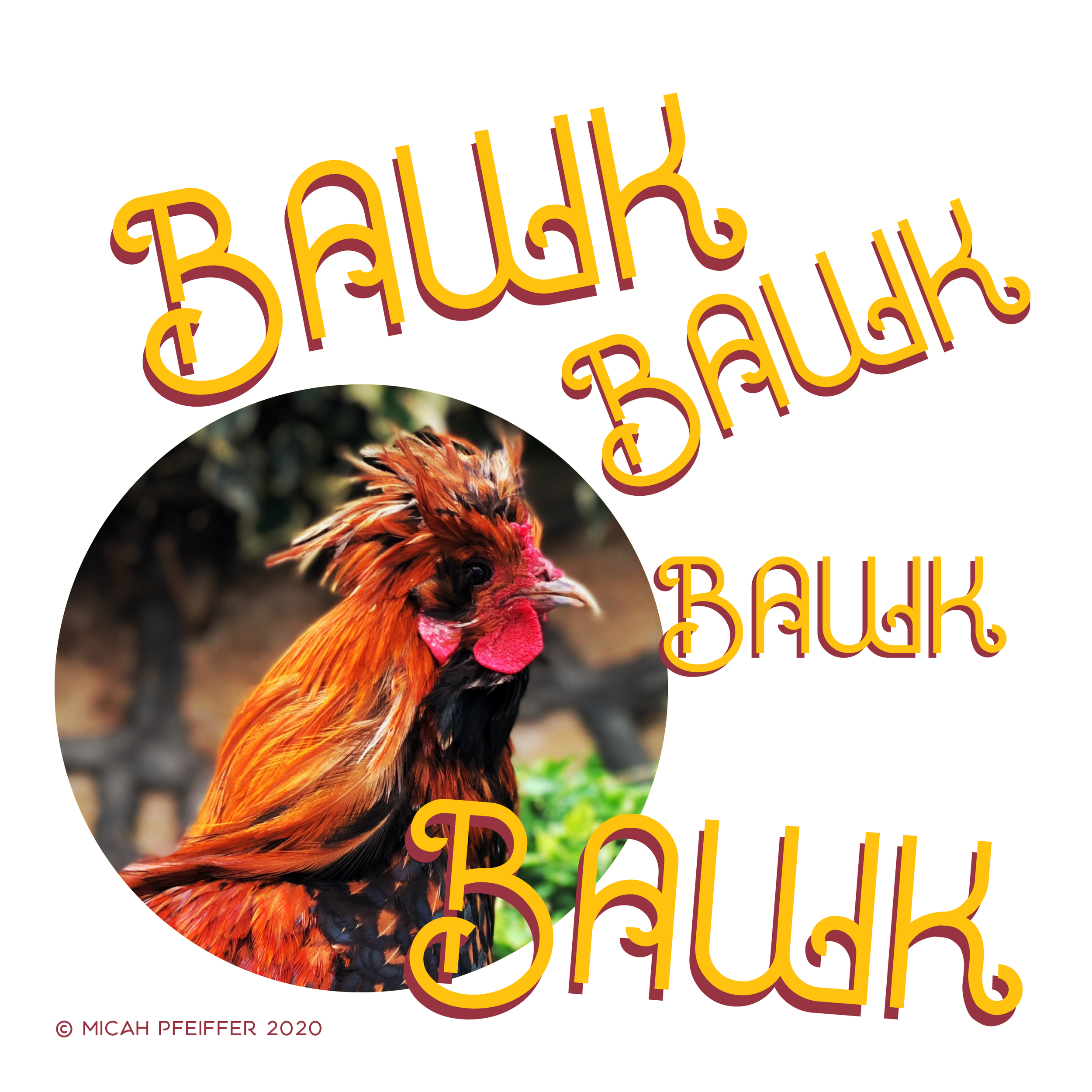
the pamphlet isn't a how-to. it makes the case for backyard chickens — the reasons people do it, testimonials from people who already have, and enough practical starting information to help someone take the first step. dramatic photography of chickens against ultra-black type and stark white space. the yellow egg-circle moving spread to spread, tying it all together. it was designed to look like something you'd actually want to pick up, not another handout.
[editorial & print]
editorial design is the work of arranging things on a page so the reader keeps going. what to show first. what to hold back. what to blow up big. where to put white space and where to refuse it. the print work in this section came out of an art direction class, which meant the job wasn't just design. it was assembling a team, holding a vision across six hundred miles of distance, and trusting the people in the room to make the shot.
[projects]