

[micahjaypfeiffer.com/makebelievefun]
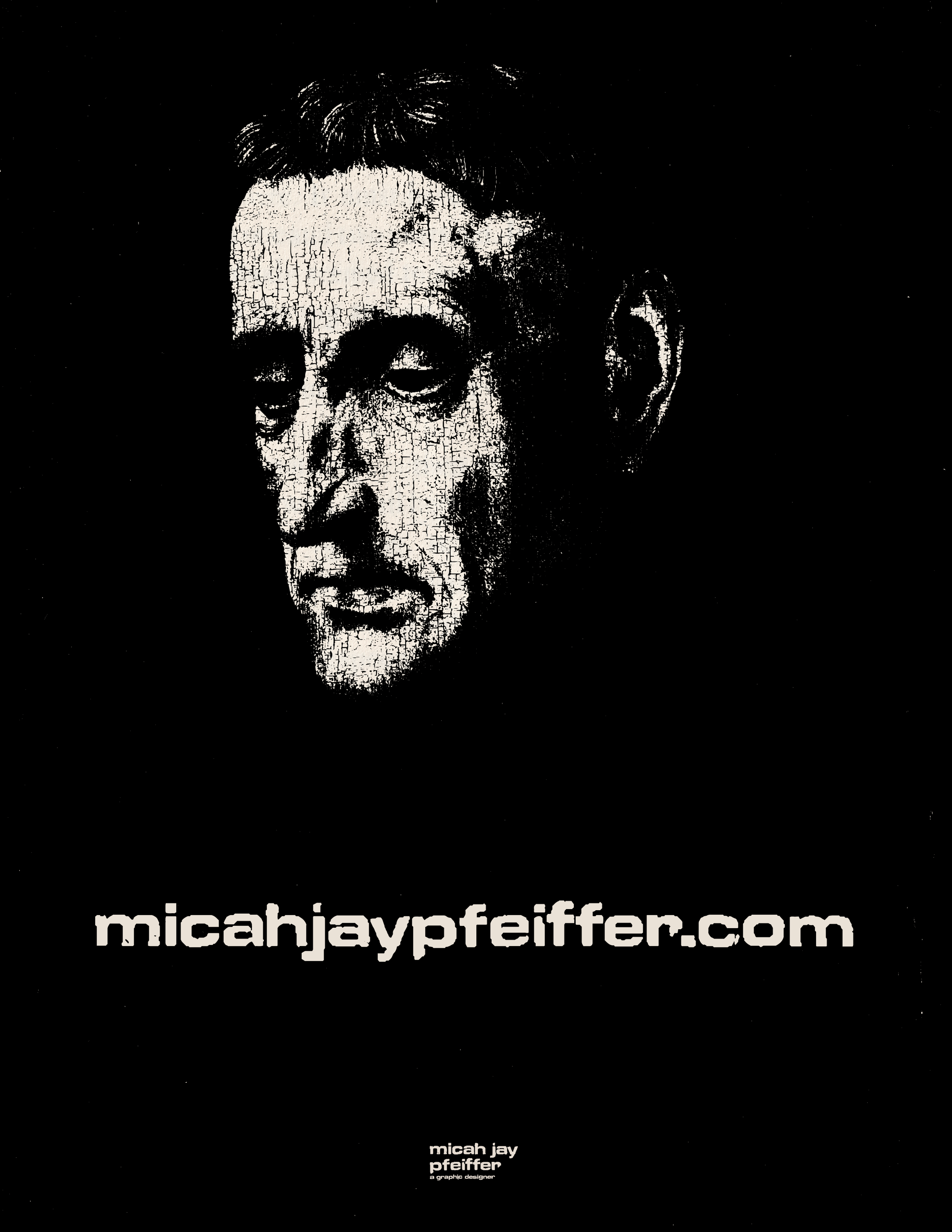
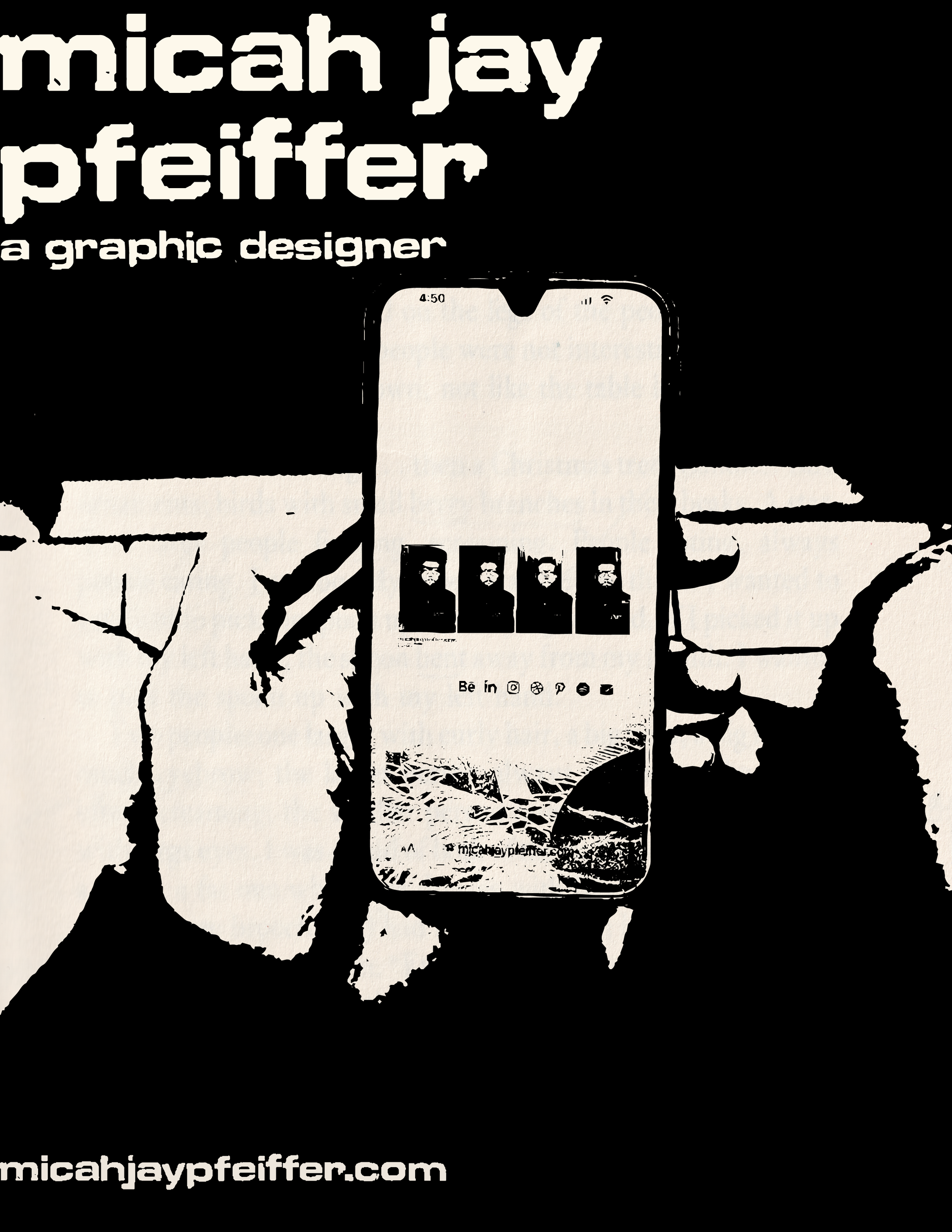
before micah jay design existed, there was a first draft. 14 print pieces — page identity marks, poster-format layouts — that lived on an earlier version of the site under my own name, with a lot of overlap into makebelievefun during the same stretch. same hand, same visual language, both feeding each other. this is where a lot of what i'm doing now got worked out.
[next]
[before]
[after]
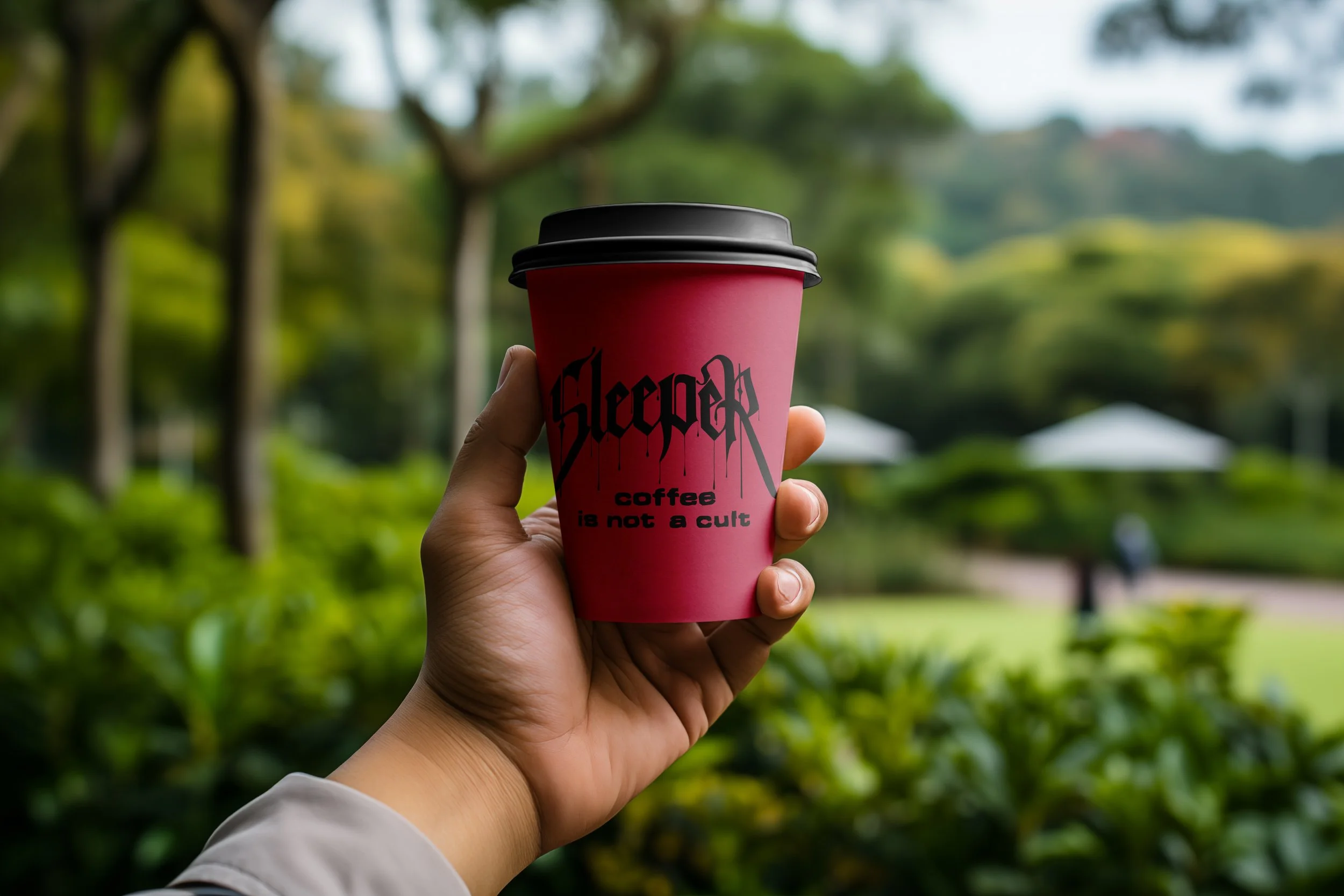
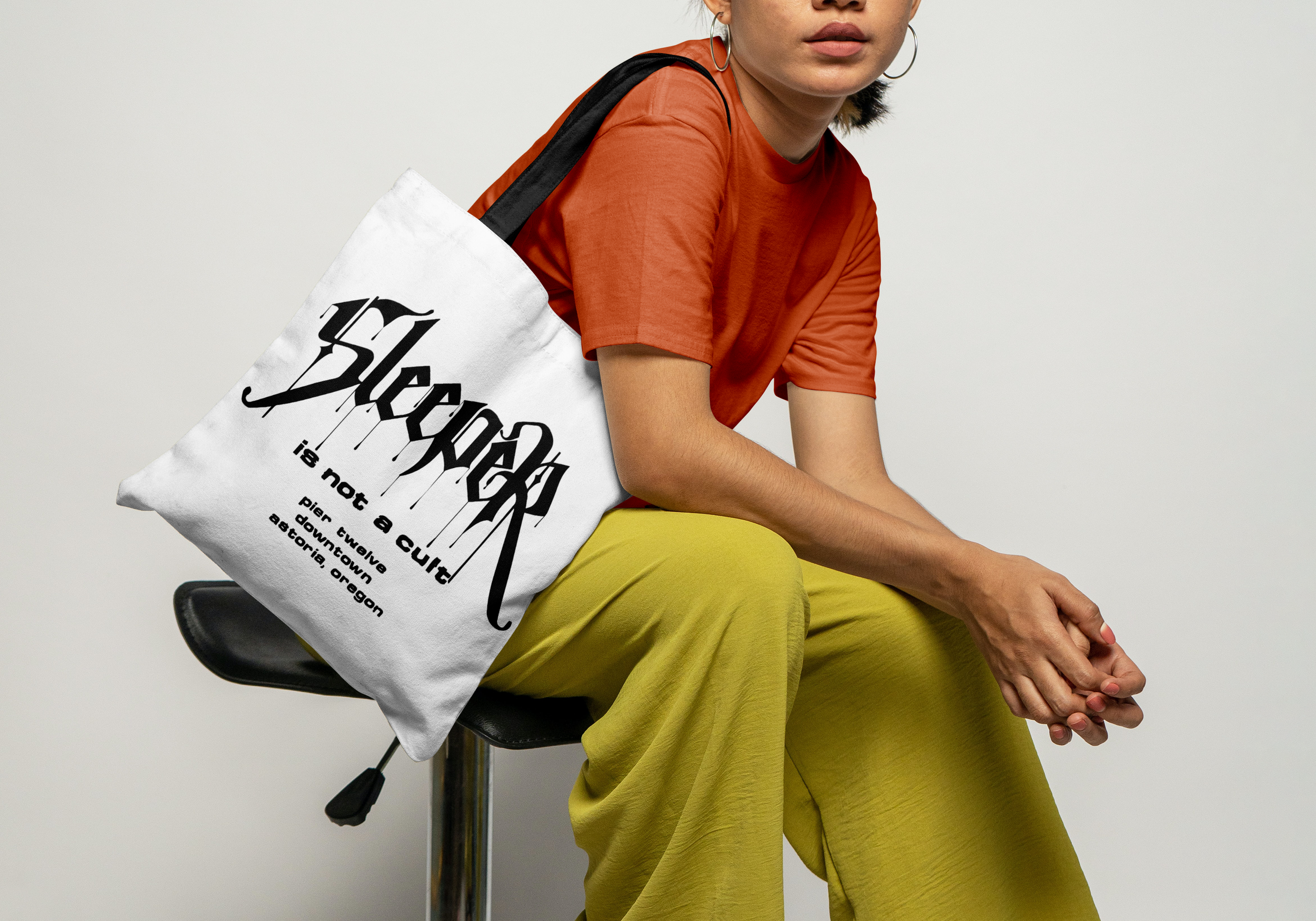
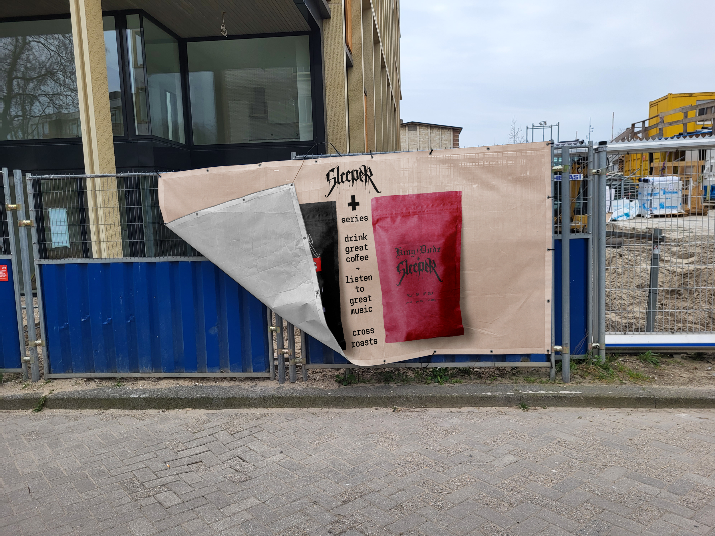
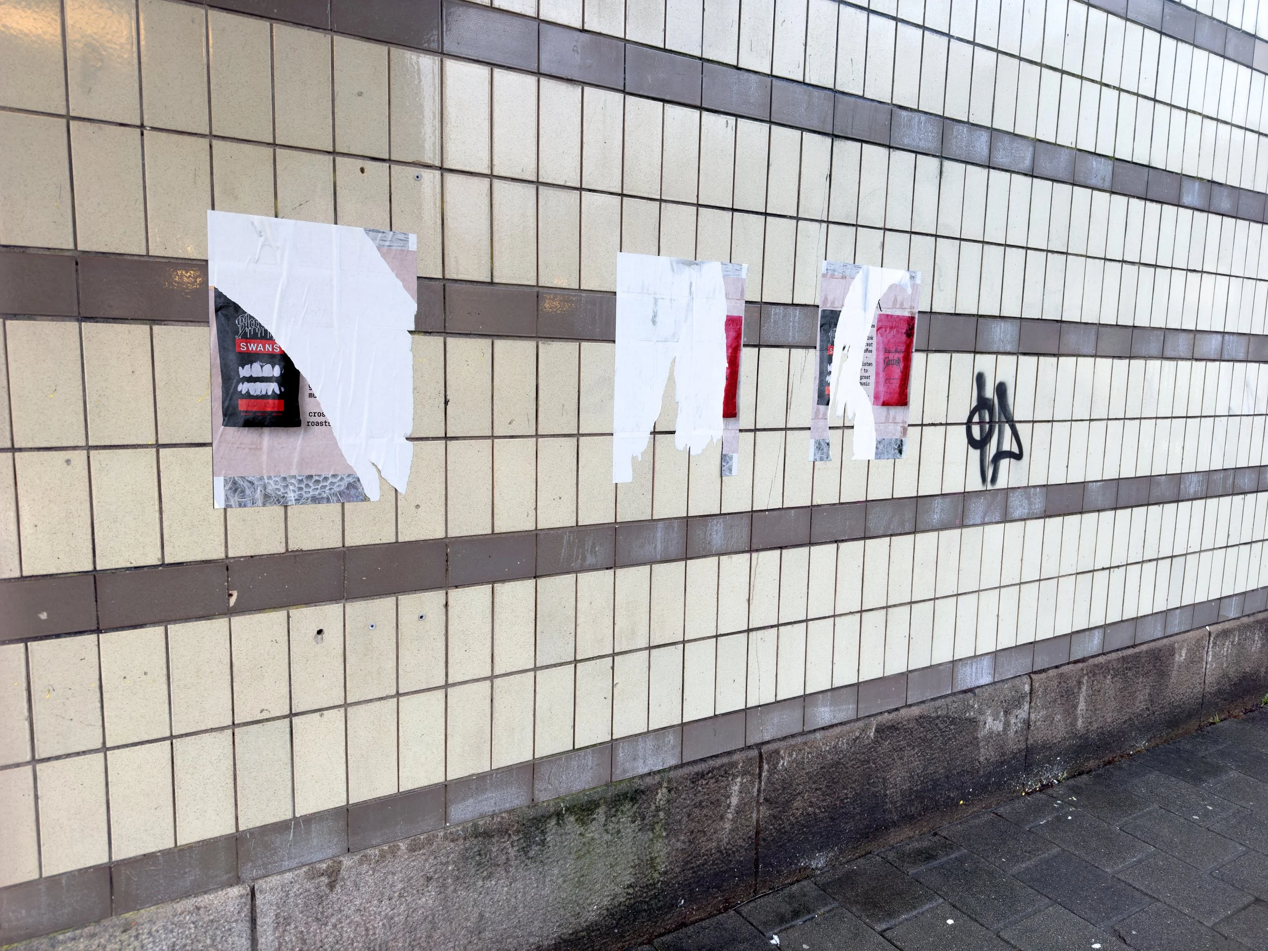
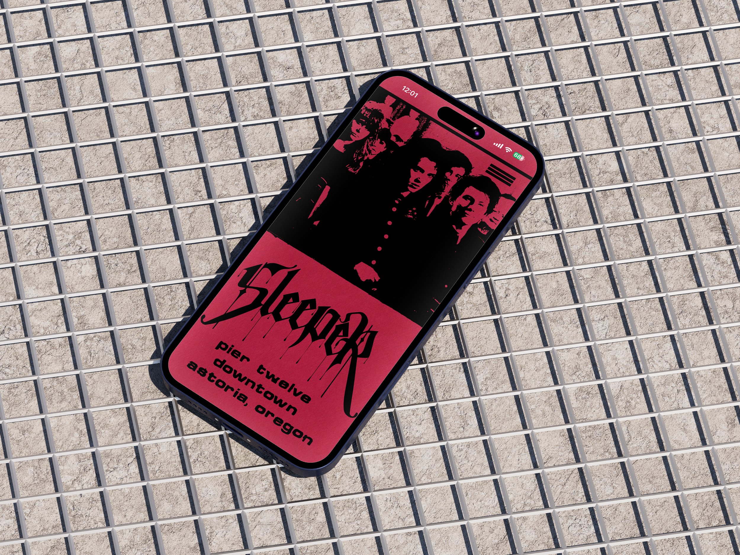
[sleeper coffee]
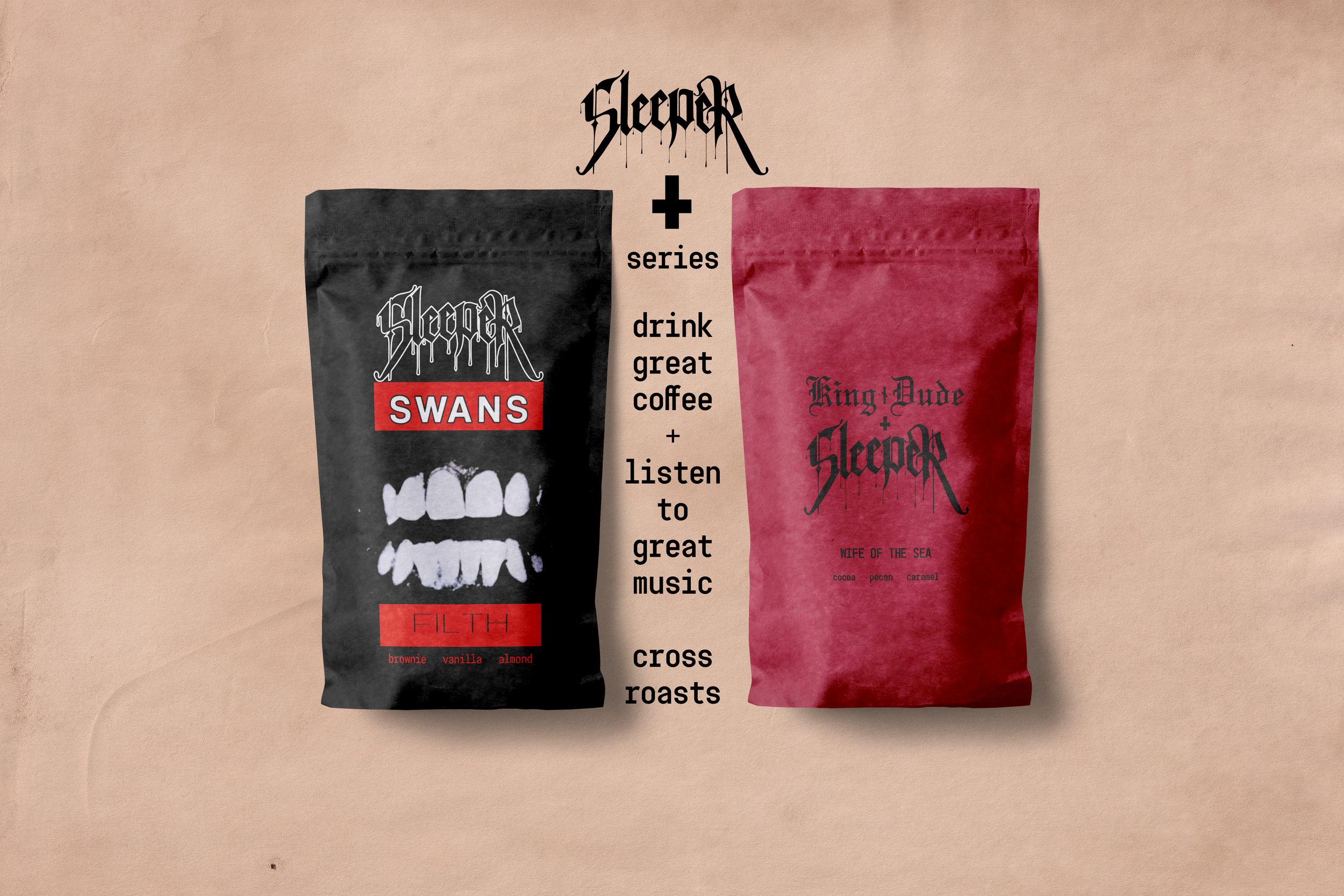
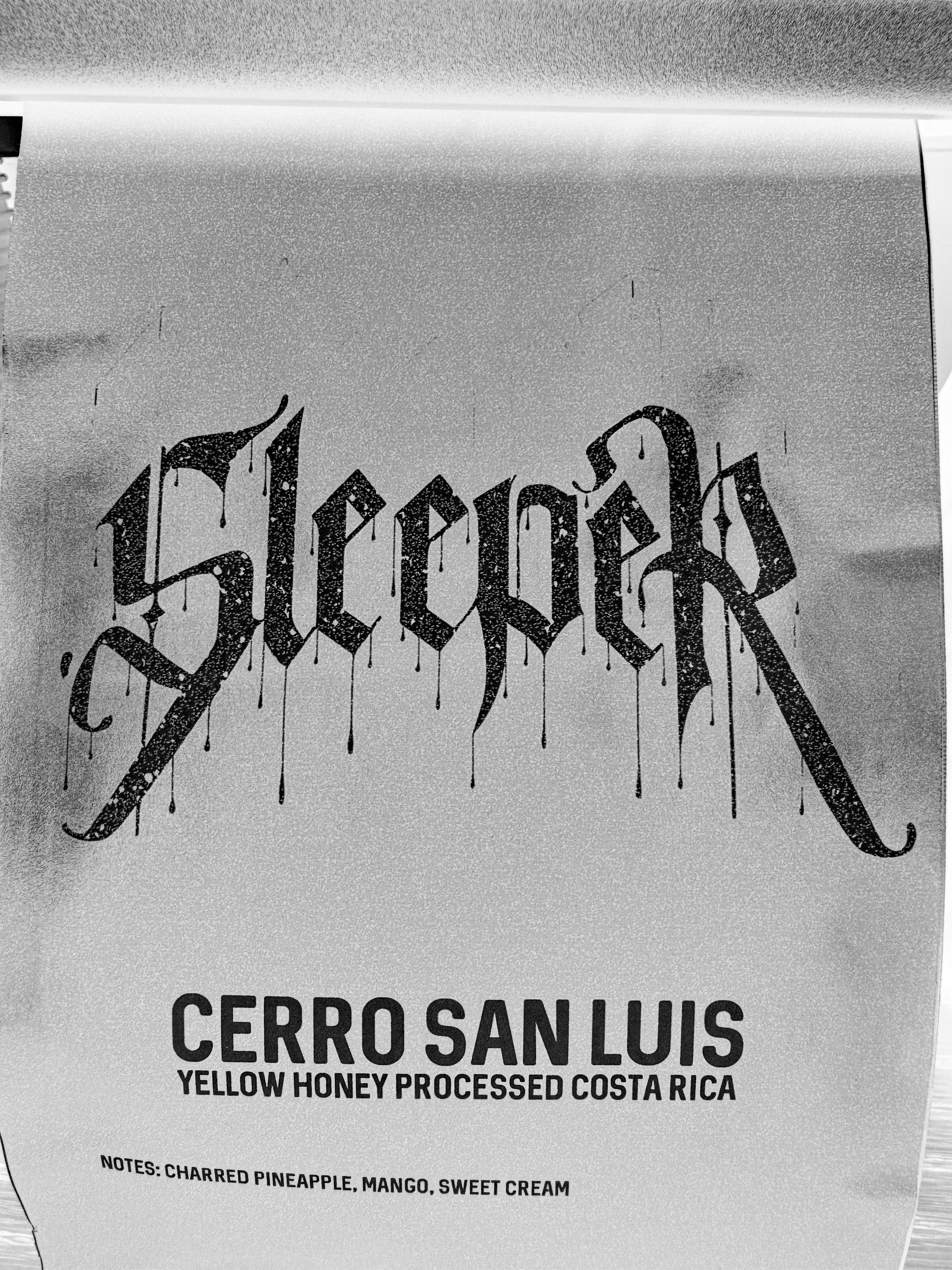
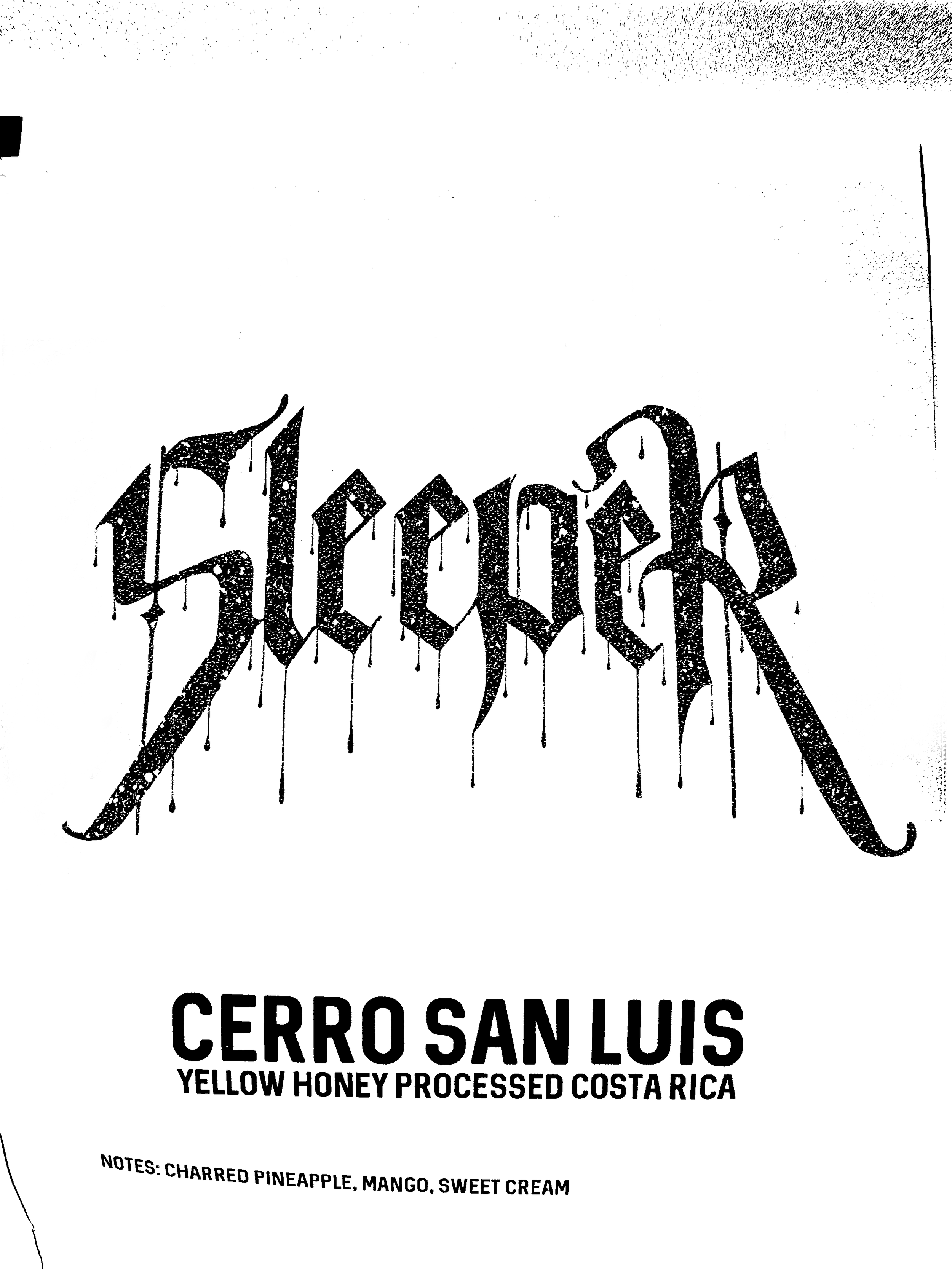
sleeper is a coffee shop in astoria, oregon. their logo has a small element attached to the S that i felt could be simplified — cleaner, more balanced, more straightforward without it. i took the piece off, kept the rest of the logo intact, and applied the revised version across bags, posters, and a print ad. spec work. nobody asked me to do it. i just wanted to see how it would land.
[next]
[texas chainsaw massacre]
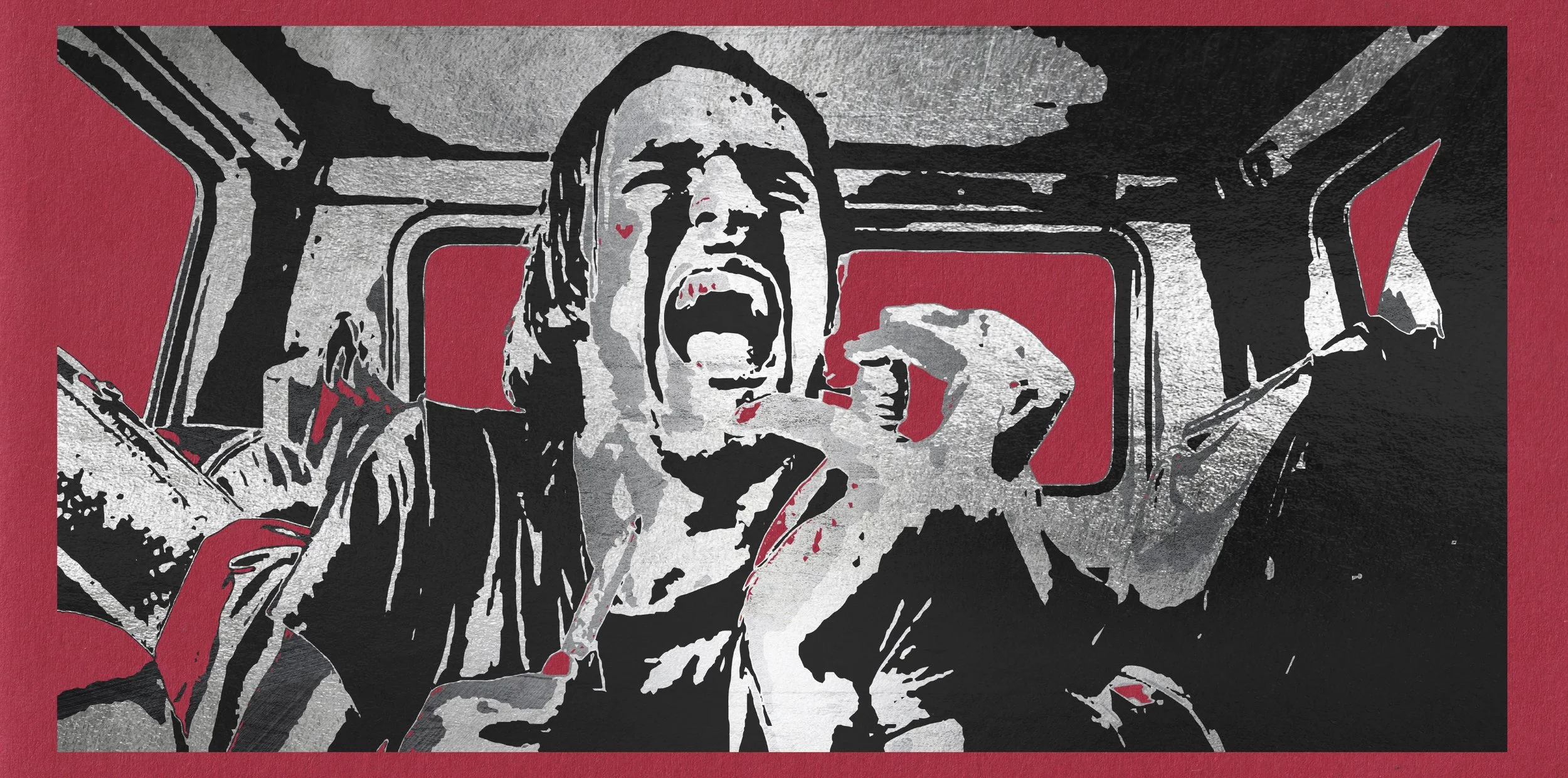
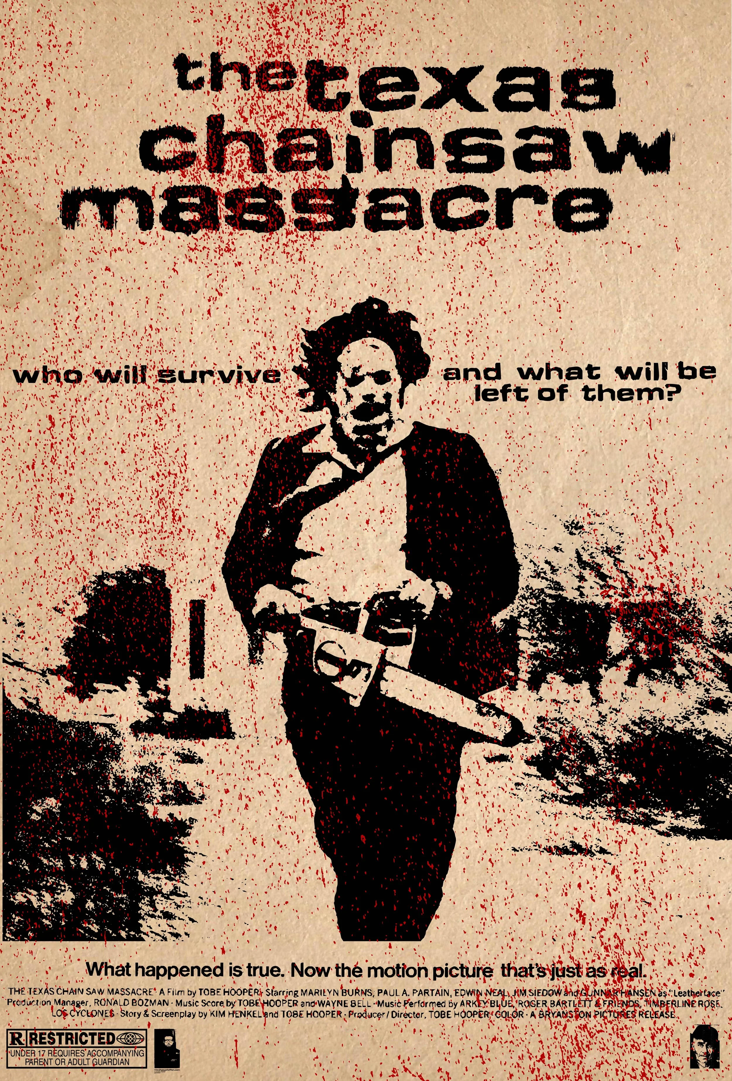
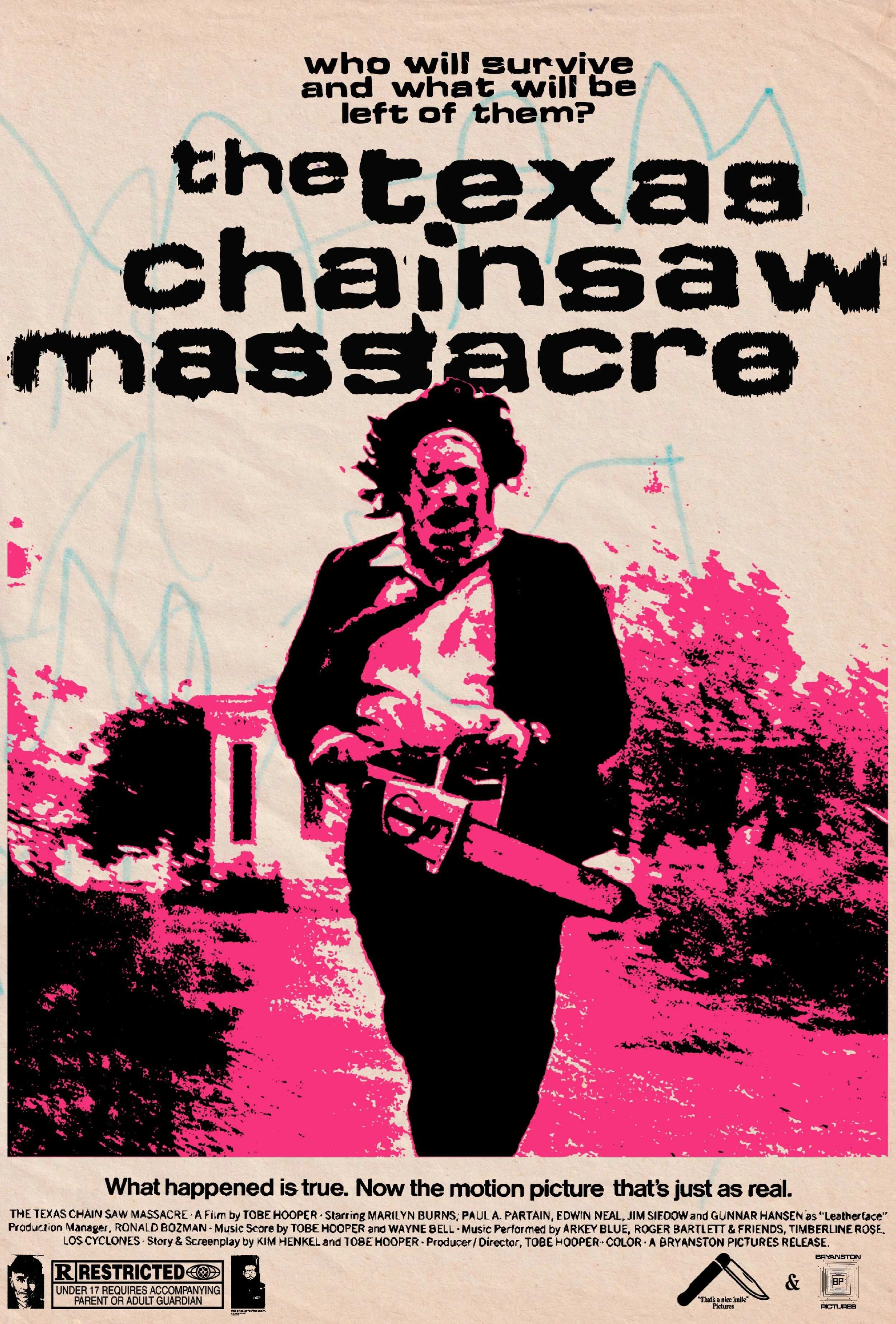
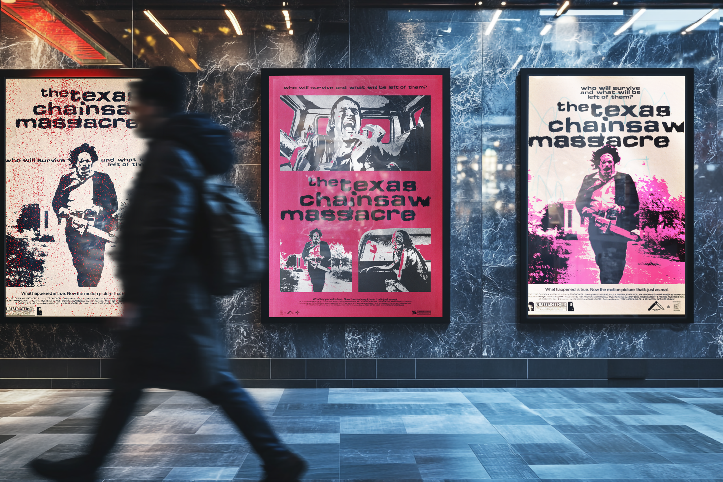
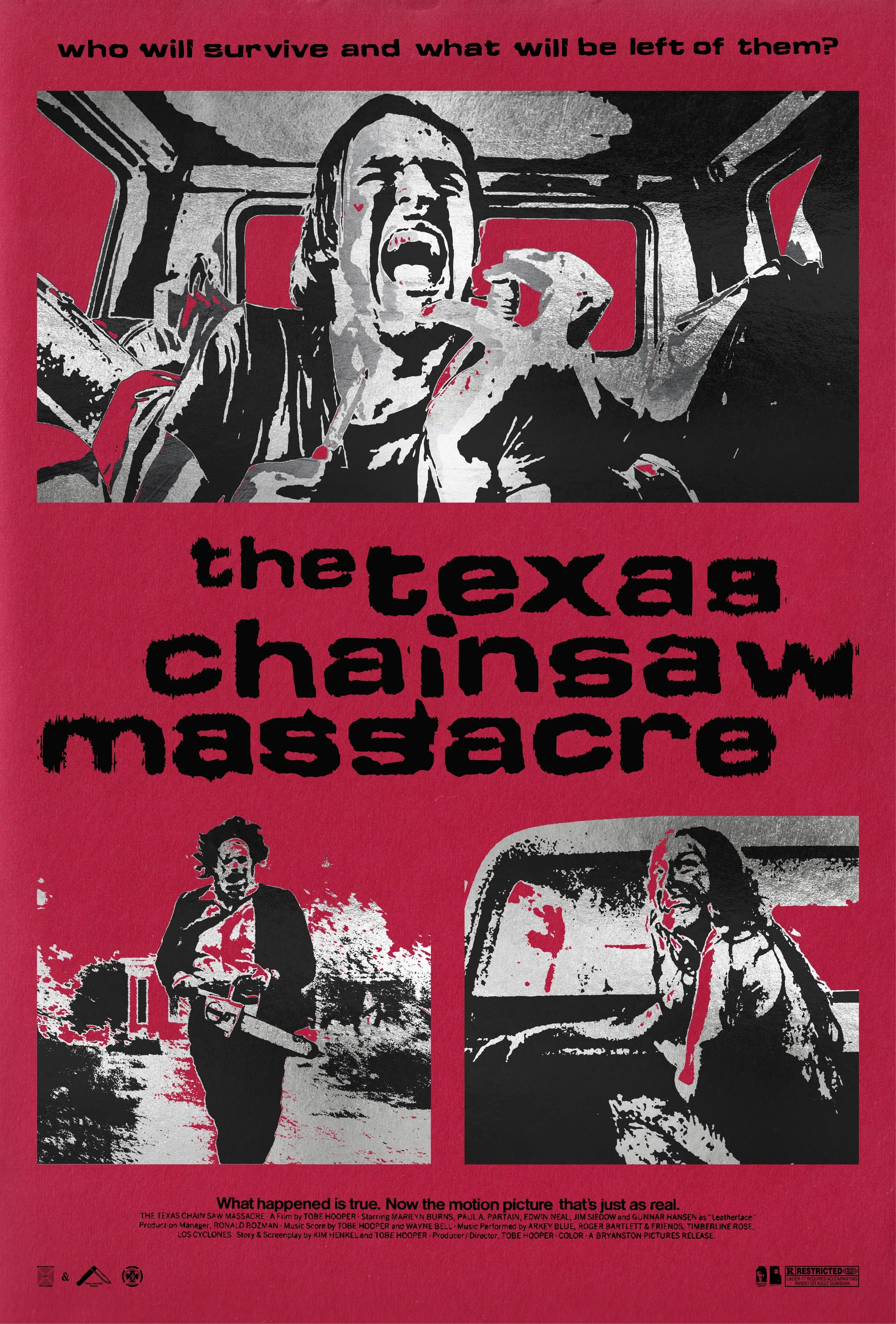
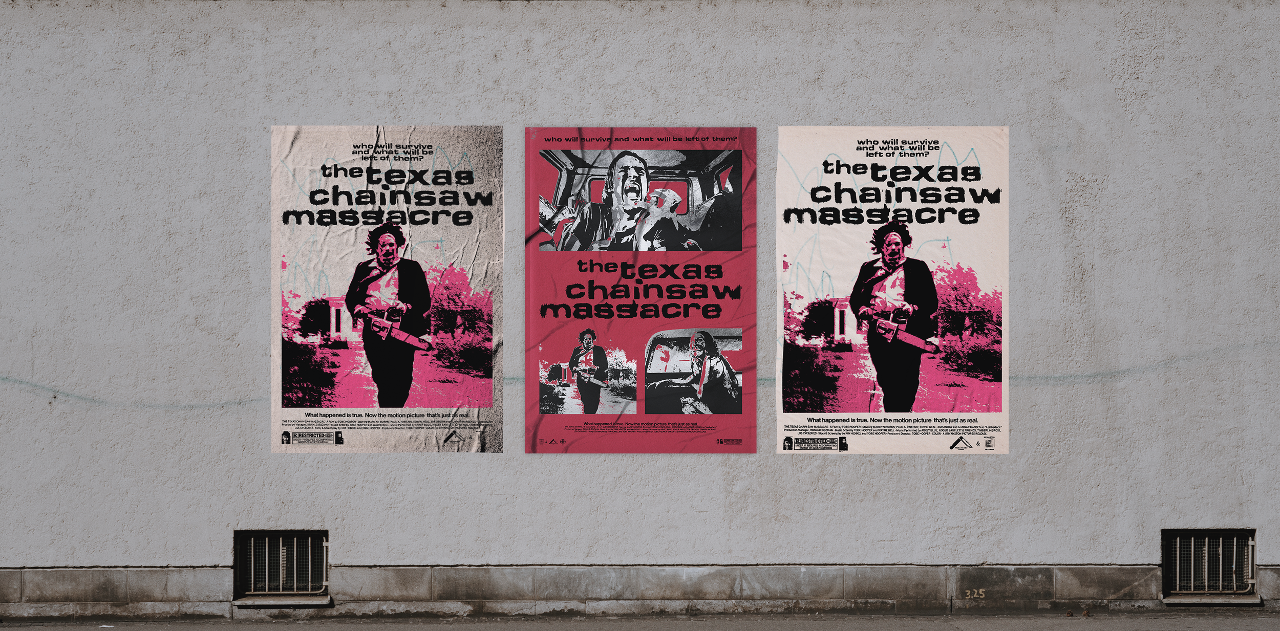
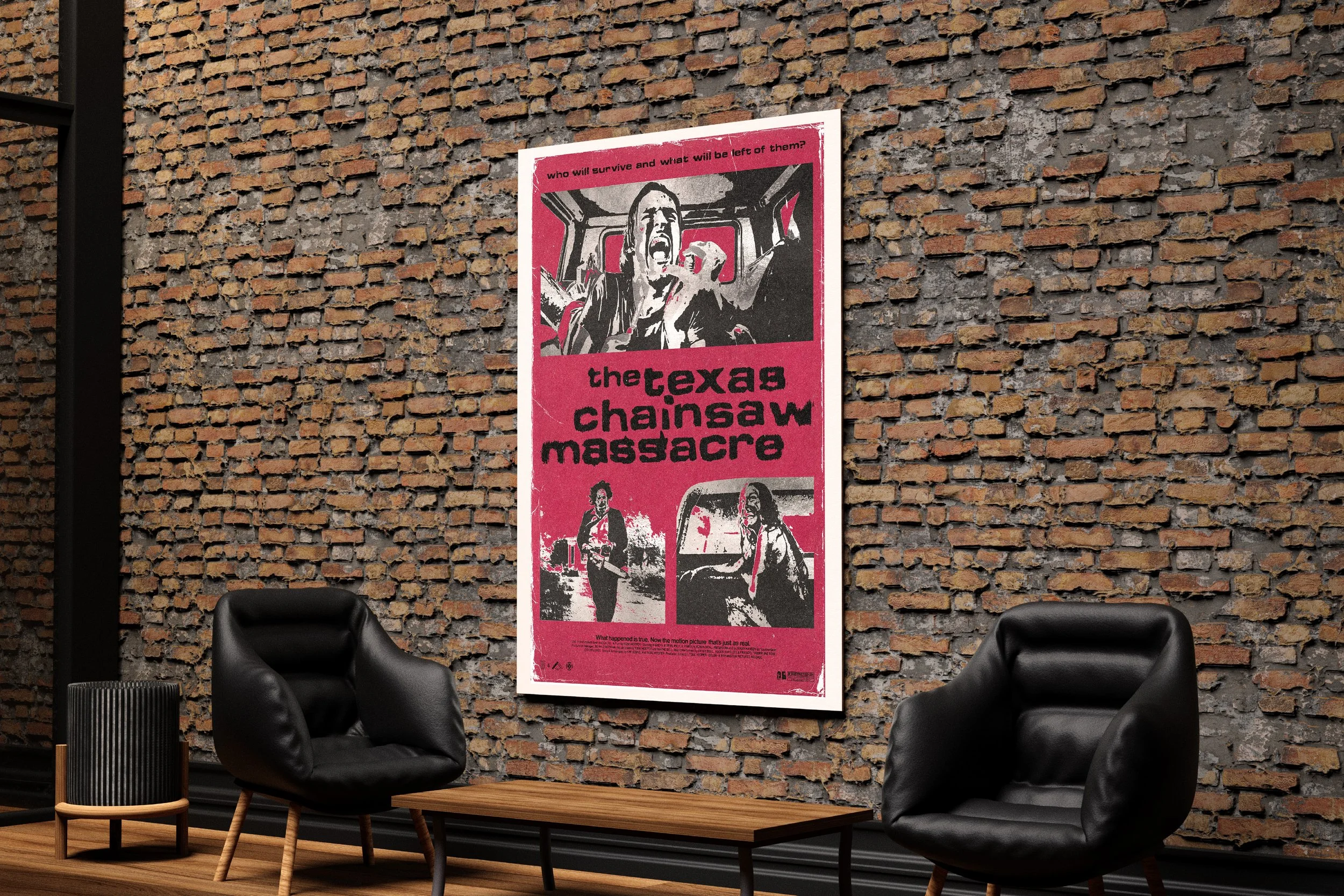
another designer put out a halloween prompt: redesign your favorite horror movie poster in your own style. simple assignment. i went all in.
i picked massacre for two reasons. first, i'm not really a horror movie person, but this one i actually like — there are shots and characters in it that stay with you. second, the film has scenes that are graphically powerful in a way most horror doesn't earn. worth spending time inside.
three takes came out of it. two are variations on the same scene, treated differently — same image, different visual approach. the third goes somewhere else: a bento layout of different scenes, one of which is the image from the first two. shown flat and mocked up on poster surfaces.
[next]
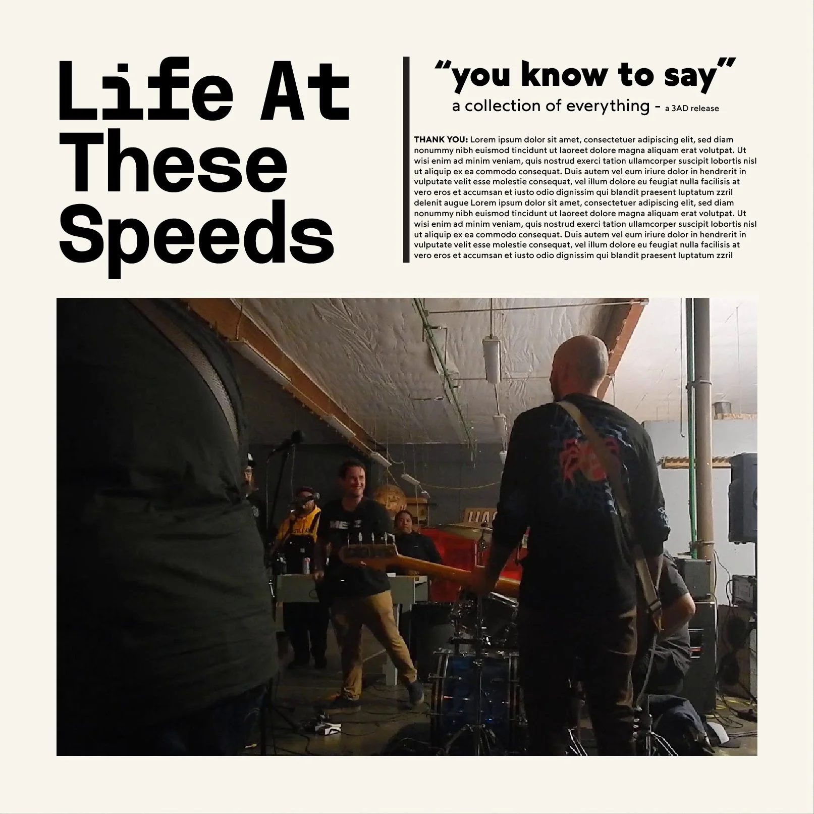
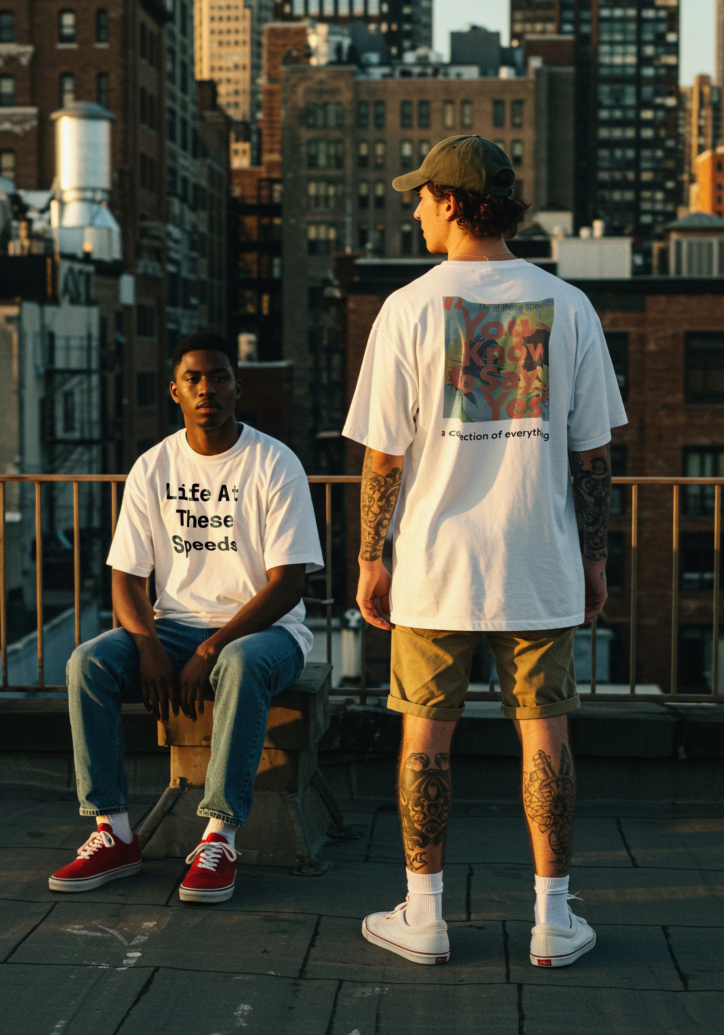
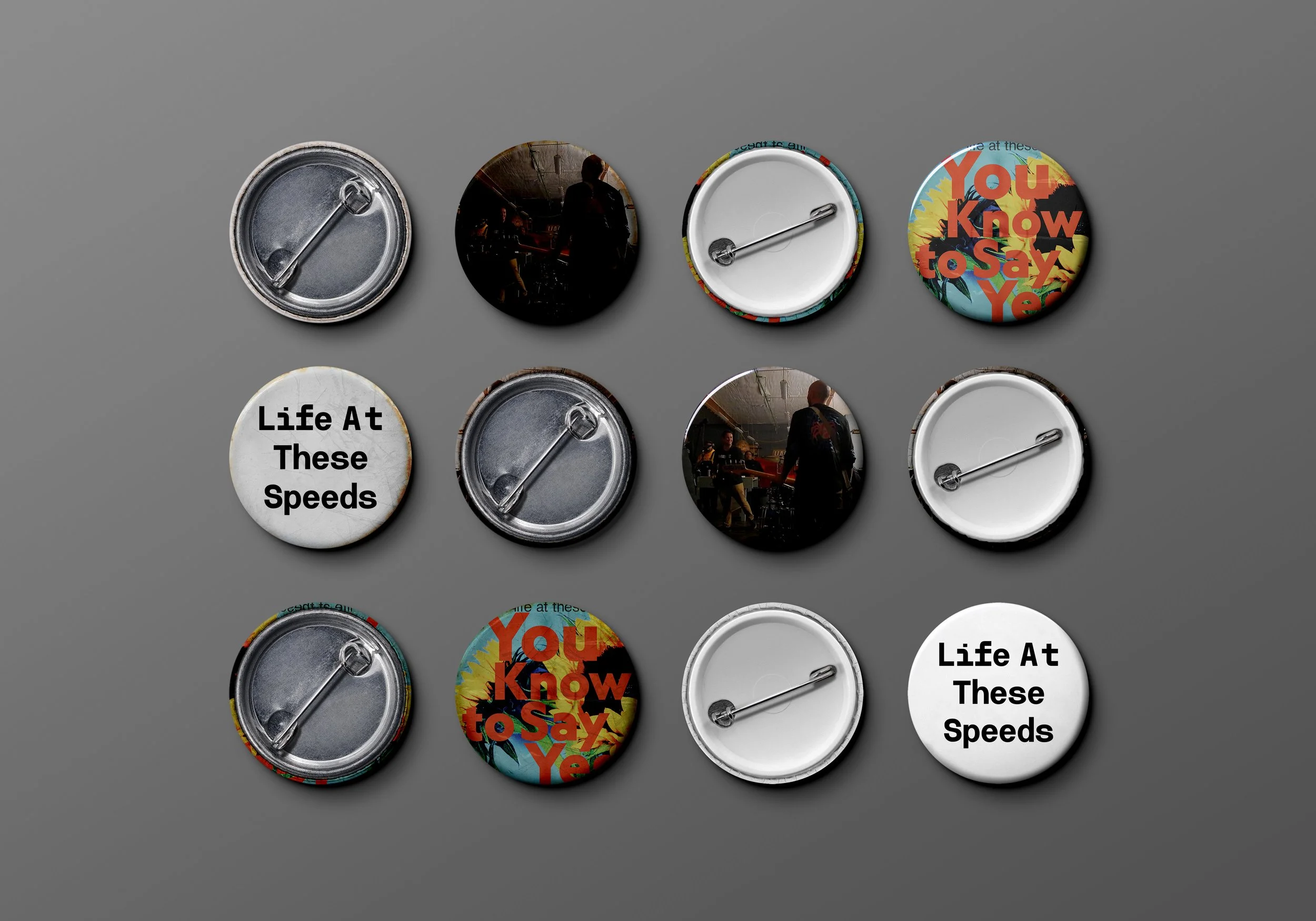
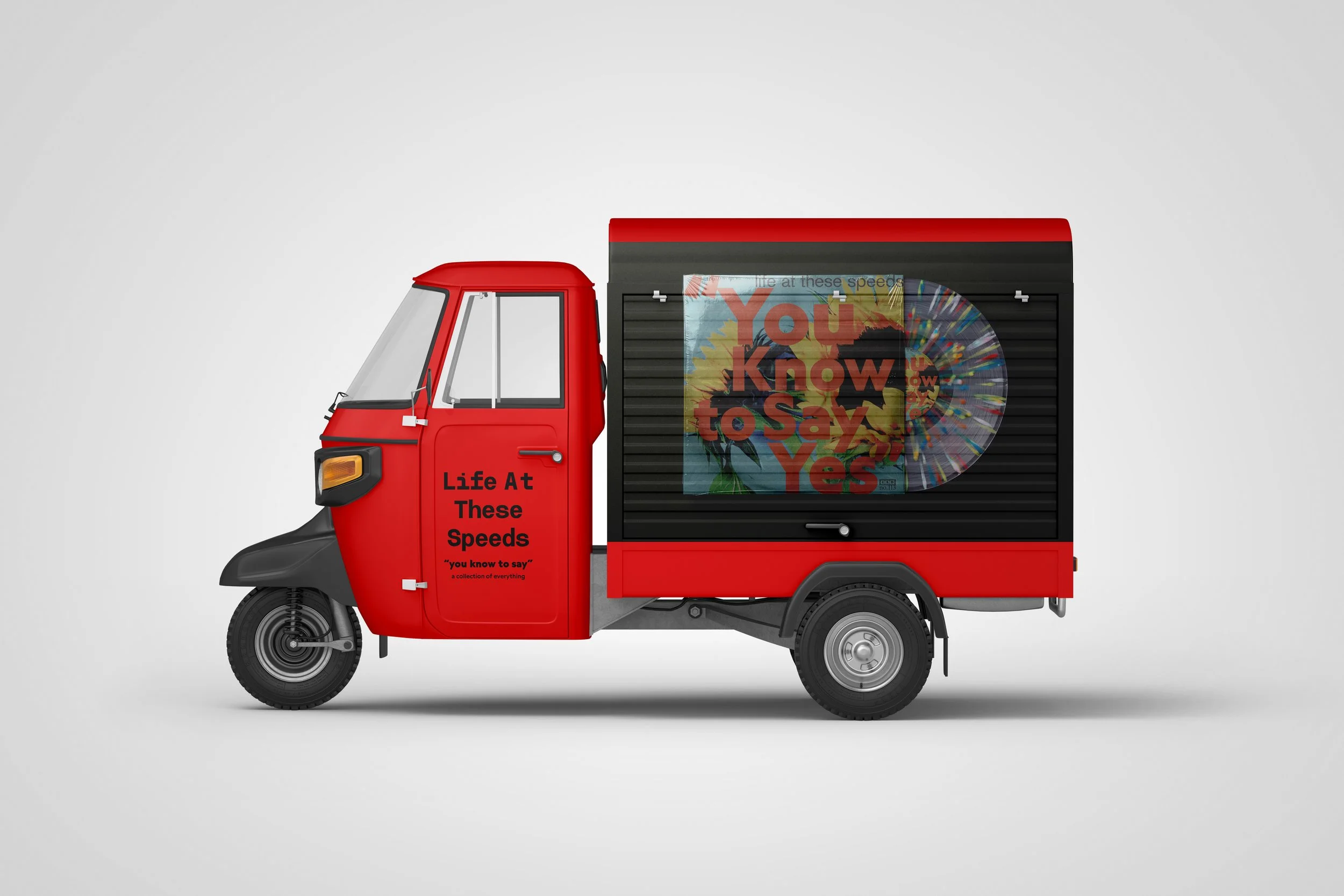
[life at these speeds]
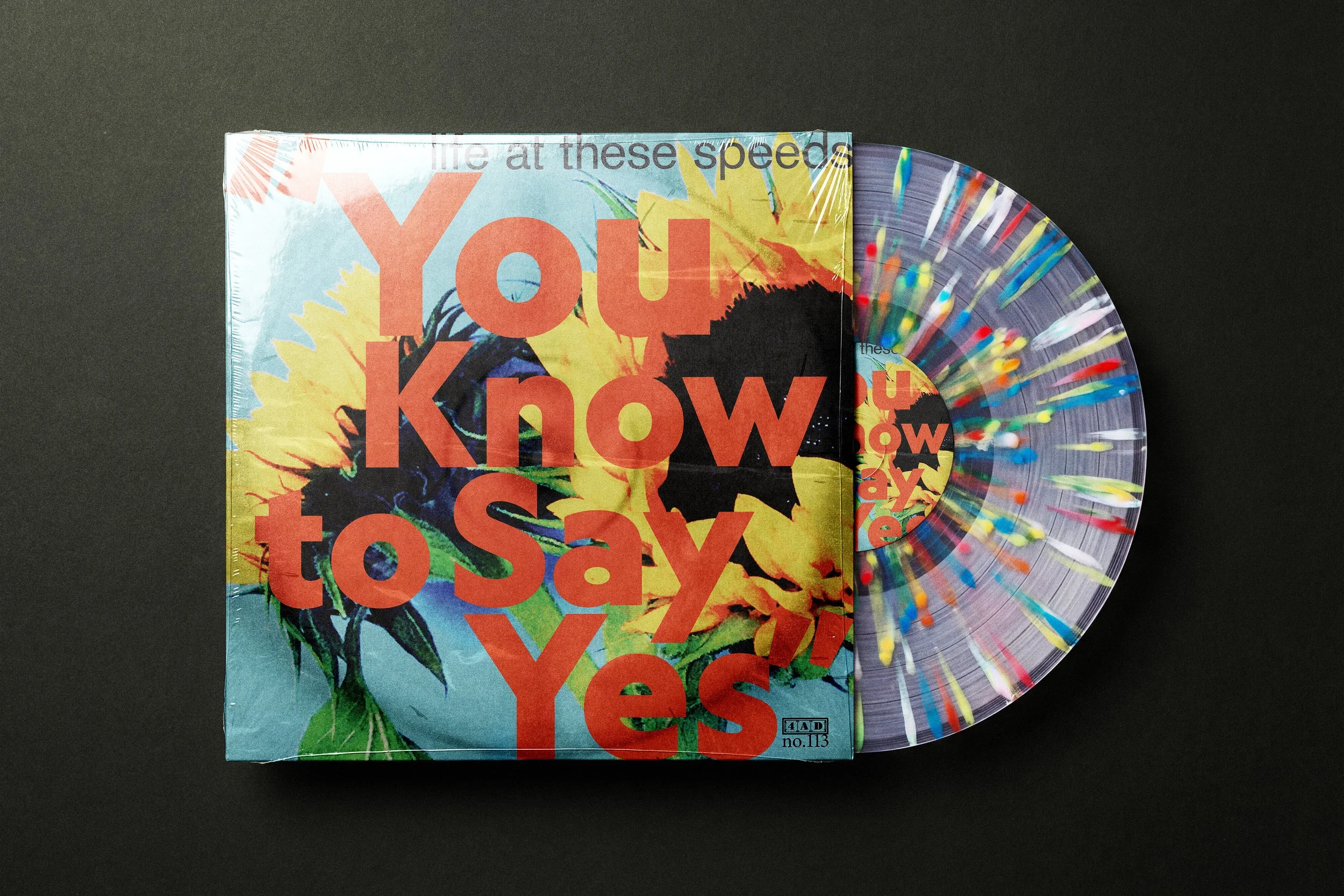
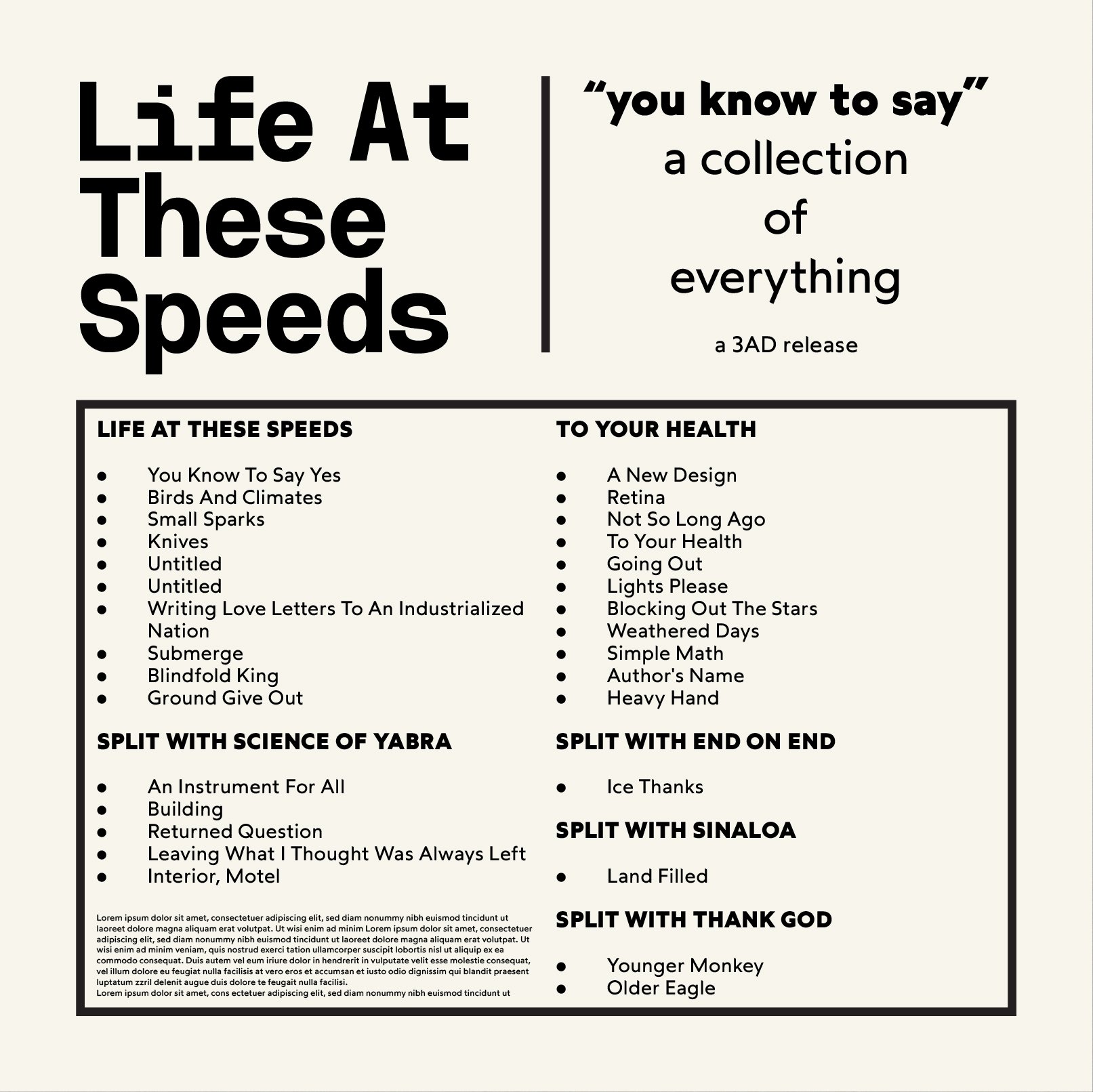
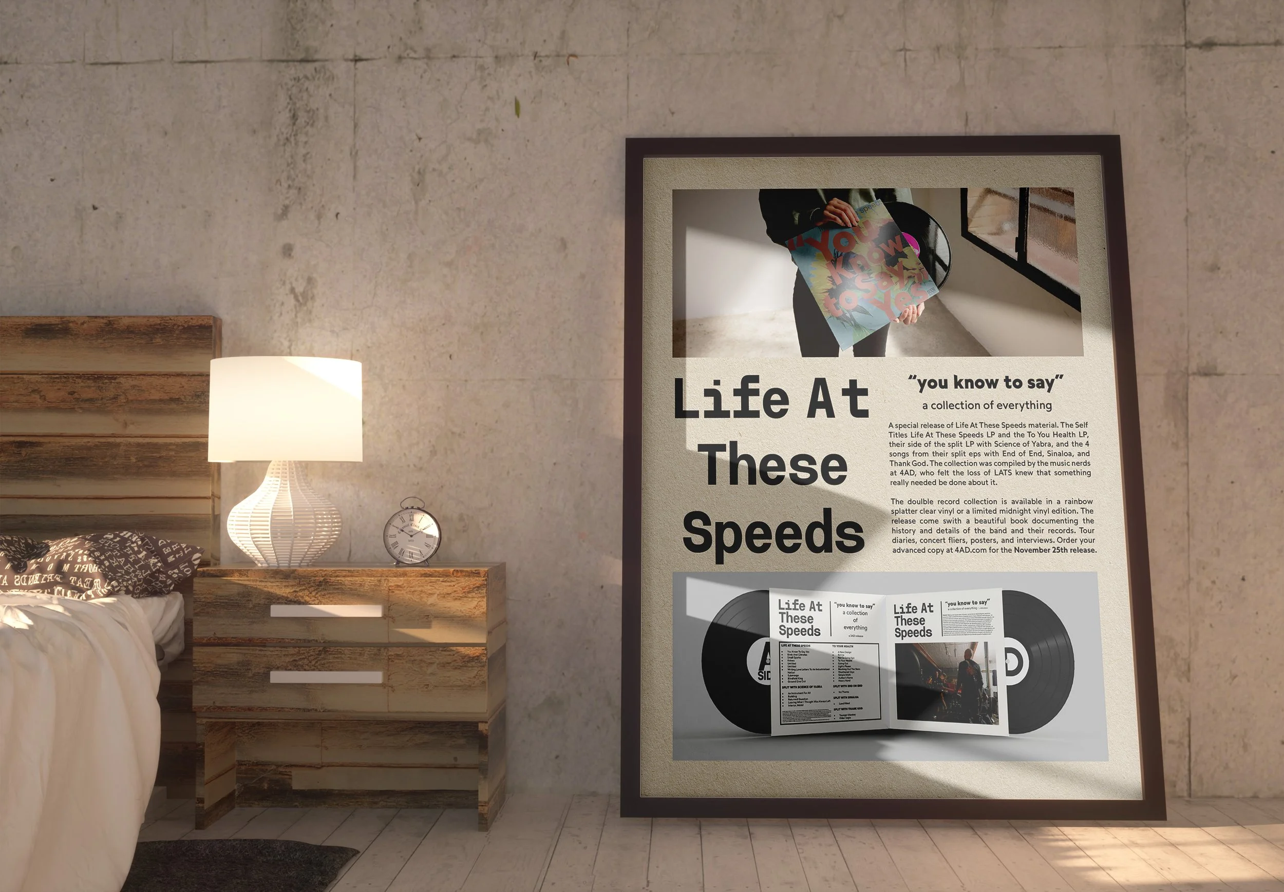
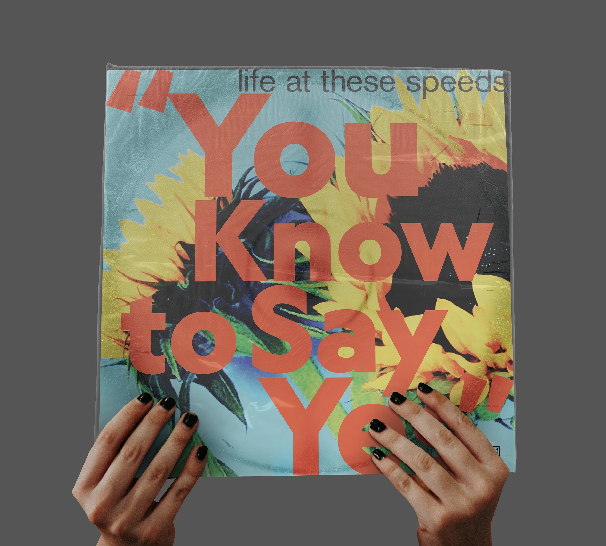
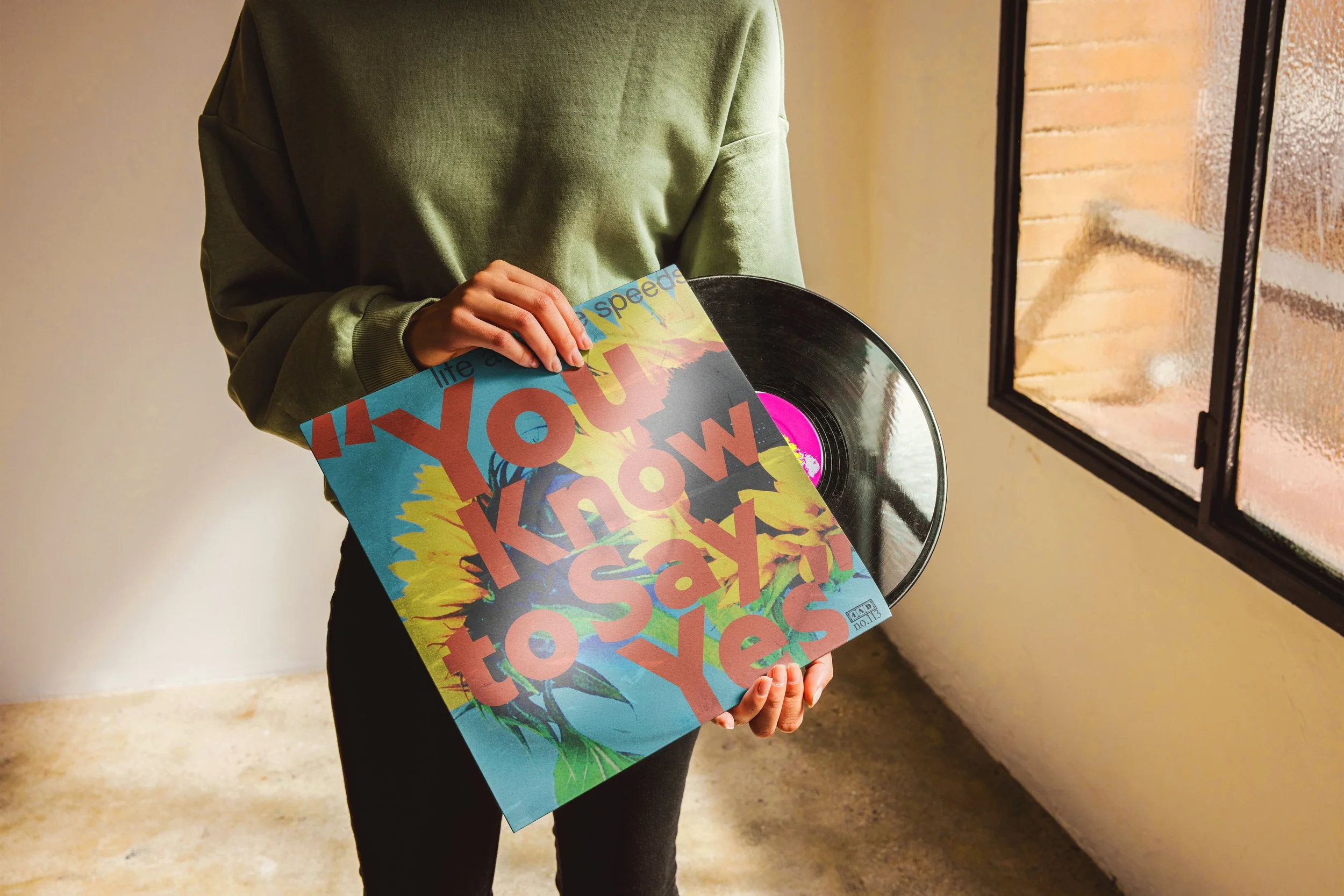
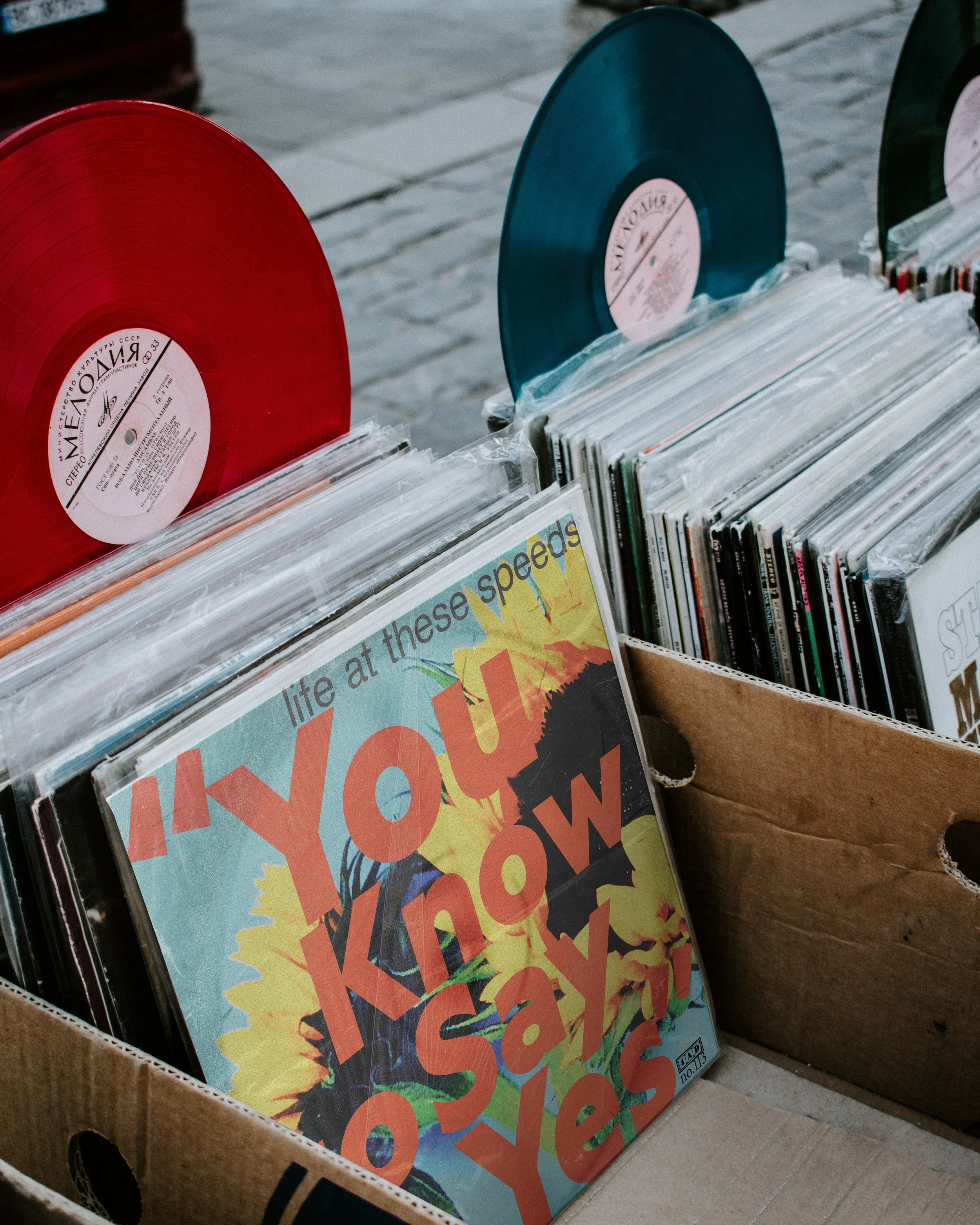
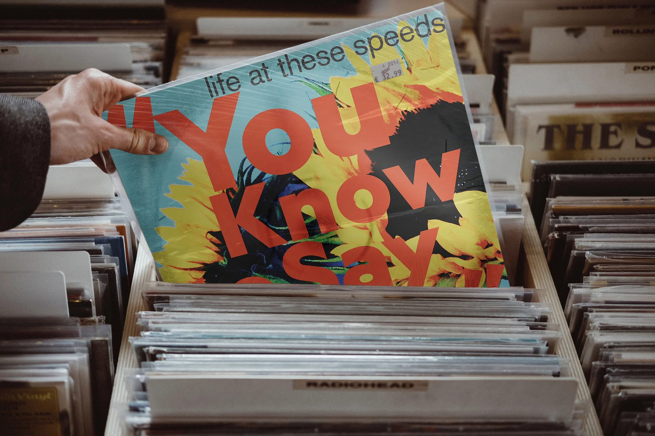
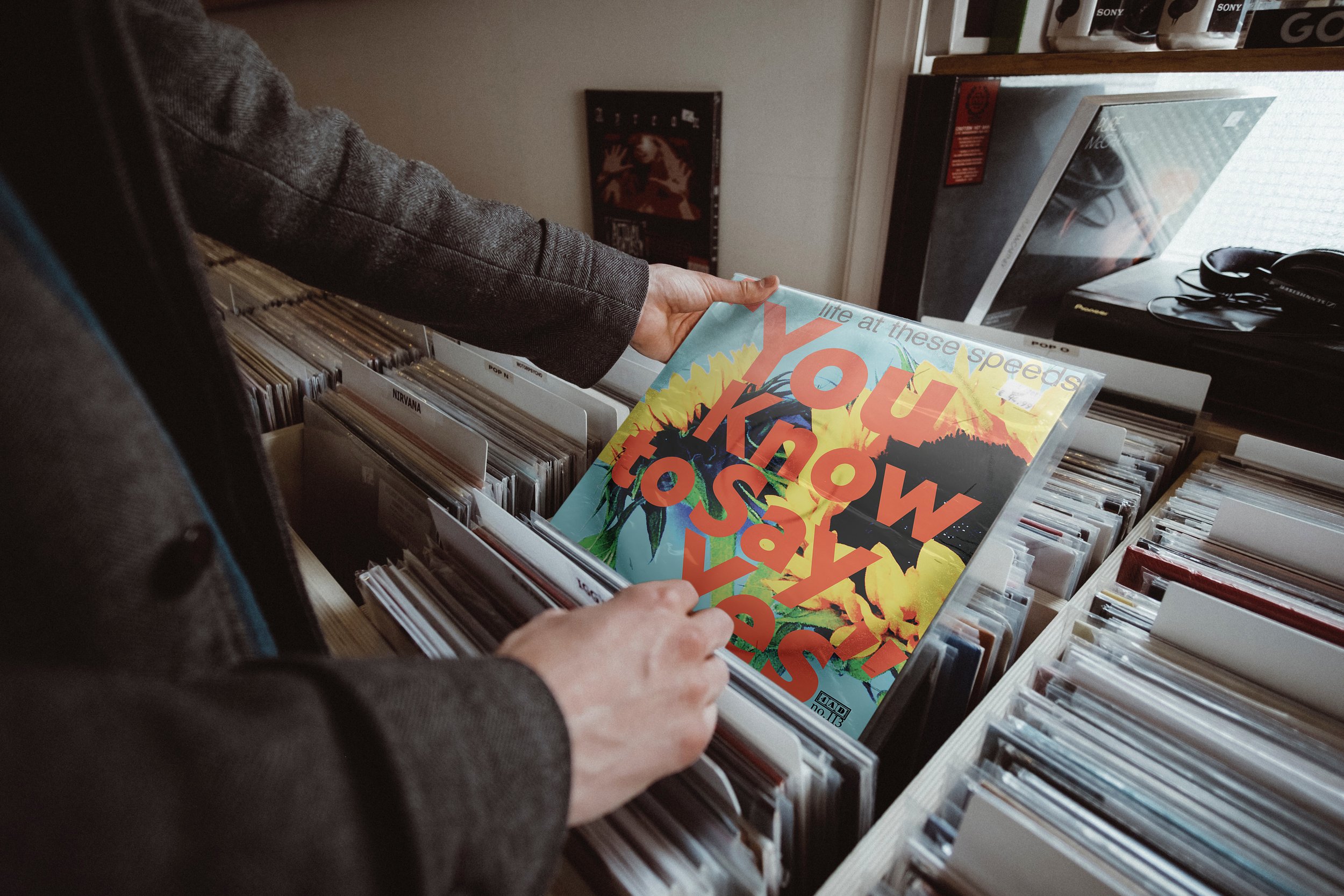
in portland, oregon and the early 2000s, i knew a few of the guys in life at these speeds. we hung out, the way you do when you're twenty-something and you are surrounded by great bands and plenty of house shows. the energy and excitement surrounding lats was electric. they combined the energy of post-hardcore and the melody of emo to create one of the best bands in the entire city. all of their offered releases (two full length albums, a split lp, and a handful of split 7” records) were coveted. years later i went back to that album and started imagining what a deluxe reissue could look like if nobody had to sign off on it but me.
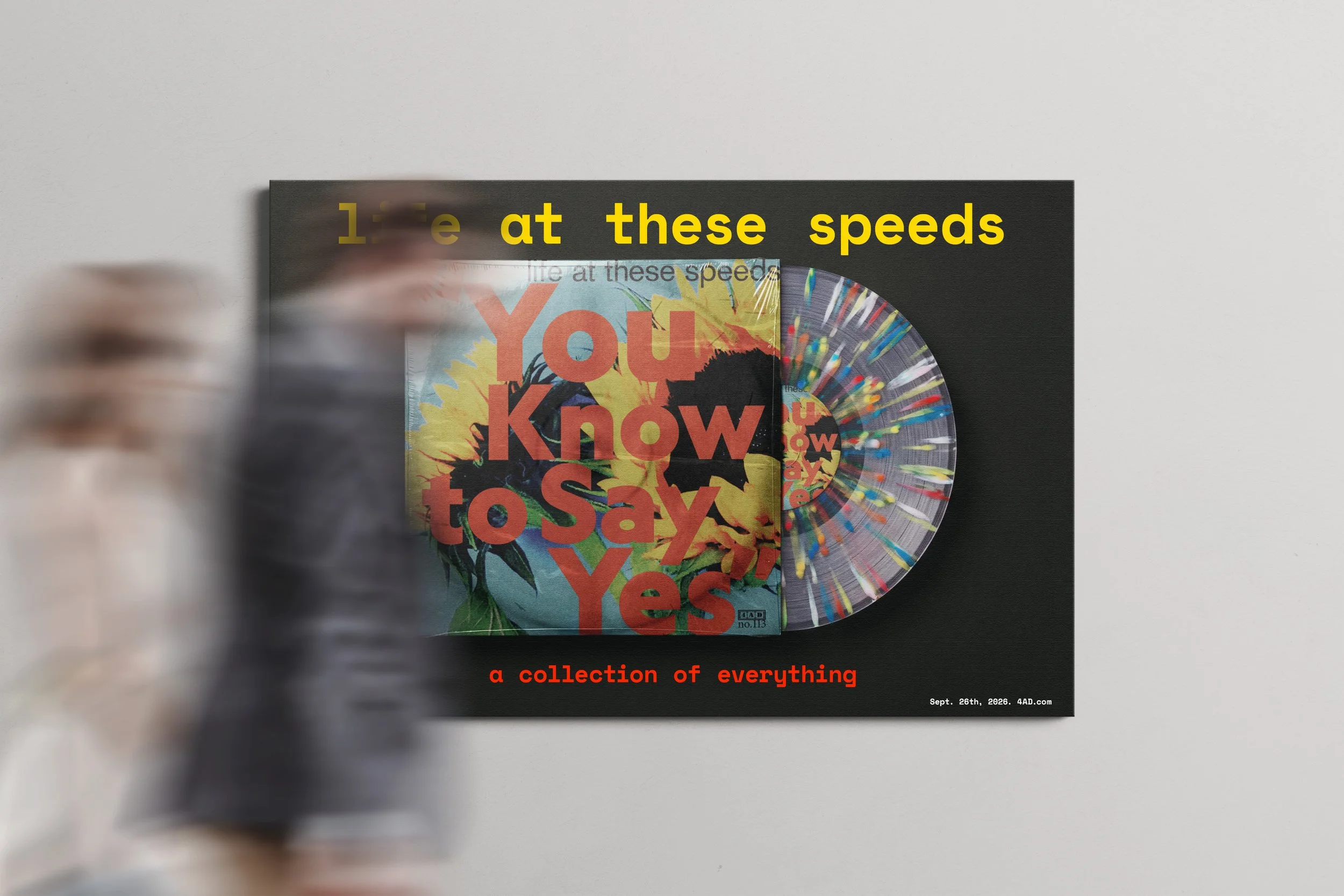
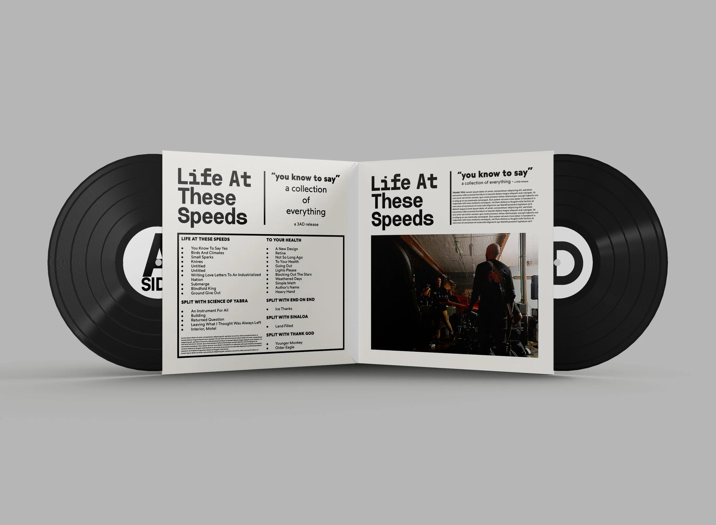
the concept grew past a single cover pretty quickly. it became a double record — the full catalog, not just one album — with two pressings: a black vinyl standard run, and a clear splatter edition kept intentionally small. once there were two editions, there needed to be packaging that told you which one you were holding. that led to internal artwork, then posters, then a piaggio ape decked out like a promo vehicle because why not, then shirts, then buttons.
thirteen pieces so far, and it's still not done. this is the project i keep coming back to when i want to make something with no client and no deadline — just a record i loved, reimagined until it felt like its own thing.
[etc.]
this is where the punks live. the outsiders. the weirdos who aren’t afraid to take risks. people who don't want their brand to look like generic corporate blah. the work in this section wasn't made for anyone in particular. it was made because it's how i see things — the aesthetic i actually reach for when nobody's asking me to reach for something else. my aesthetic comes from the raw, the real, the mistakes, the imperfection that is part of our lives. torn posters weathered by rain, stacked over each other on a telephone pole, creating amazing textures. office copier that jams and shreds and spits out something that goes straight into the recycling. grunge, punk, hardcore… the design history i keep going back to. purposeful mistakes drawn from the imperfections of life. this is the section built out of that. if you see yourself in it, we should probably talk.
[projects]